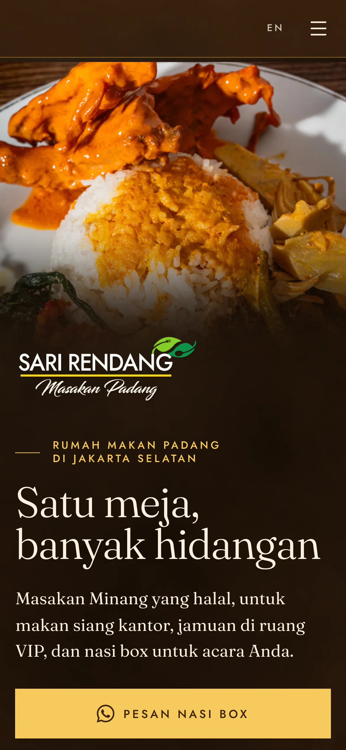
A halal Padang restaurant's website, chosen from three complete looks, built for office buyers ordering through WhatsApp.
The owner chose Coklat on 3 November, after four rounds of revisions and a photoshoot.
Project facts
- Role
- Designer: wireframes, Figma designs, client feedback, copy
- Timeline
- 5 weeks, 1 Oct to 3 Nov 2026
- Built with
- Claude Code
- Stack
- Astro 7
- Tailwind CSS 4
- TypeScript
- three.js
- Static files
Why
Sari Rendang is a rumah makan Padang with two outlets in South Jakarta, halal-certified by BPJPH. It had no website. Its Instagram bio linked a link page, its old business cards printed an address that was never built, and its awnings, flyers, VIP card and posts carried at least nine phone numbers between them. A buyer could not tell which number answered.
The food, the rooms and the service sit above street level, while the old identity used three logo treatments and about six colour stories. The site's job is to be the one source of truth: the dated price list, two outlets with their own WhatsApp lines, the hours, the halal certificate, in Indonesian and English.
Halfway through, the owner's team asked for a site that sells to businesses ("lebih buat b2b"), in a more formal register. The home page now leads with nasi box for offices, then the VIP rooms, then dining in.
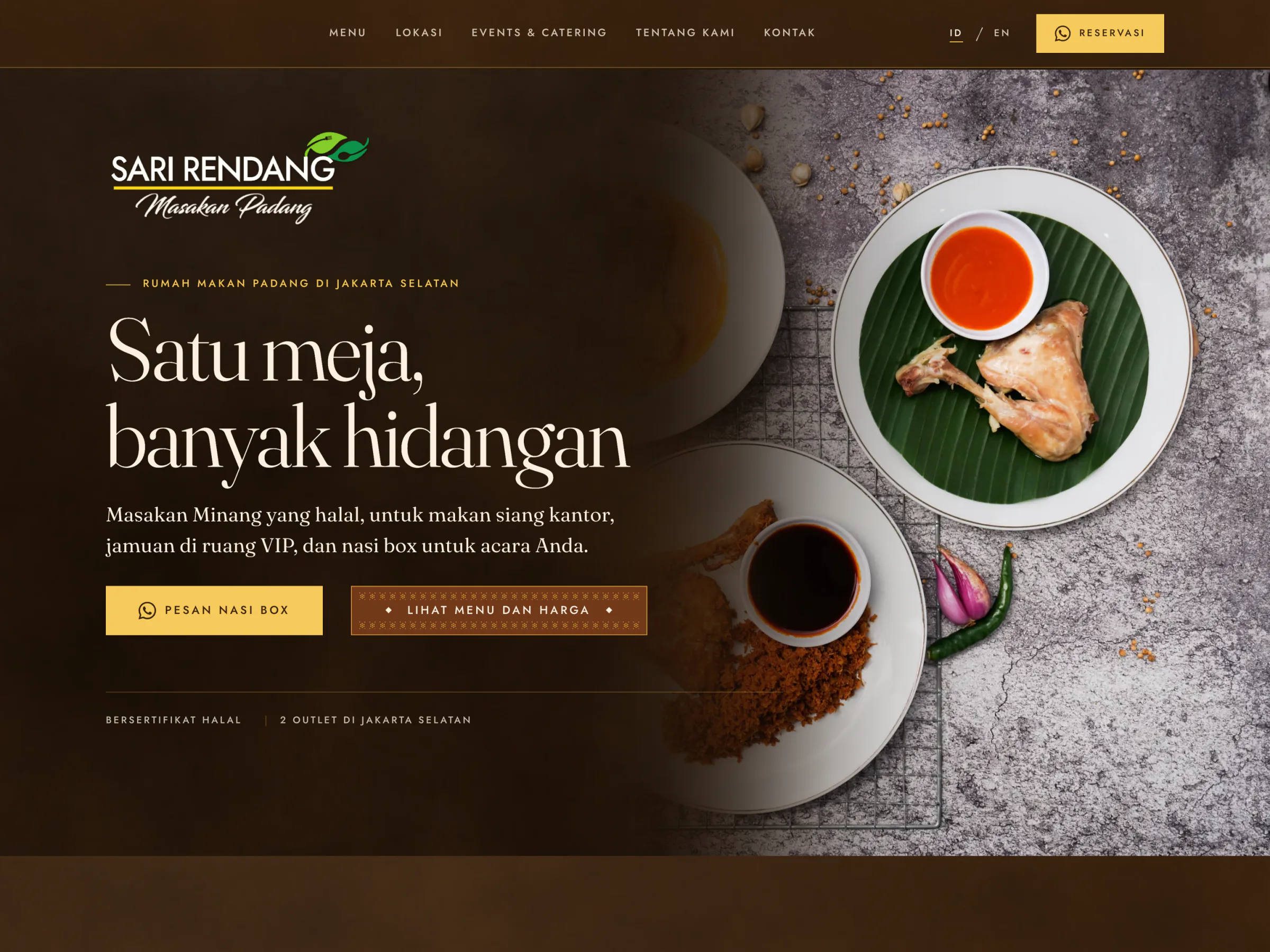
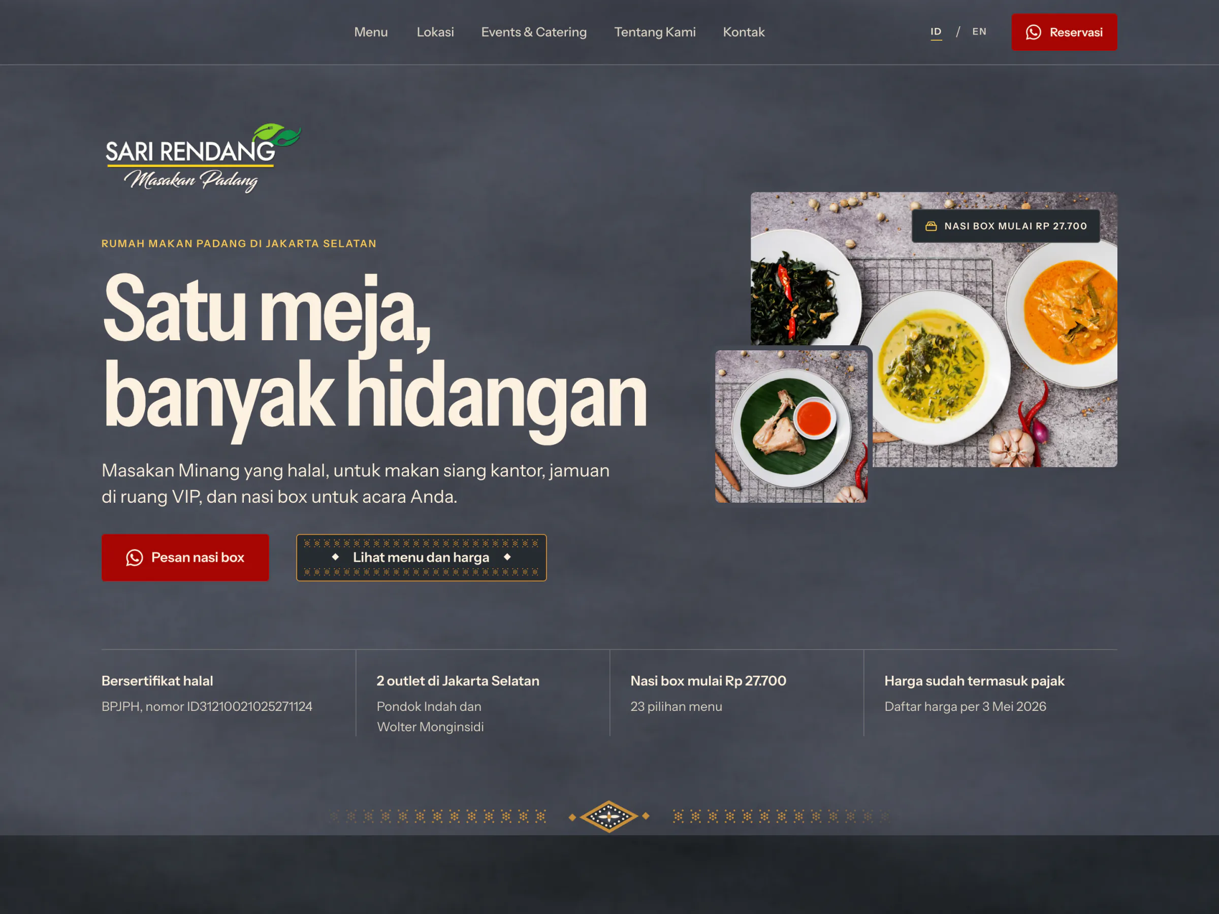
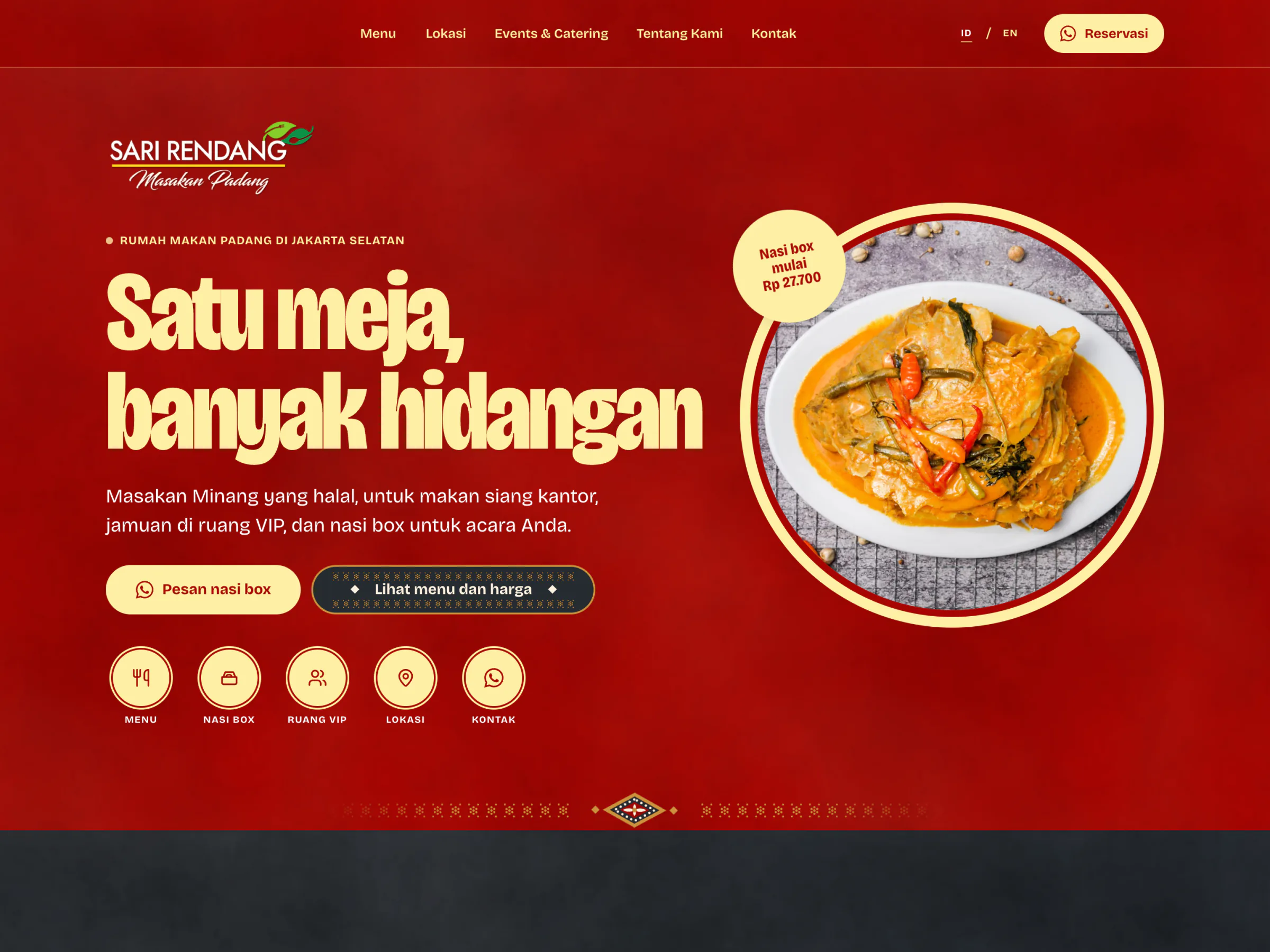
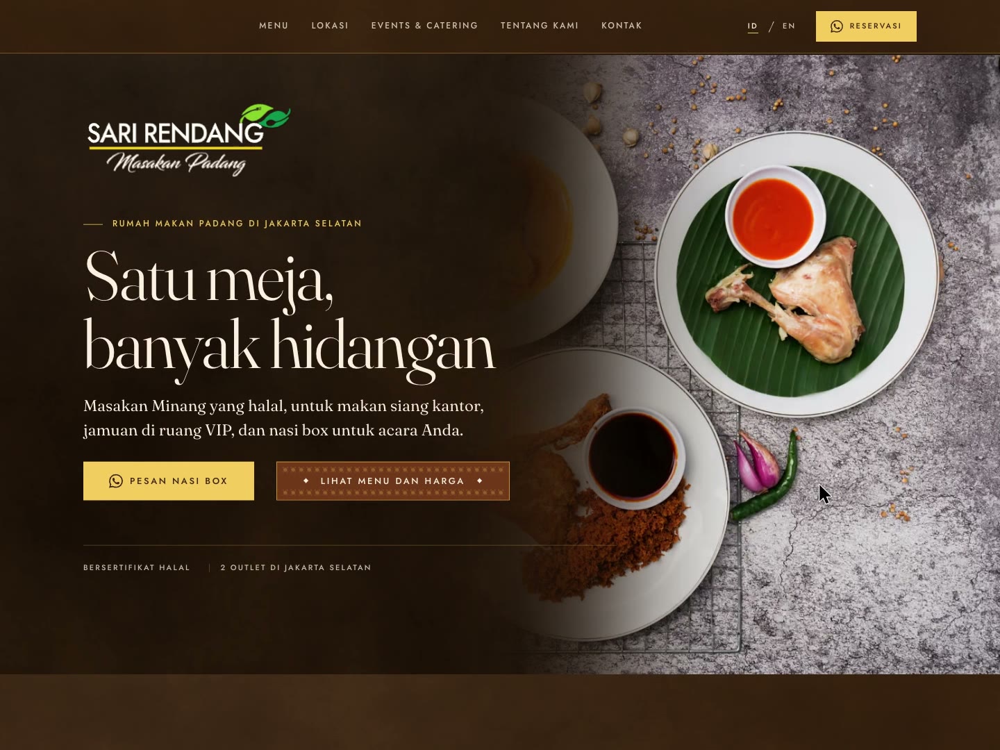
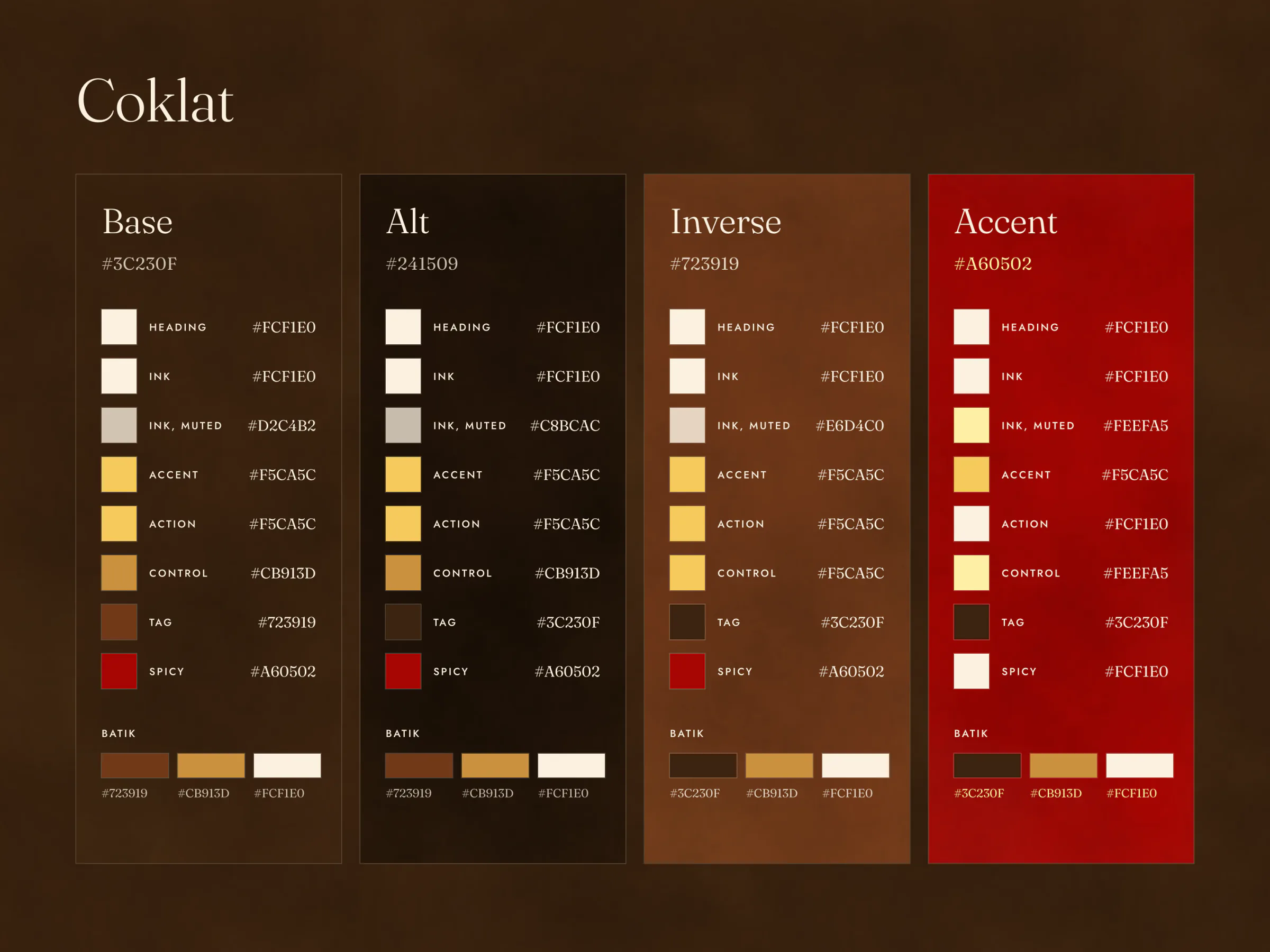
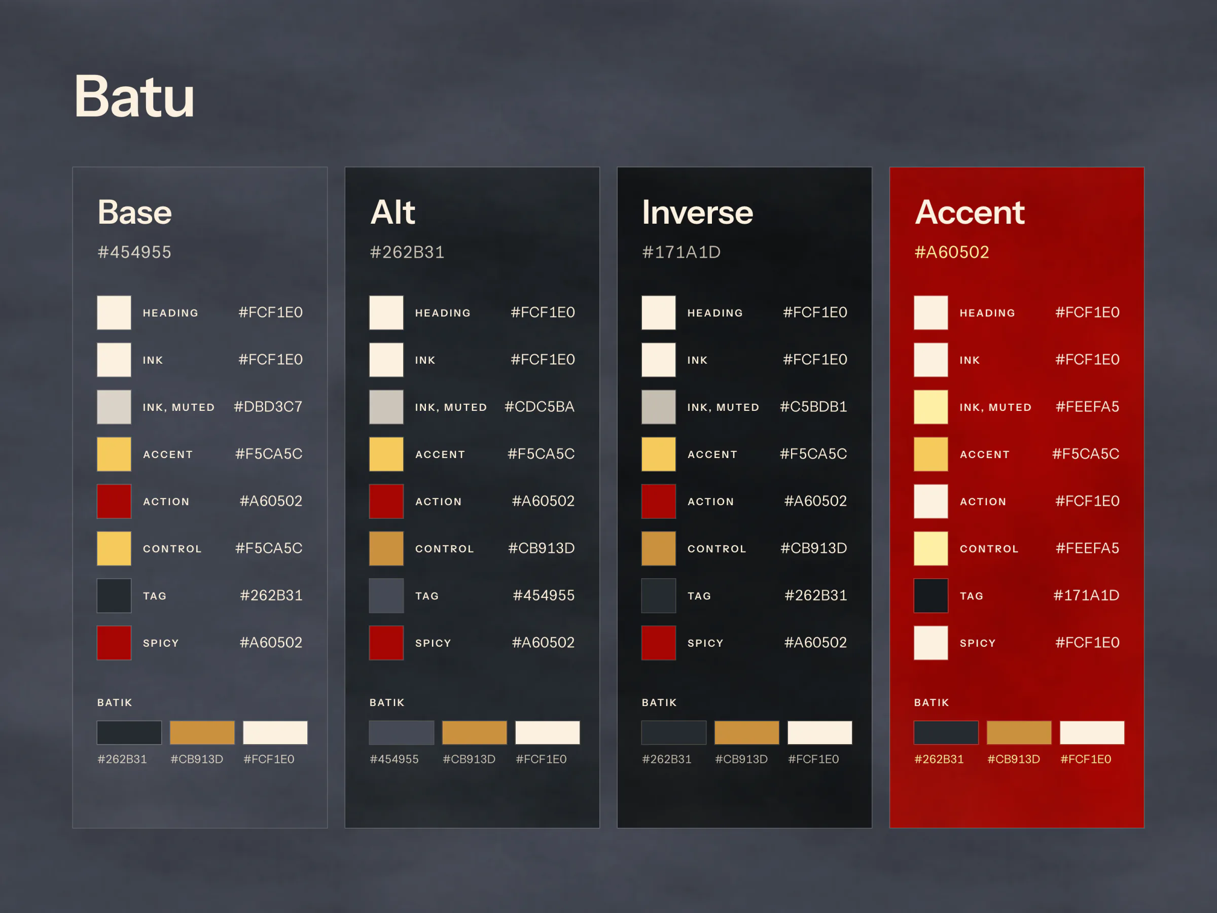
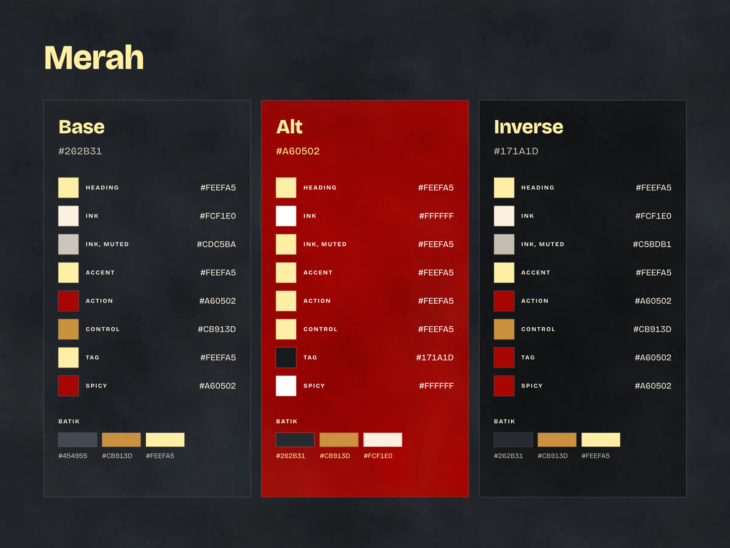
The owner had not chosen a look yet, so the site was built three times over: A Coklat on the brown of their logo plate, B Batu on the slate their food is photographed on, C Merah on the red of their Instagram.
How It Works
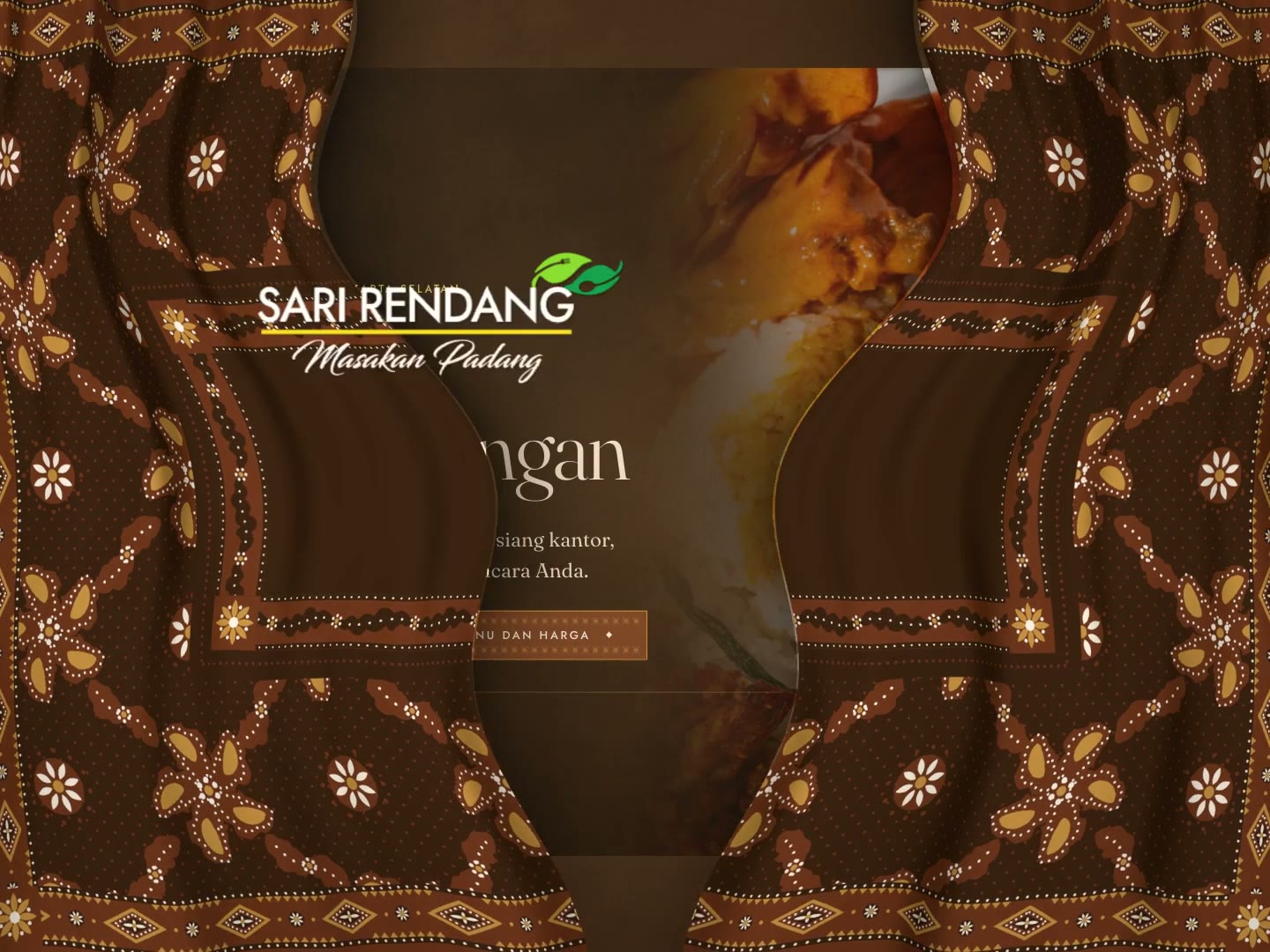
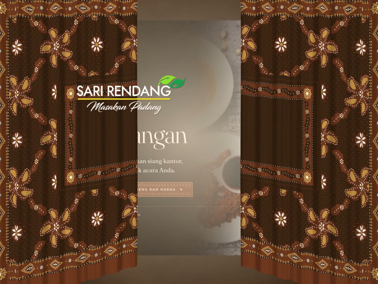
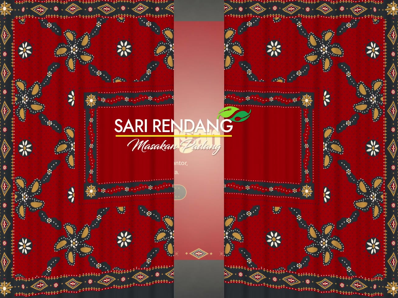
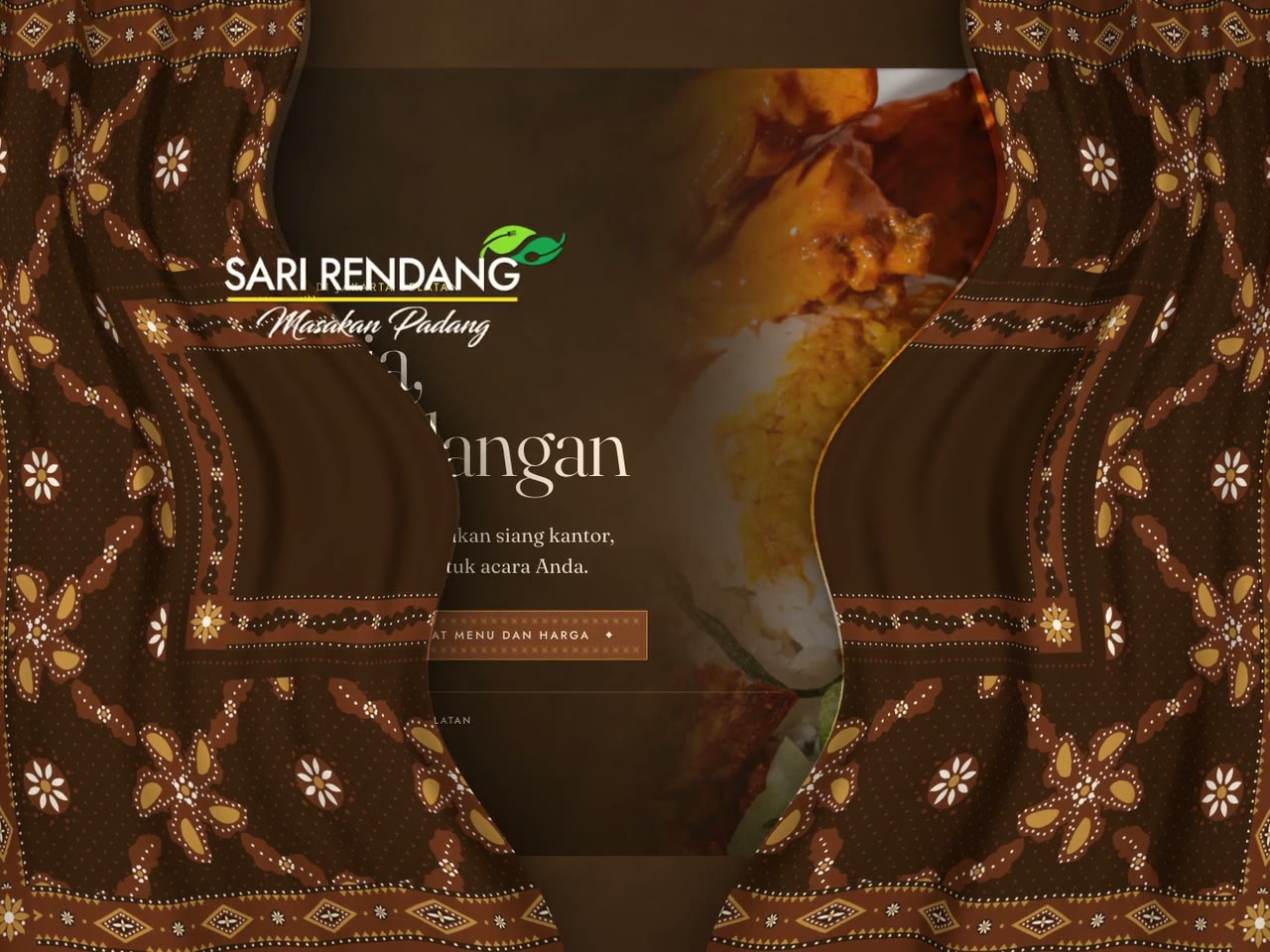
- A first visit opens on batik. Their logo builds on a whole cloth of batik tanah liek, the Minang batik, while the page loads underneath; the cloth draws apart and the logo lands in the hero. Any touch or key ends it, and it never runs past five seconds.
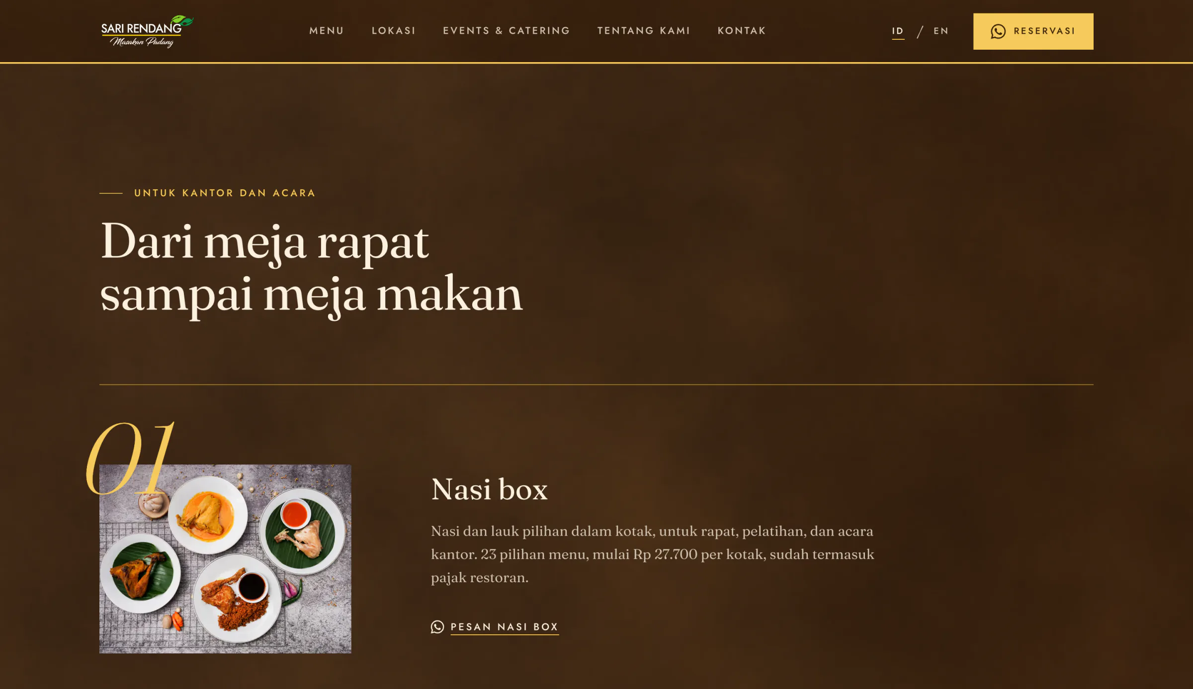
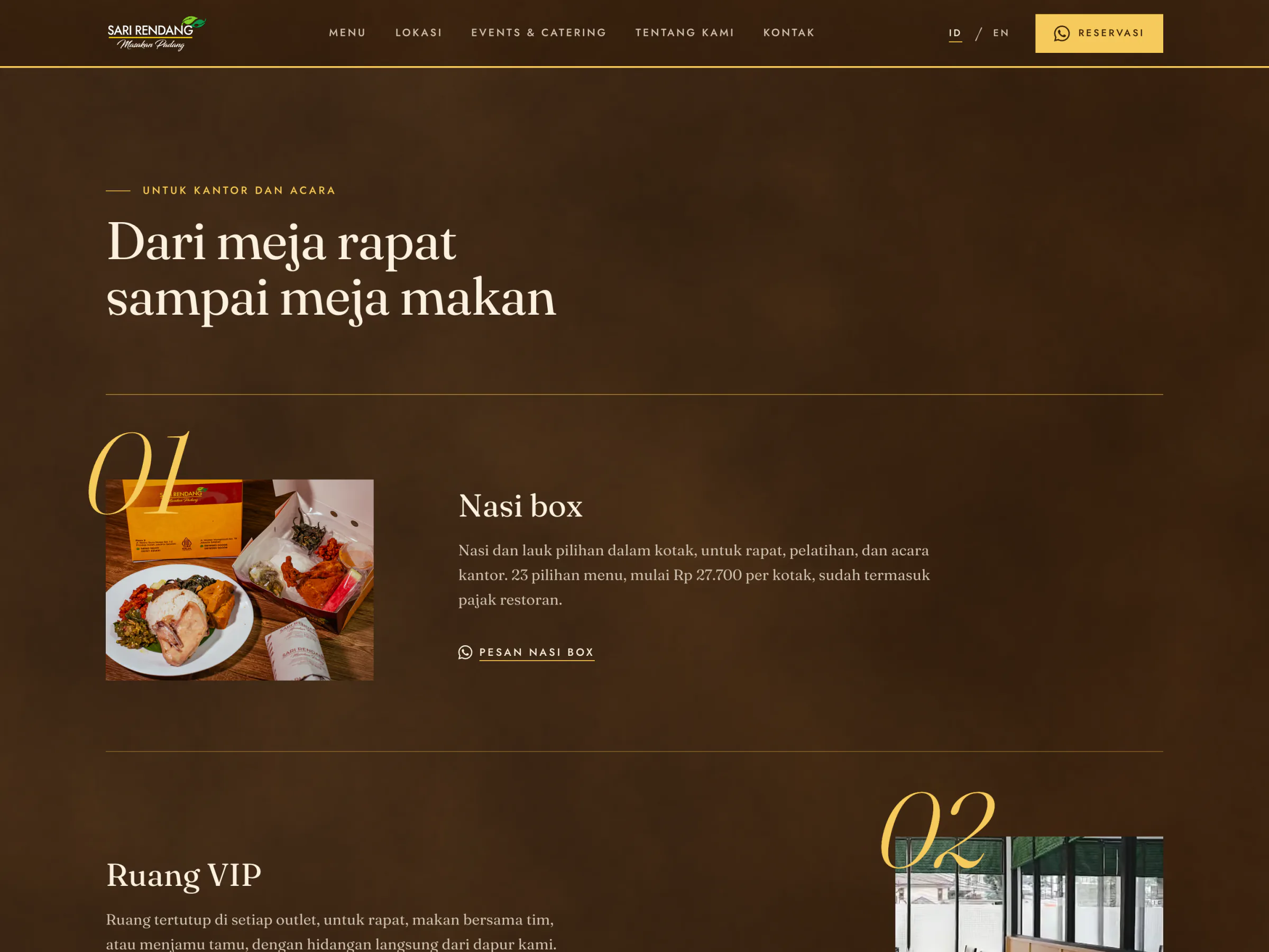
- The services, in the buyer's order. Nasi box with its starting price, the VIP rooms, dining in.
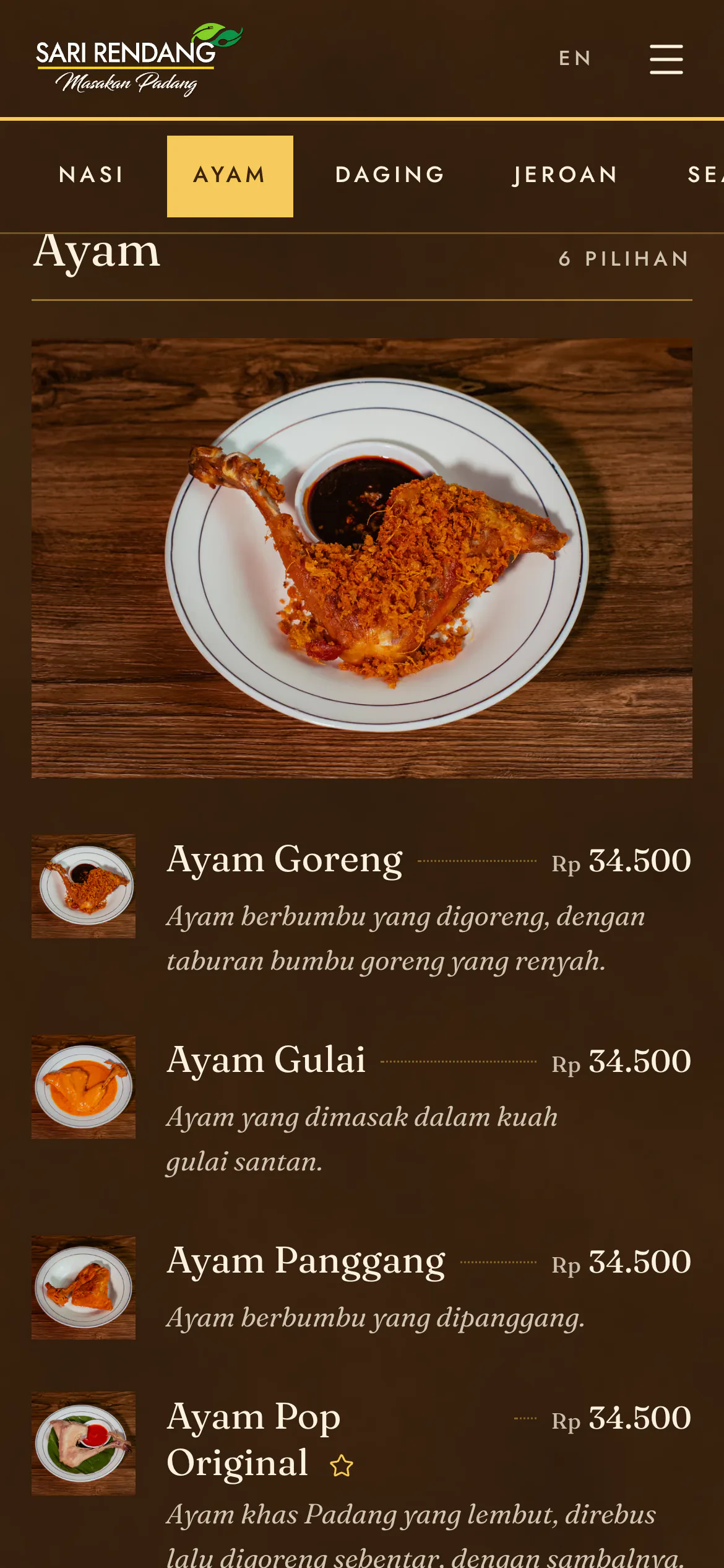
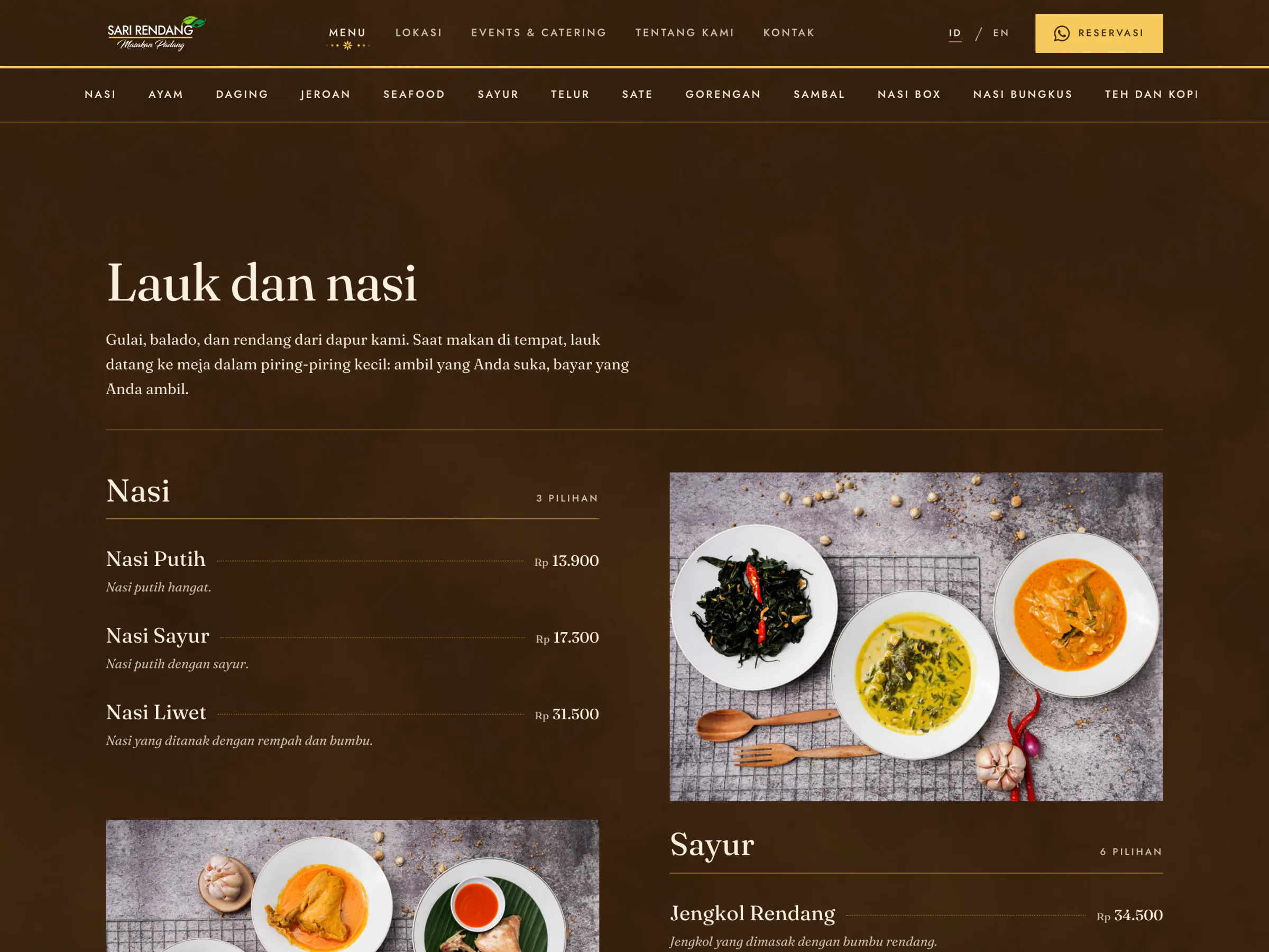
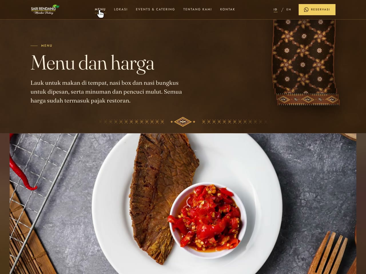
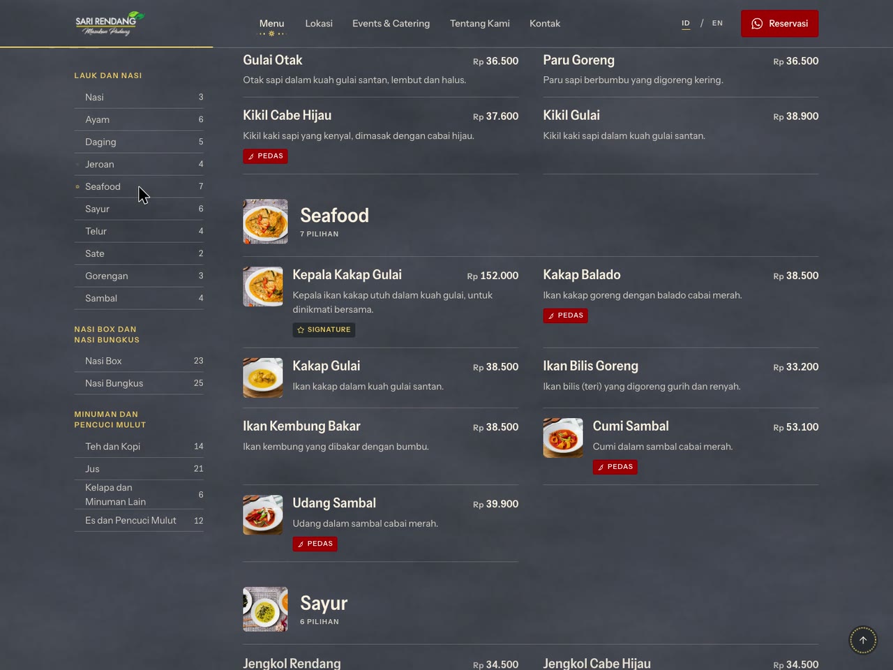
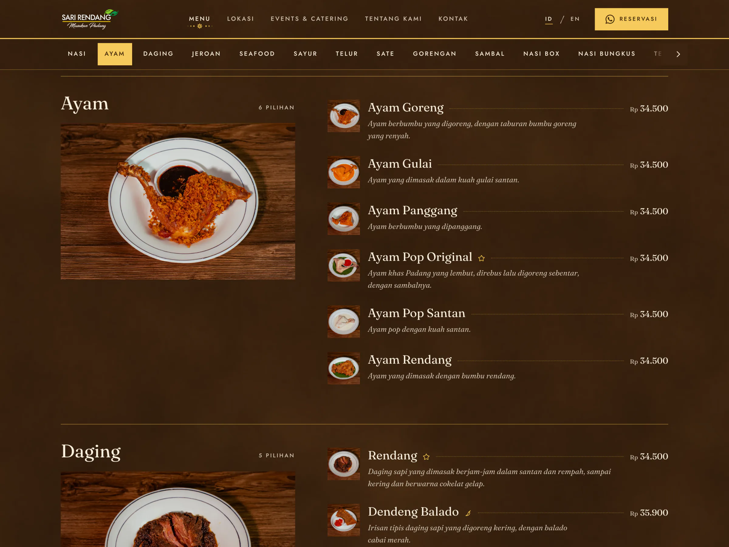
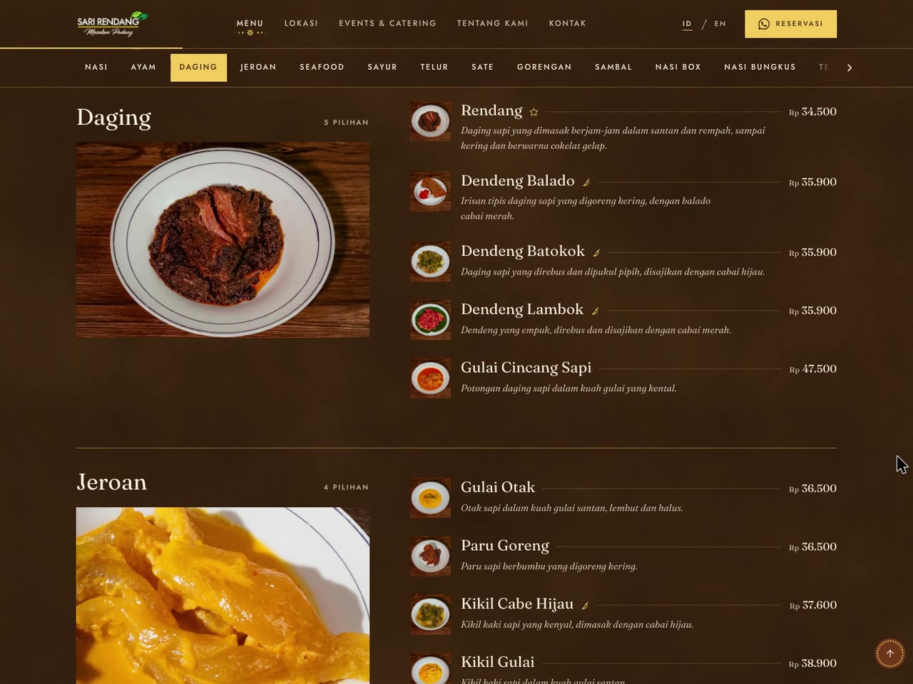
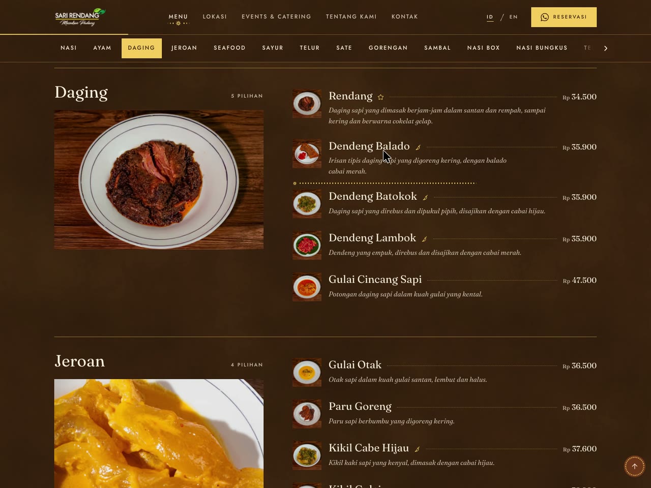
- The whole menu as text. 145 dishes in 16 categories from the price list of 3 May 2026, tax included, Signature and Pedas marked, with jump links that follow the reading.
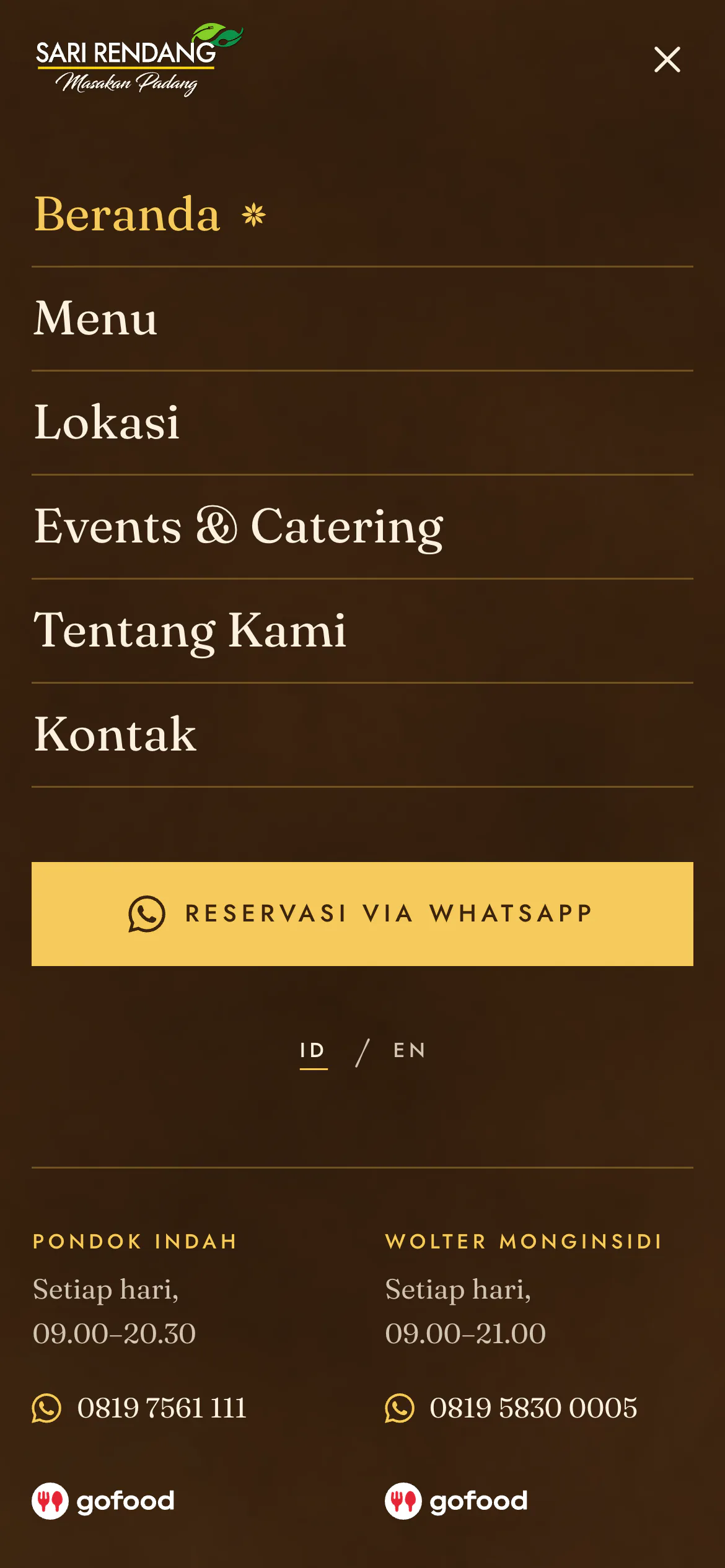
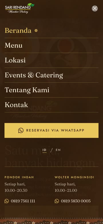
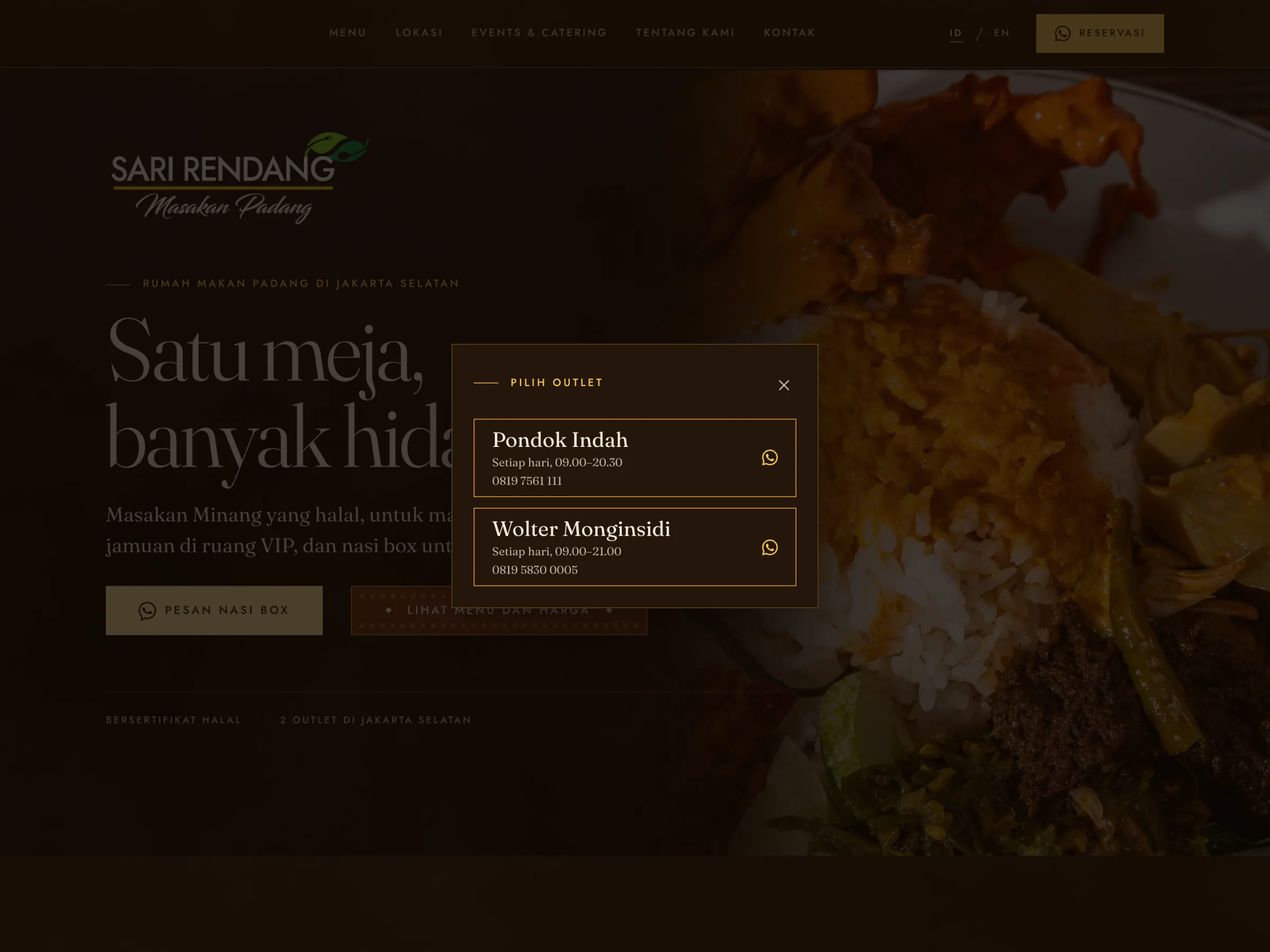
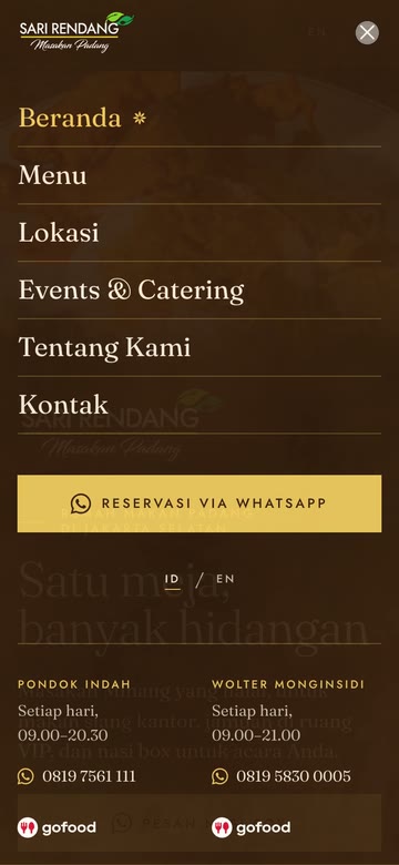
- An outlet, then WhatsApp. Every reservation or order button asks which outlet first, then opens that outlet's own WhatsApp line with the message written in the visitor's language.
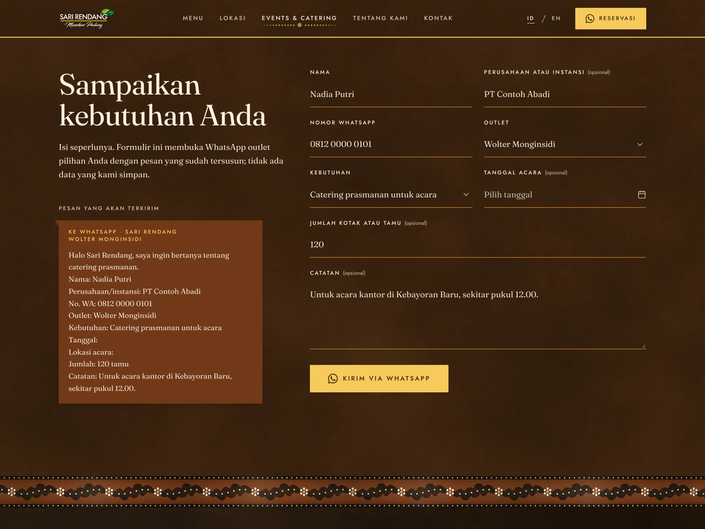
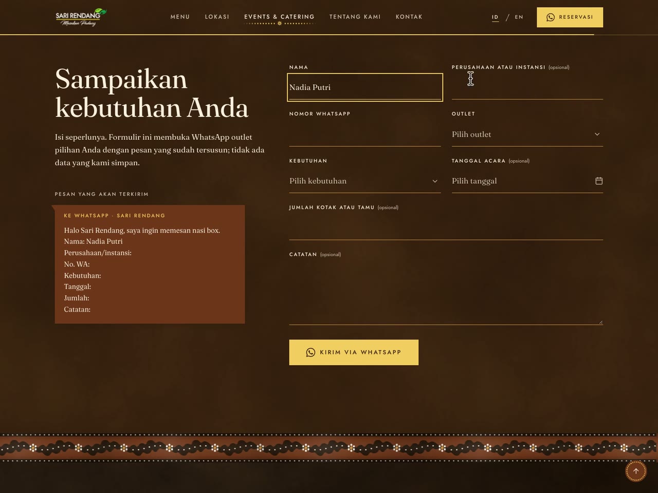
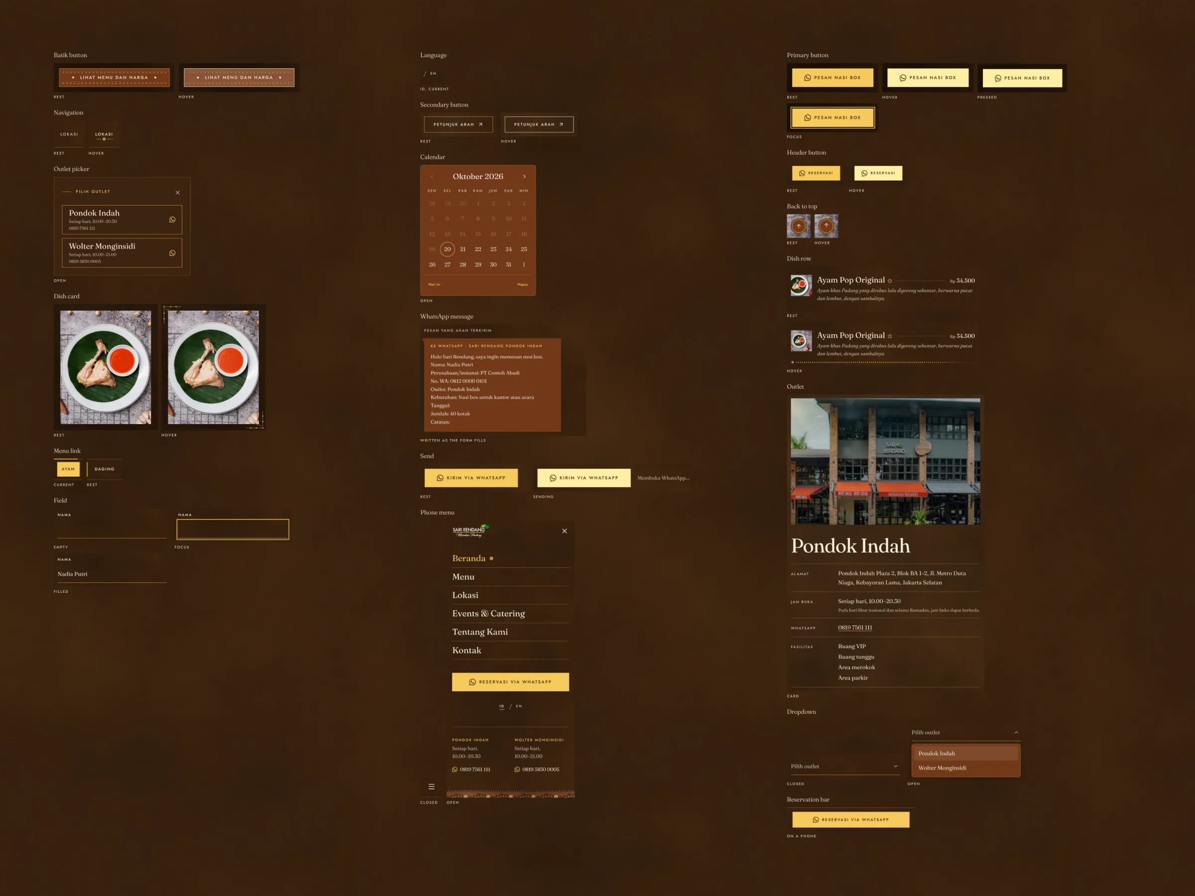
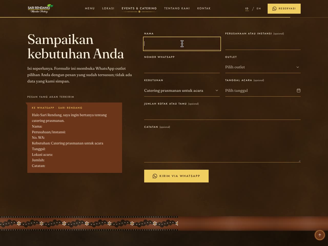
- Forms that show what they send. The catering form writes its WhatsApp message beside itself as it fills, so a buyer sees every word before it leaves.
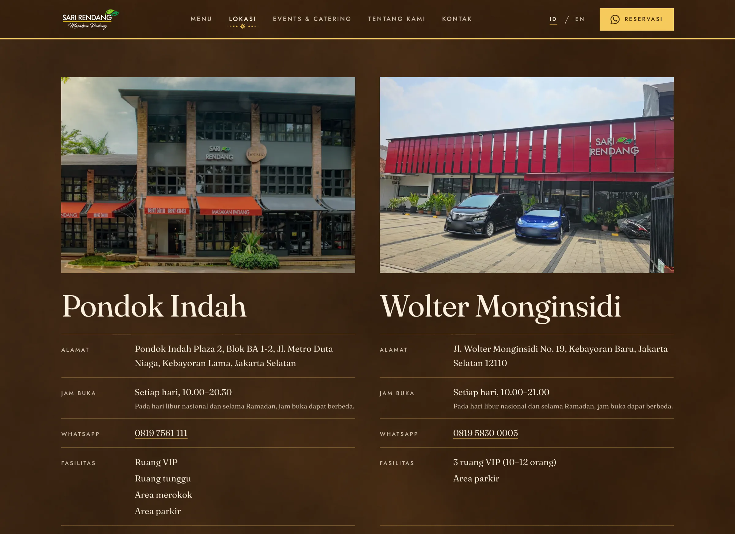
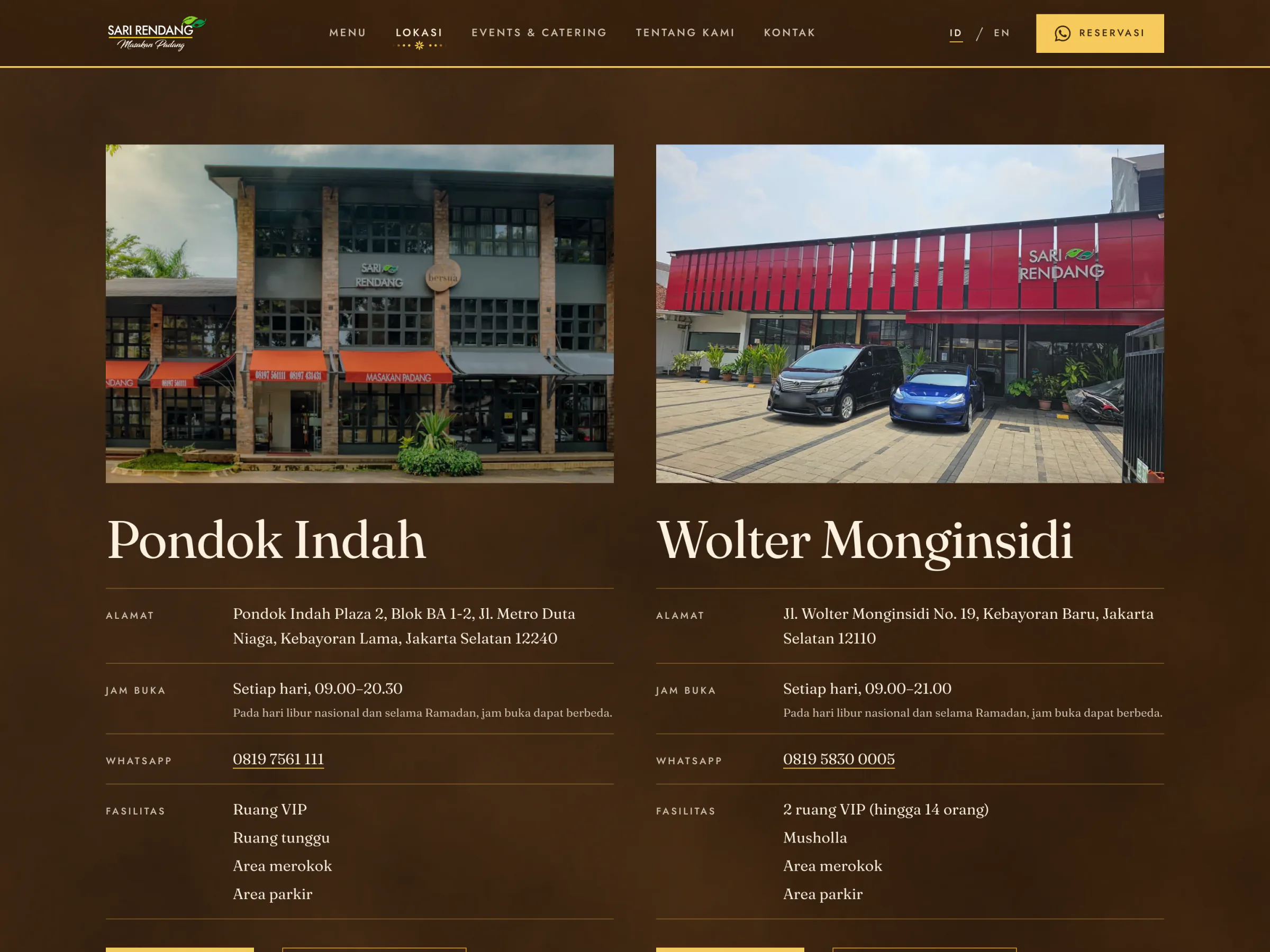
The site speaks Indonesian first, with an English twin under translated addresses at /en/; the language switch keeps the visitor on the same page. Each outlet's card carries its front, its hours, its rooms (small stills from the restaurant's company video), its facilities and a map drawn from OpenStreetMap in the concept's own colours; Google's map loads only when asked for, so no request leaves the site on load. A line of copy never carries a typed price or date: it quotes the price list, and the page fills in the starting price and the list's date itself.
Under the Hood
The site is plain static files, built by Astro, so it runs on the shared hosting the restaurant buys with no server code. Facts live in one place (src/data, checked at build time: 145 dishes, two outlets, a WhatsApp line each) and every line of copy in another, one blueprint per page with Indonesian and English side by side. Each concept is a theme on one token contract, and where it differs, its own home page and menu.

Life of one catering request:
- The form. Eight fields, four of them required: name, WhatsApp number, outlet and need.
- Checked. The browser stops a send with a required field empty and focuses it.
- Written. The message builds beside the form as it fills, greeting first.
- Sent. The icon turns once and a line says "Membuka WhatsApp".
- WhatsApp.
wa.meopens in a new tab with the outlet's number and the message ready. - Kept nowhere. The page stores nothing; the request lives in the chat.
The opening is the one heavy part, and it is kept off the main thread: three.js draws the cloth inside a Web Worker on an OffscreenCanvas, on a first visit by a capable device only. Everywhere else a CSS layer plays the same cloth, and a test keeps the two in step.


How It Was Built
Two weeks, 1 to 14 October 2026, in 20 commits, every one co-authored by Claude Code (Claude Opus 5.5). The project's rules file holds what every session starts from: the brand rule, the writing rules (no em dash, never an invented fact) and the motion rules learned from bugs. The copy, in both languages, was drafted with Claude Code from 2 October and edited in review; the preview went up on Vercel on 12 October.
Three Whole Sites From One Body of Content
Discovery needed three looks the owner could use, not three pictures. The content is written once and each concept is a theme on one set of roles (bg-surface, text-ink, rounded-button), never colours. Cost: the shared pages had to carry three very different looks, and every check runs per concept: 412 contrast pairs.
The Client's Brand, Not a Rebrand
A first design layer followed an earlier rebrand proposal and was thrown away on day one. The palette is sampled from their Instagram and logo plate, and their logo, known only from WhatsApp copies, was remade as a vector. Cost: a logo that stays a remake until the original arrives, and red in the palette, the category's most common colour.
Every Action Ends in WhatsApp, and Says So
The restaurant runs on WhatsApp, one line per outlet. Buttons say what they do ("Pesan nasi box"), ask for the outlet, and open WhatsApp with the message written. Cost: no booking confirmation on the site, and a form that depends on WhatsApp; nothing is stored, so nothing can leak.
Dark, Textured Grounds
After the reviews of 11 October, every ground became dark and textured: suede on the browns, slate on the stone, drawn in code as soft WebP tiles. Cost: contrast proved on every texture's lightest and darkest patch, and a finer grain that aliased into a grid had to go.
Facts Filled From Public Sources, Never Made Up
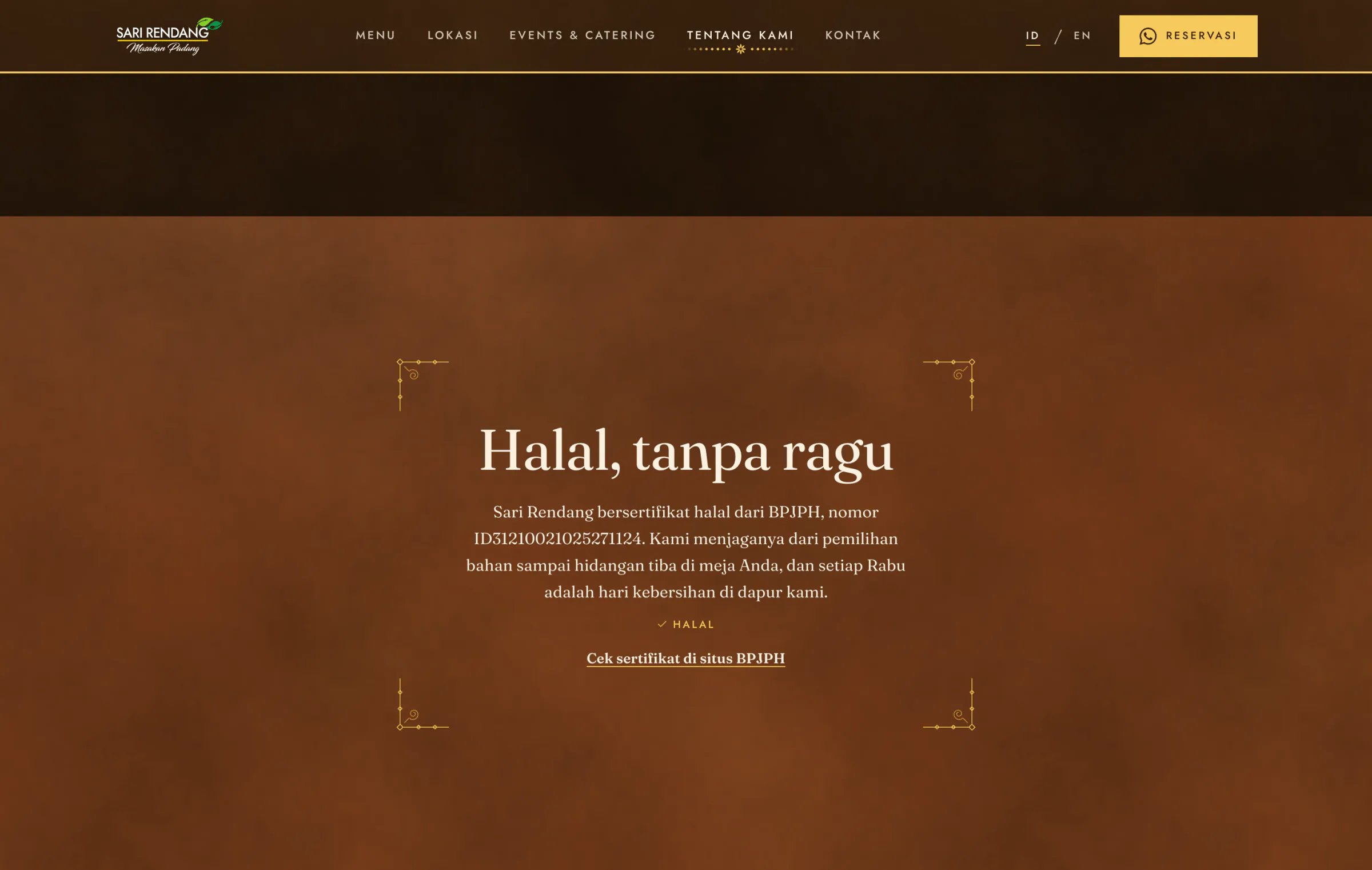
Facts the owner had not sent were filled from the best public source and recorded: hours from the outlets' Google listings, the halal certificate checked in BPJPH's registry and linked. Cost: a list for the owner to confirm before launch, and copy that says less than it could.
Design Details
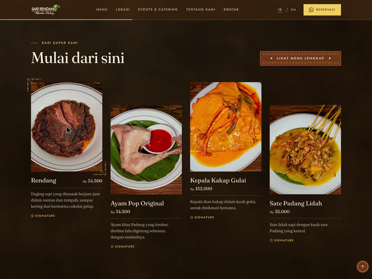
Motion is native CSS on opacity and transforms, scroll-driven where it follows the scroll, and token-driven per concept: Coklat slow and soft (a base of 320 ms), Batu quick (220 ms), Merah with a damped spring that overshoots by about 5%. Batik answers the pointer in small places: a flower opens under a navigation link, a line of cecek runs under a text link or a dish row, and two corners draw in around a dish card's photograph.
The opening has two layers: a three.js scene inside a worker for a first visit by a capable device, and a cloth drawn in CSS everywhere else, laid out alike and checked by a test. Nothing moves on its own for more than five seconds, and reduced motion keeps the fades and drops the movement; under it the opening rests on its finished frame.
The Owner Chose Coklat
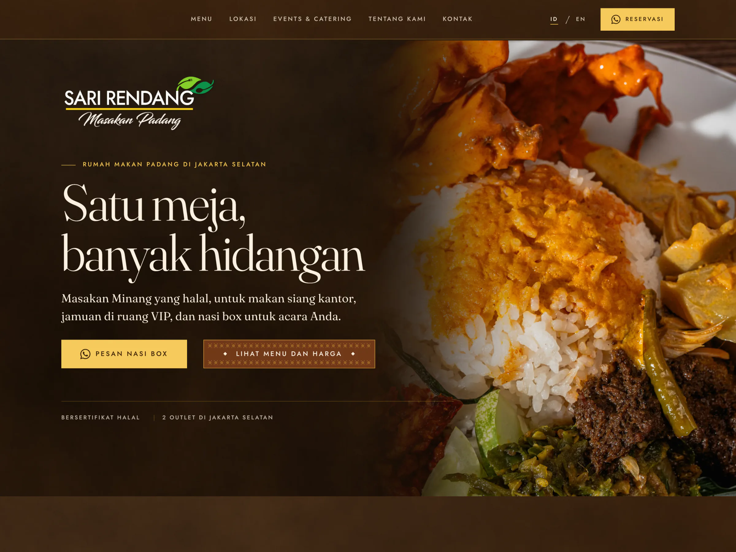
On 3 November the owner chose Coklat, and the preview now presents only that. Batu and Merah stay in the code. The build ran five weeks in the end, 1 October to 3 November 2026, in 34 commits, every one co-authored by Claude Code (Claude Opus 5.5).
Four Rounds With the Owner
The owner's side sent four rounds of changes.
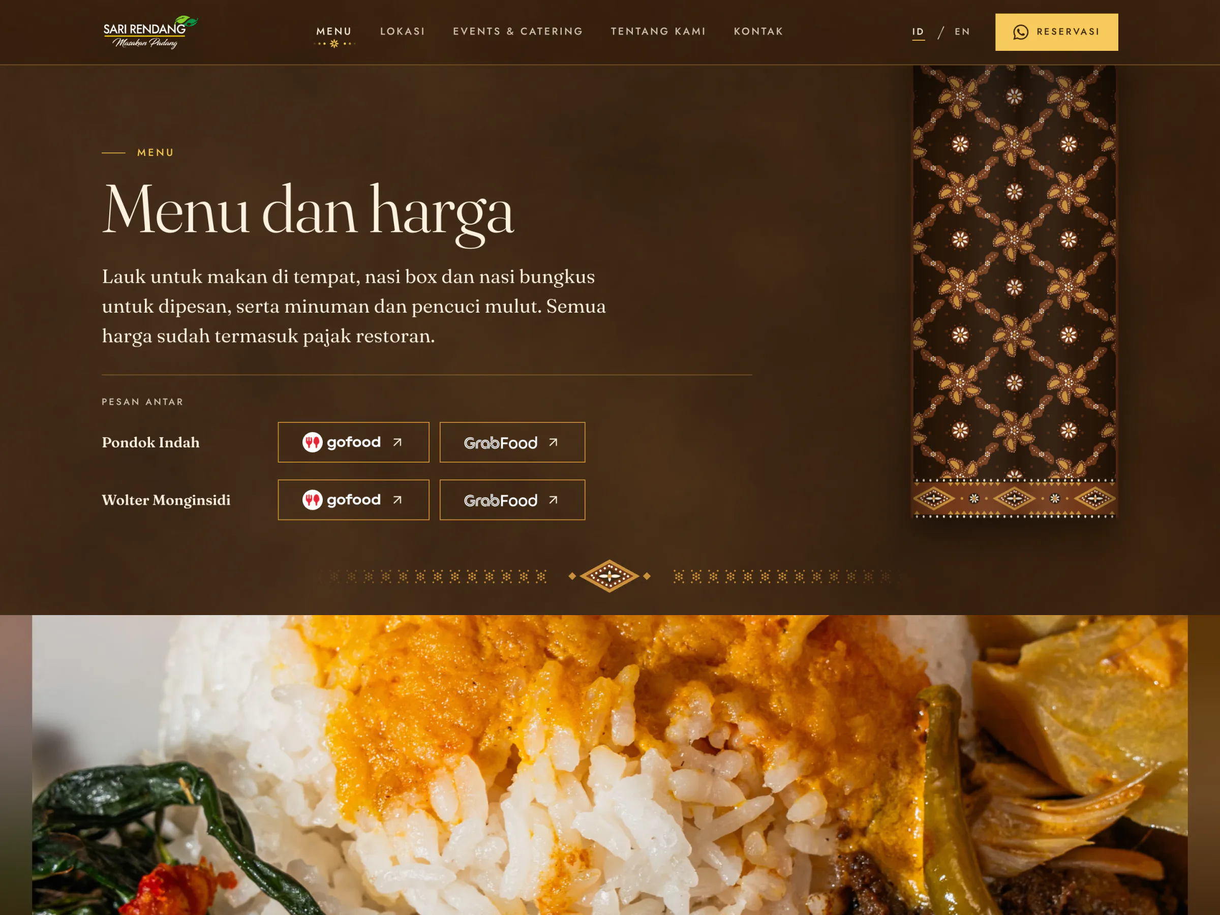
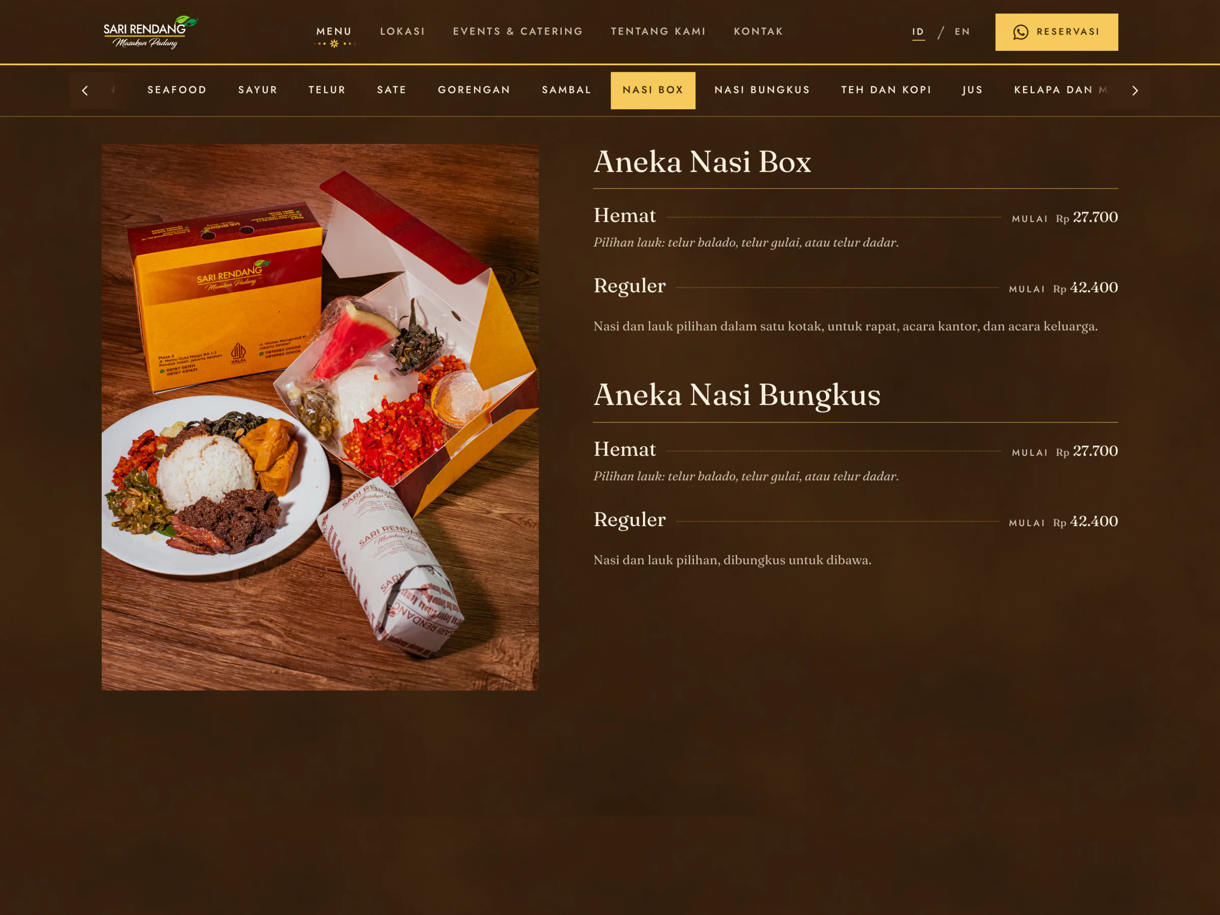
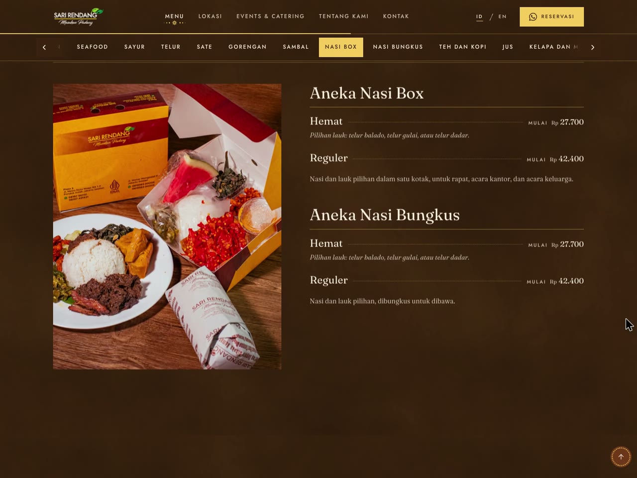
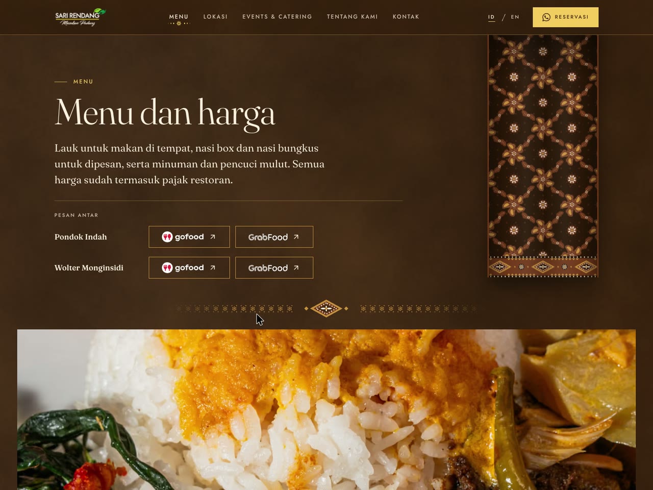
- 23 October. The nasi box and nasi bungkus become one entry each on the Menu, GrabFood joins GoFood, and both move to where they are seen.
- 28 October. Hemat and Reguler tiers, buffet catering from 50 guests, the outlets as they are now, and no nasi box prices on Events & Catering.
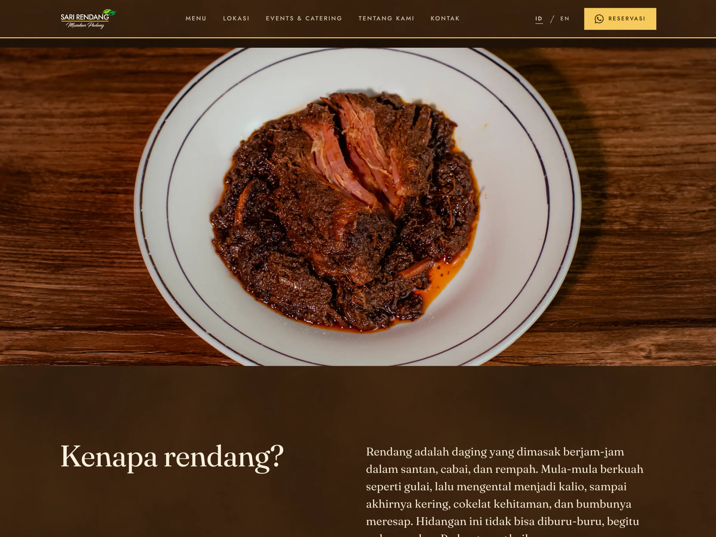
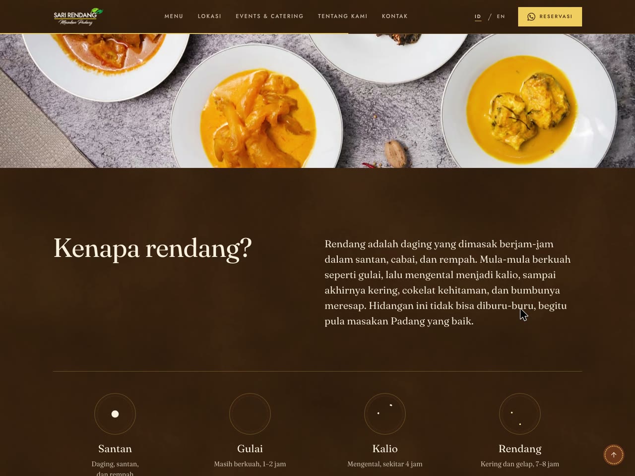
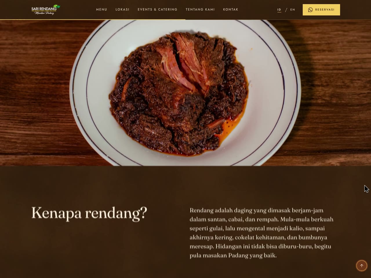
- 2 and 3 November. The Menu's bar jumps because of its two columns, the photo above "Kenapa rendang?" should be rendang, and there are more bugs, with no list. The whole site gets audited.
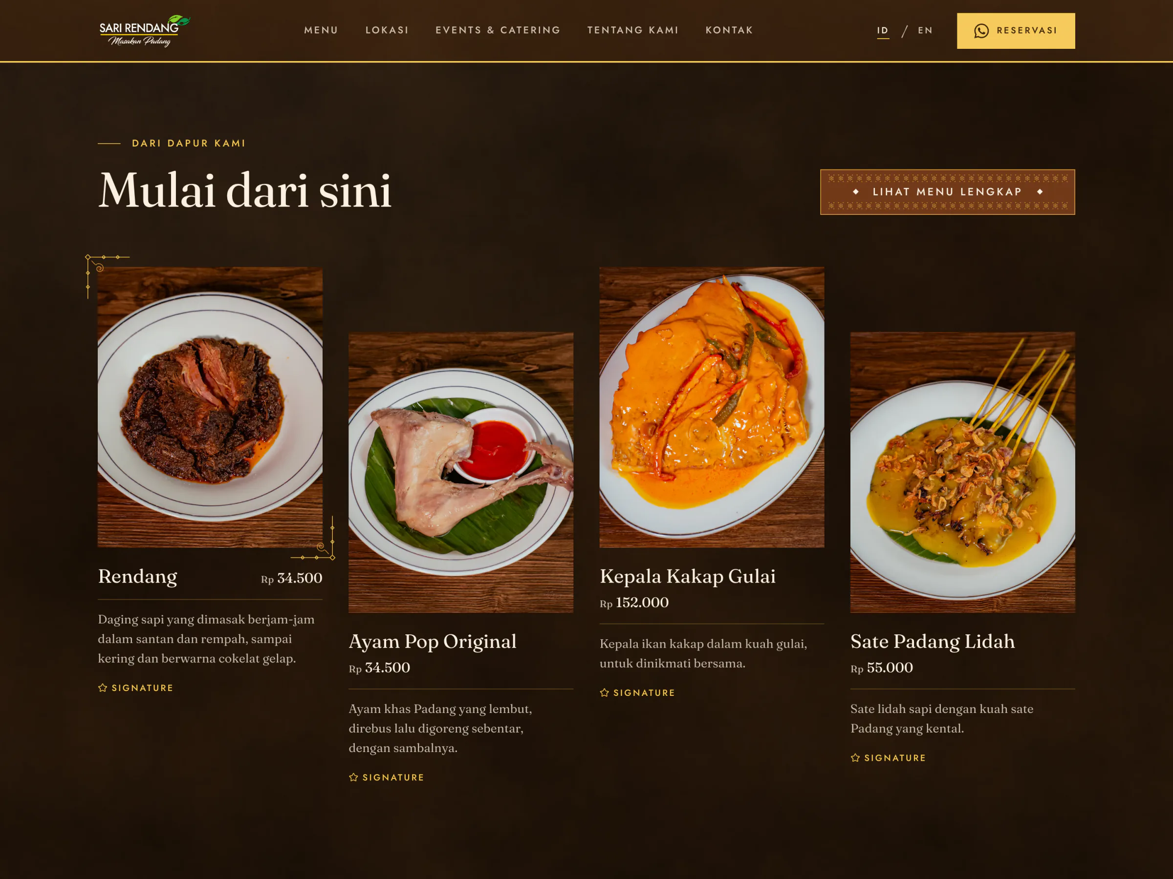
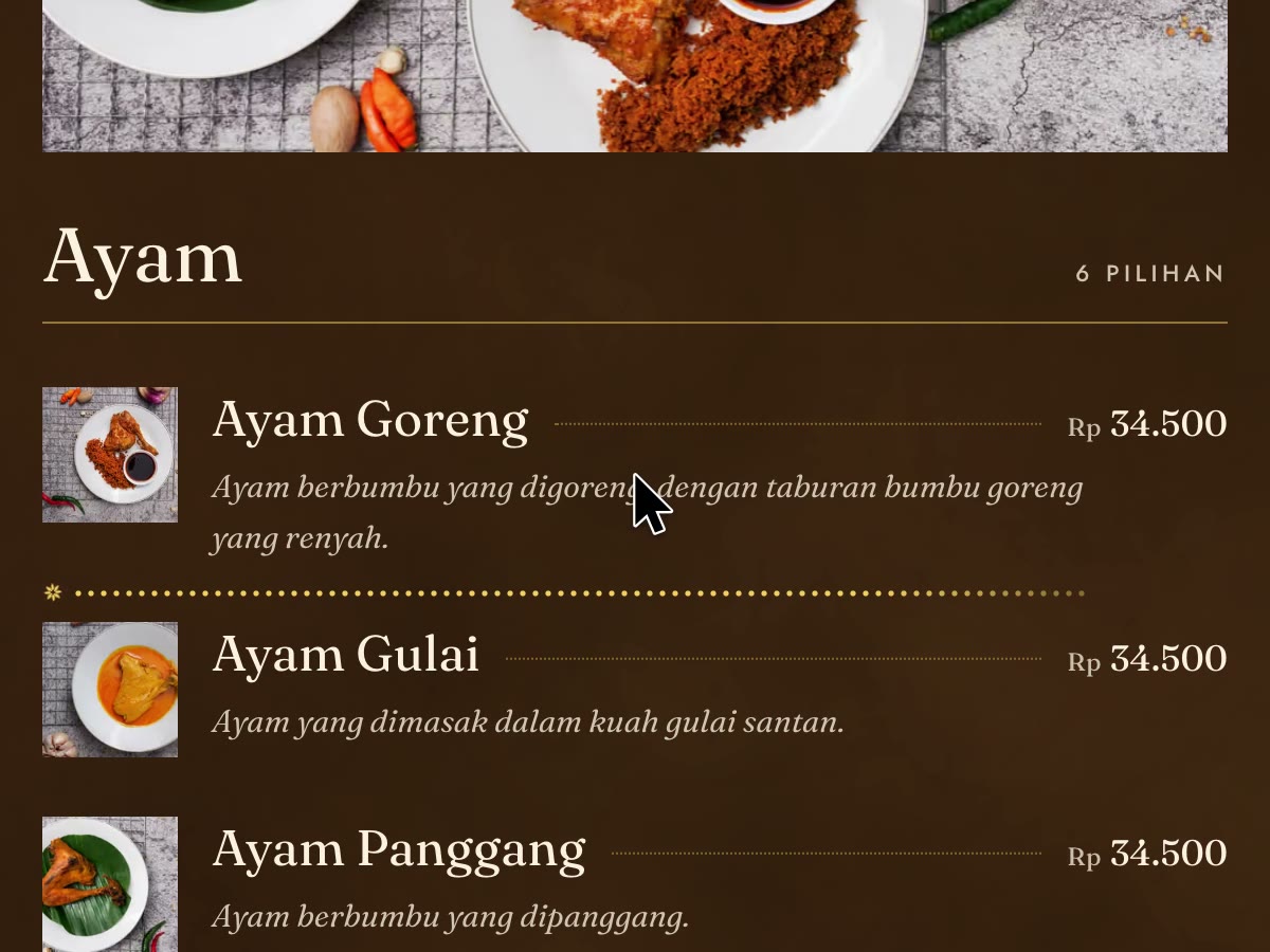
- 3 November. Opening hours, four dish descriptions, one Aneka Jus in place of seventeen lines, and the photoshoot: 50 of its 56 photographs go into the site, 42 dishes get their own picture.
The owner chose Coklat the same day and called this the last round before launch.
Hide the Two Looks Not Chosen, Keep Them
Batu and Merah left the owner's preview and stayed in the code, at their own addresses, out of search engines. Cost: the contrast check still covers every look, and a change to a shared page can still break one nobody is looking at.
An Audit, Because the Report Had No List
The third round said there were many more bugs without naming them. So the site was walked with real pointer and touch input at the sizes of the screens the owner's team uses: a small Windows monitor and an Android phone. Then every page ran in WebKit and Firefox too, with the newer CSS switched off to stand in for older browsers. Cost: the fixes answer what the audit found, not what they saw, and their list is still to compare. A real iPhone remains untested.
What Changed on the Page
- The whole menu as text, in one reading order. 145 dishes in 16 categories from the price list of 3 May 2026, tax included, Signature and Pedas marked. Each category holds its name and photo at the side while its dishes pass, and the jump links follow the reading.
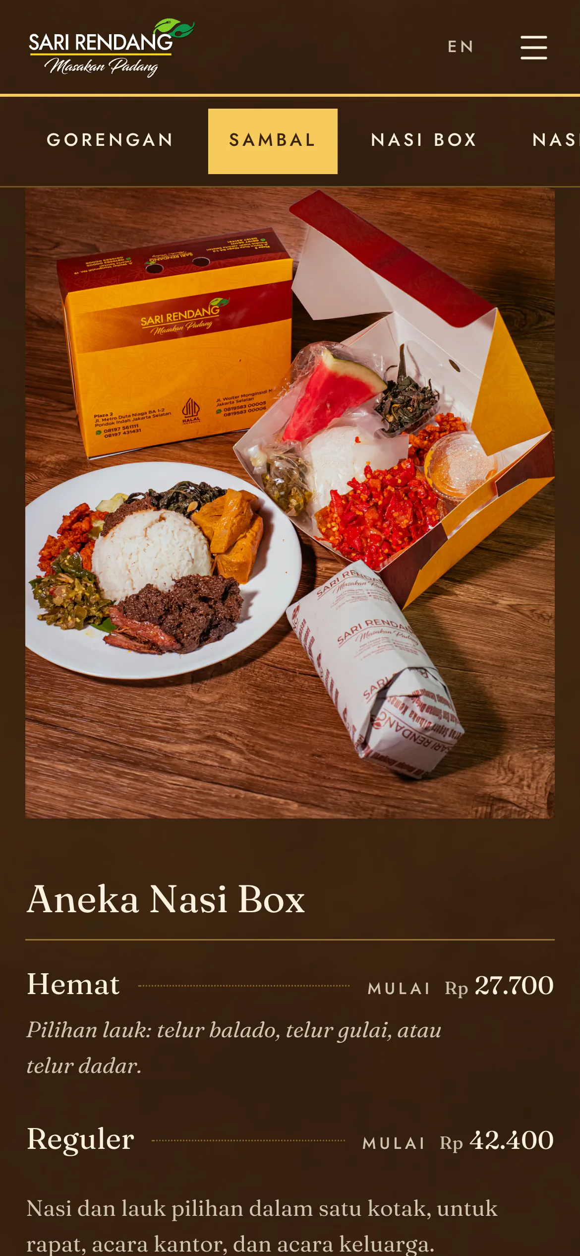
- Nasi box by tier. One large photo of what comes in a box, then Hemat from Rp 27.700 and Reguler from Rp 42.400, each worked out from the price list.
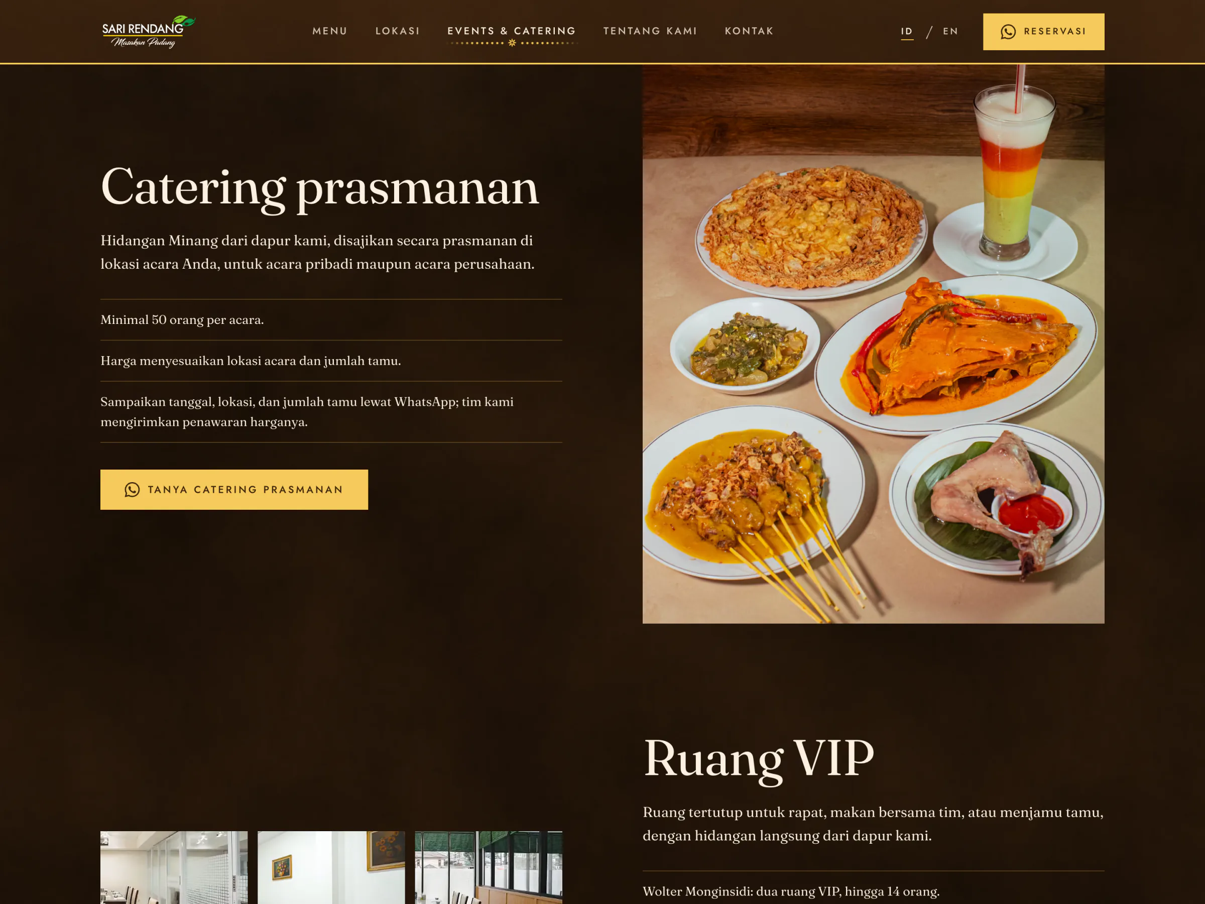
- Forms that show what they send. The catering form writes its WhatsApp message beside itself as it fills, and its first line changes with what the buyer needs: a nasi box order or a buffet.
Each outlet's card carries its front, its hours, its rooms, its facilities, its GoFood and GrabFood links under the apps' own logos, and a map drawn from OpenStreetMap in the site's colours; Google's map loads only when asked for, so no request leaves the site on load.
The Same Map, in the Chosen Look
Each look is a theme on one token contract, and one setting, selectedConcept, decides which look the site renders; choosing Coklat was a one-line change.


The Opening, Rebuilt
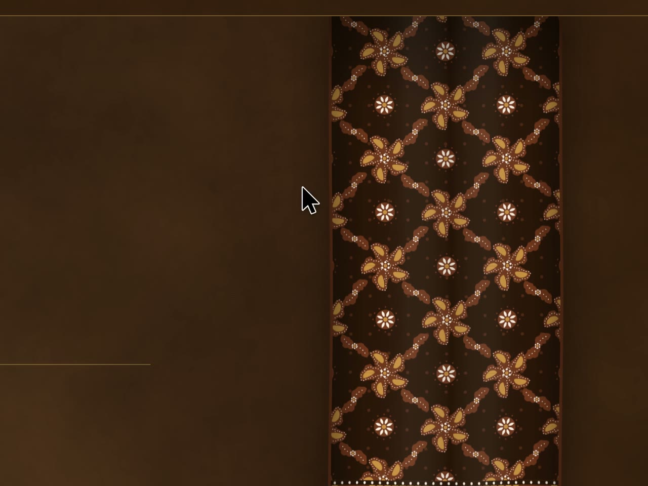
The opening was rebuilt on the last day, after the first cloth read as "so rough, not soft like fabric". It now falls from its rail, hangs in long folds that drift, and parts with a curved edge and deepening pleats. The hanging batik on the inner pages went the same way: sixteen sliding strips became one length of cloth bent by a small WebGL shader, swinging from its rail under the pointer.
One Poster per Page, per Language
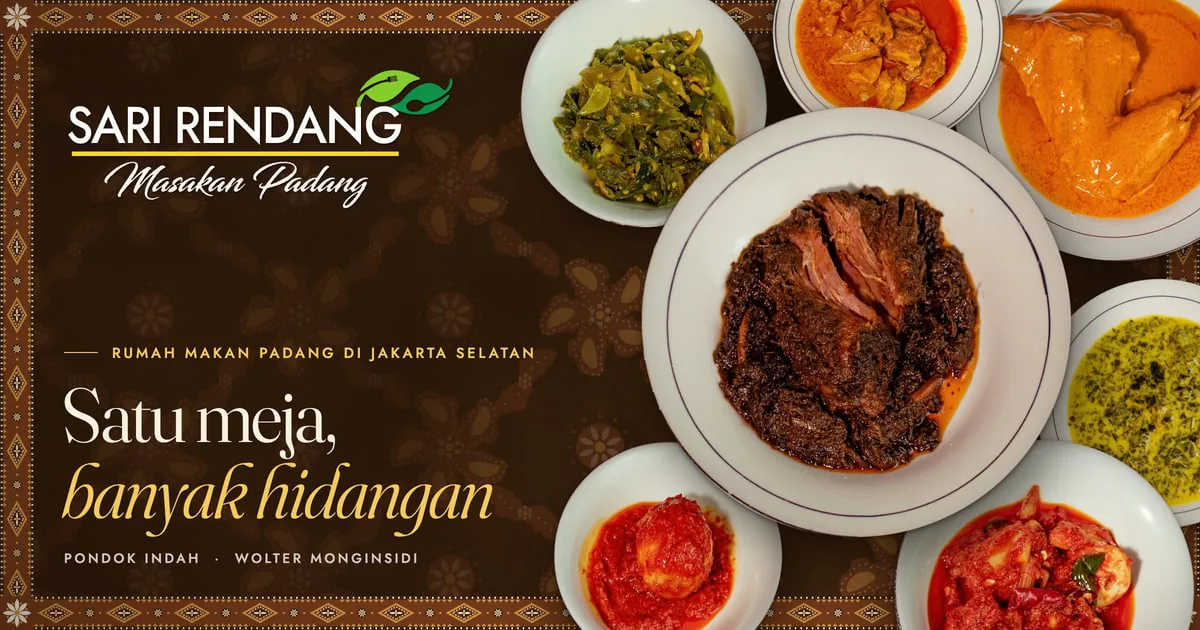
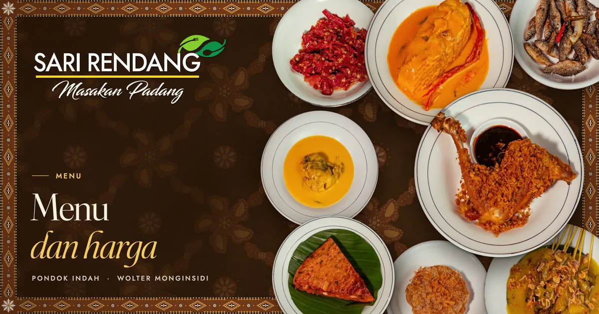
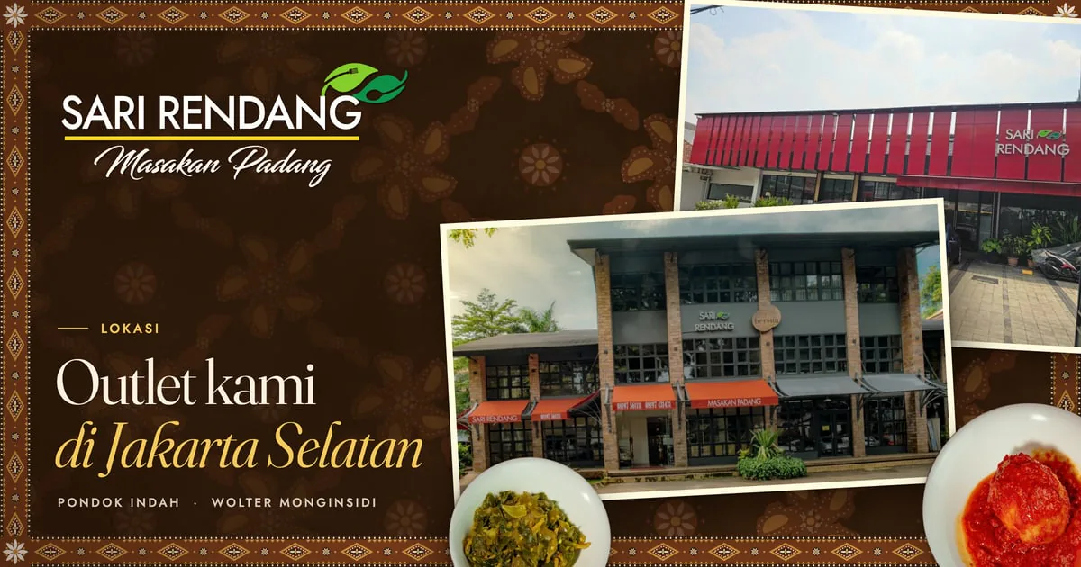
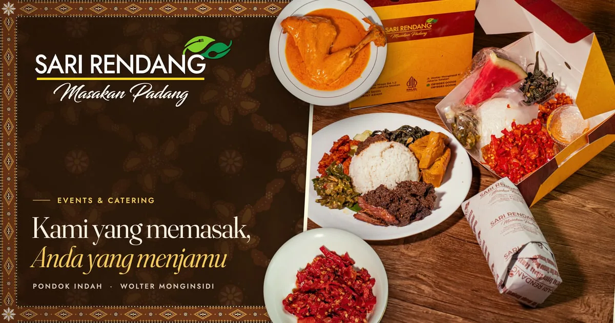
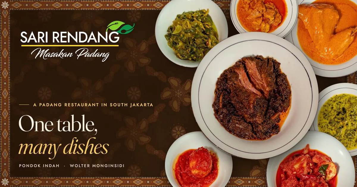
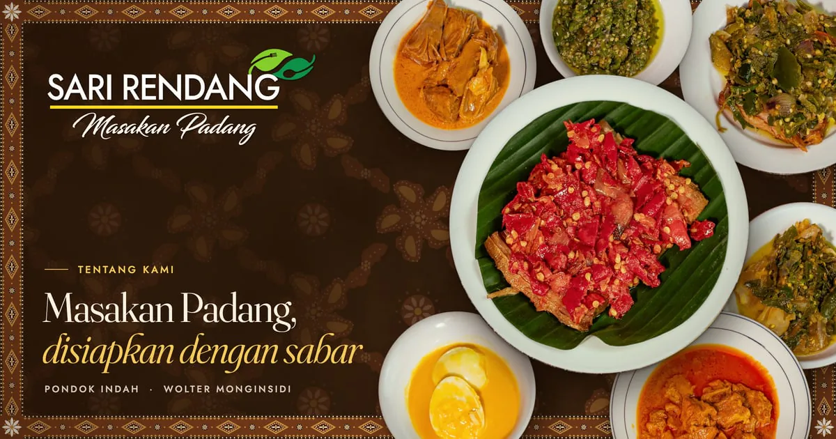
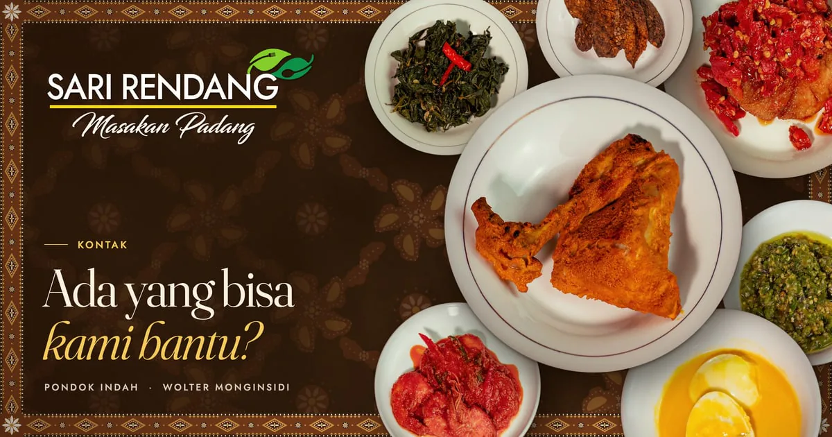
Every page sends its own title and description in its own language, with its canonical address, its hreflang pair and a link preview made for that page. The previews are designed, not captured from the page: a script lays each poster out as its own web page and renders it in Chrome, so it uses the site's own fonts and batik. A build needs none of this and no network.
A shared link is often the first thing a buyer sees, so each page in each language has its own poster: their plates crowded across the batik cloth with its border and corner flowers, their logo, and the page's own title from its blueprint, its second line in gold italics. Lokasi lays the outlet photographs on the cloth like prints. The plates are cut from their photographs, and the script finds each plate's white rim itself, so a new photo needs no measuring.
Outcome
The owner chose Coklat and called the fourth round the last before launch. The site runs at its preview address in that look, on the owner's photographs, and waits for its domain and hosting: it is not live yet. Every check the project runs passes: 173 unit tests, 412 contrast pairs, 2,863 internal links and assets in the production build, no em dash in 435 files, and no placeholder left in the content check. On that build, Lighthouse scores accessibility, best practices and SEO at 100 on all 13 pages, desktop performance at 99 to 100 and mobile performance at 86 to 100, with no layout shift on any page.
What it does not have yet: a launch, the owner's original logo file, a test on a real iPhone, and the owner's check of the closing hours and some dish lines.
In October the site was in preview with the owner, three concepts awaiting a choice. The checks then: 161 unit tests, 412 contrast pairs, every internal link in each build, no em dash in 428 files, and on the production builds Lighthouse at 100 for accessibility, best practices and SEO on all 39 pages, desktop performance at 99 to 100, mobile performance at 84 to 99. The link to BPJPH's certificate check was 23 px tall in two concepts, the one control under 24 px.
Gallery
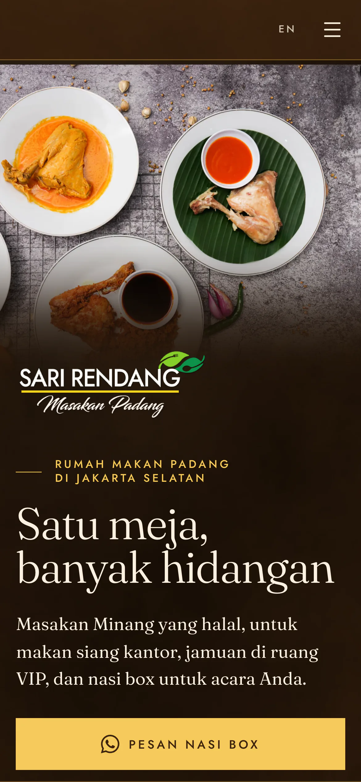
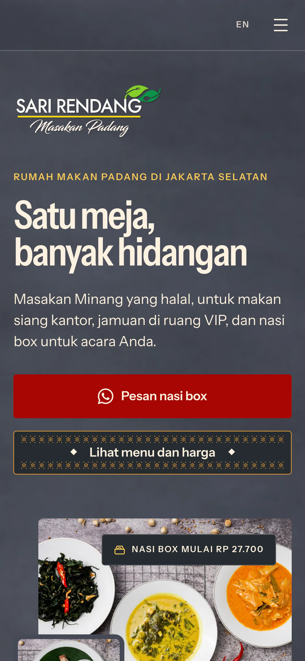
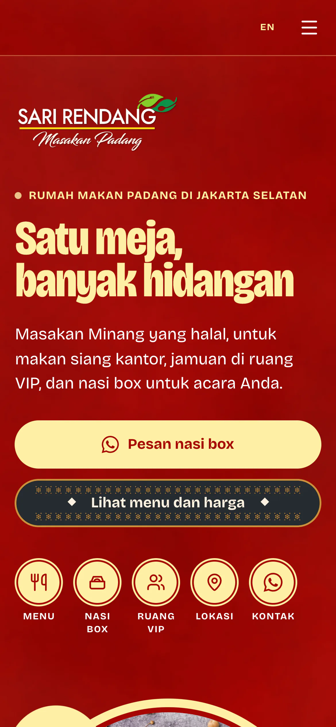
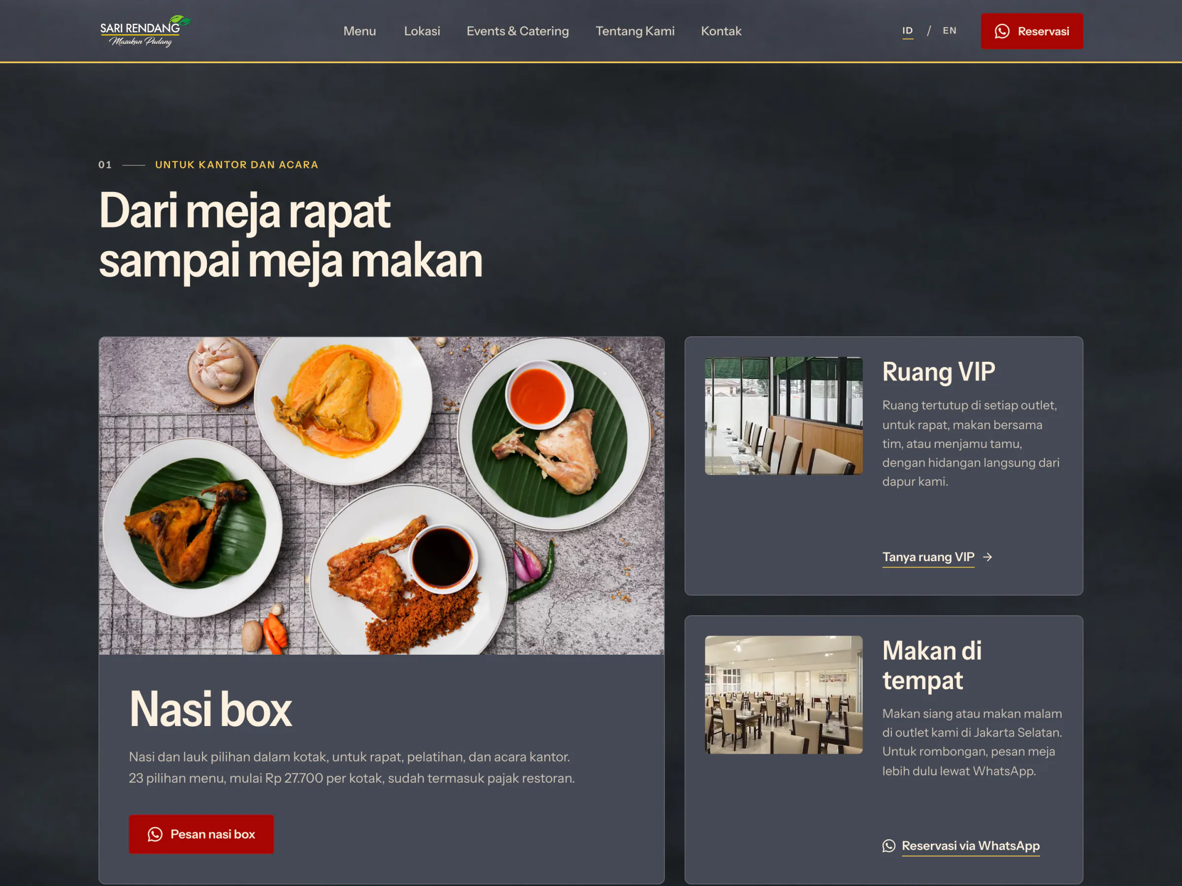
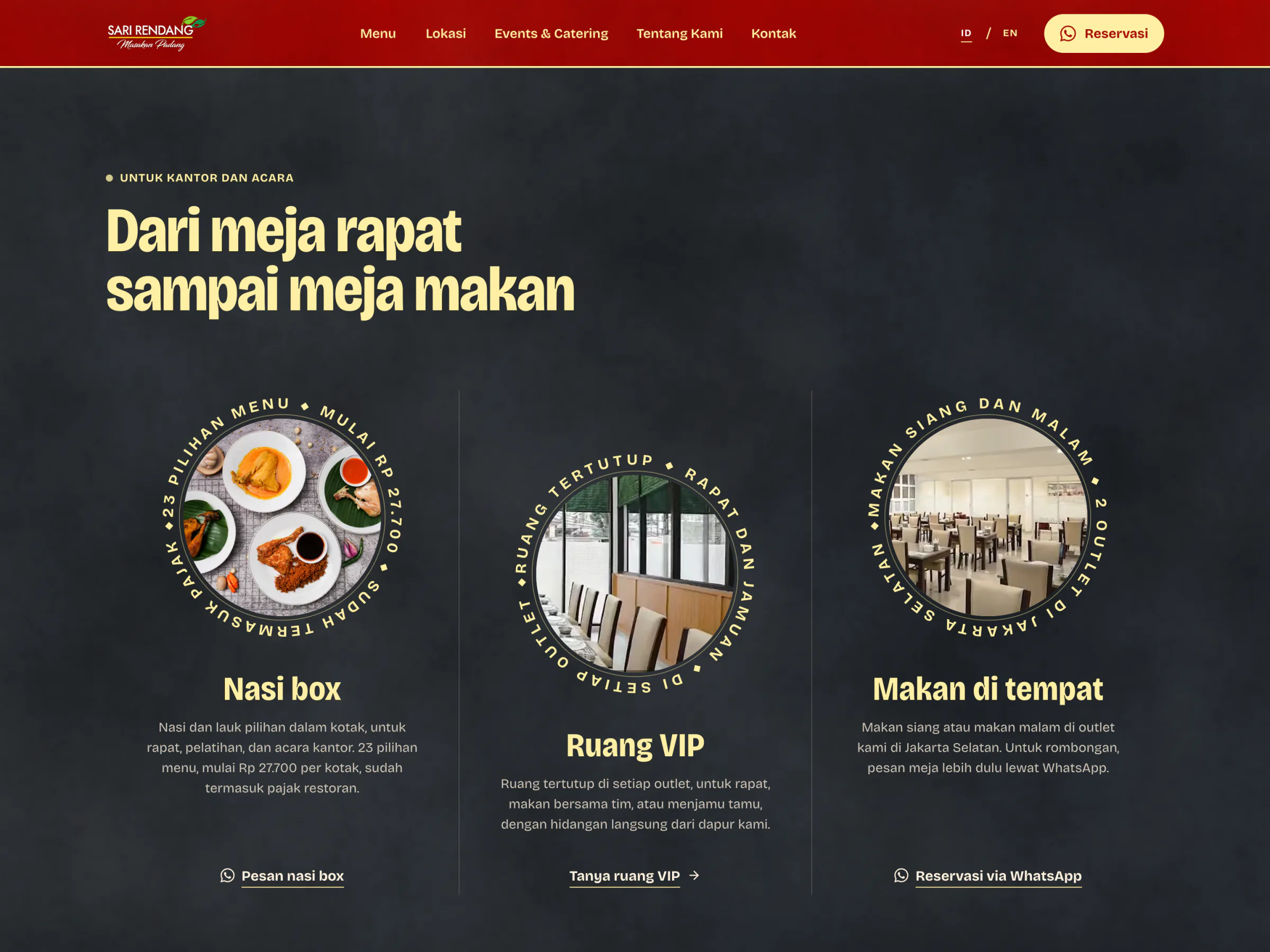
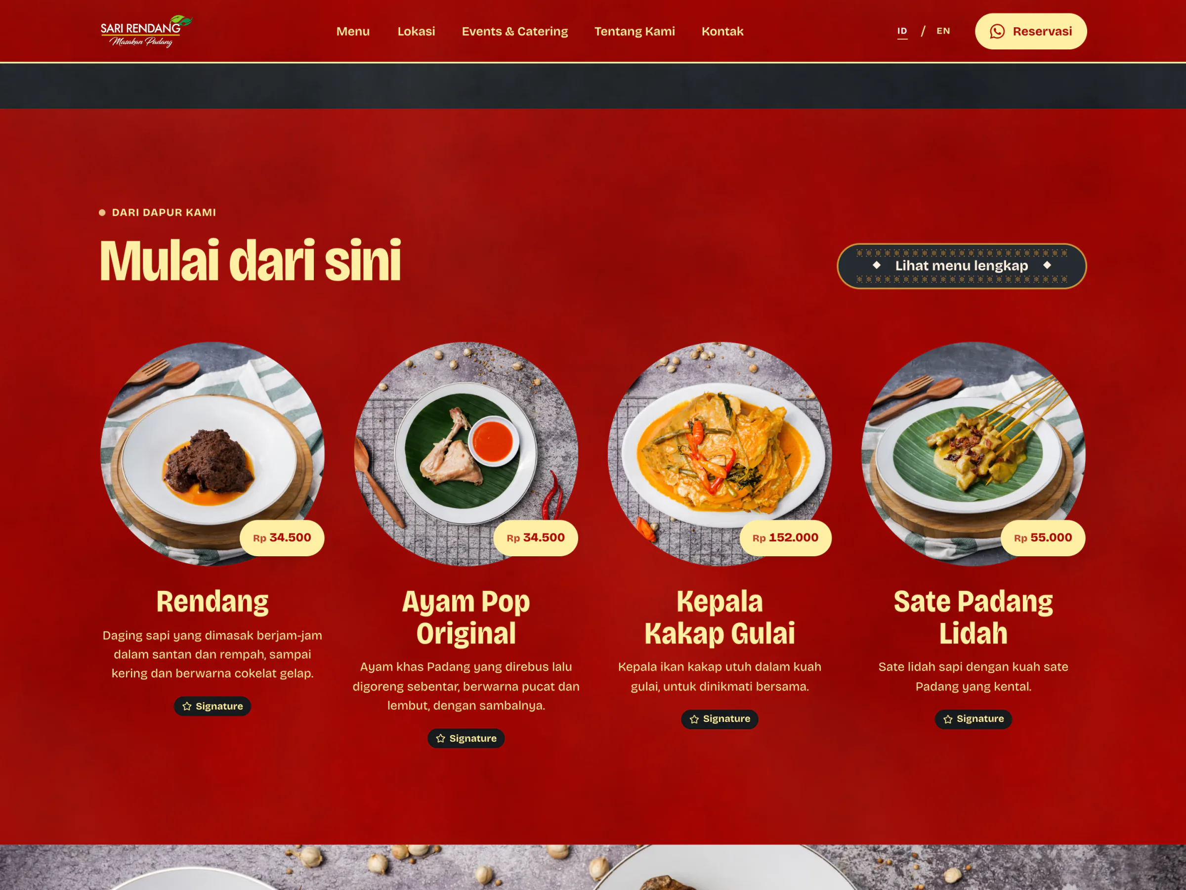
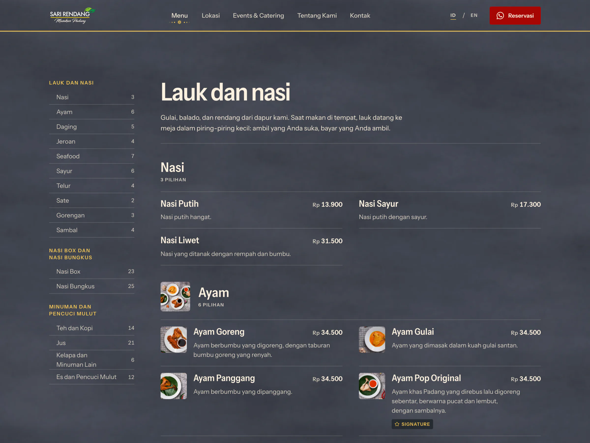
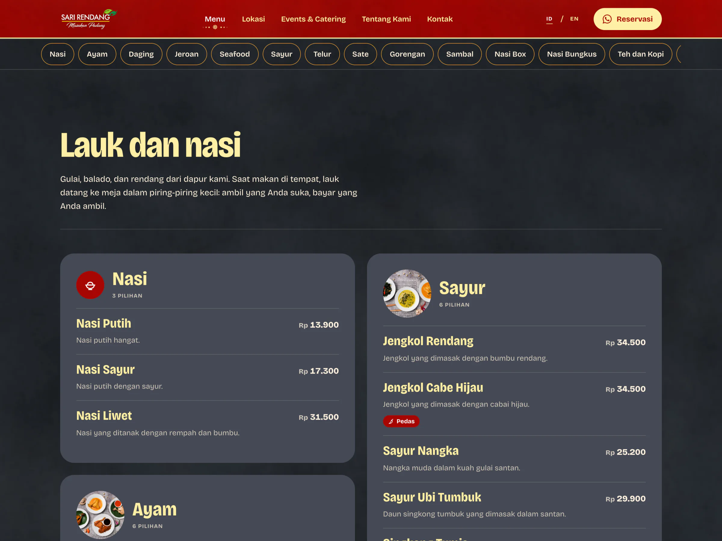
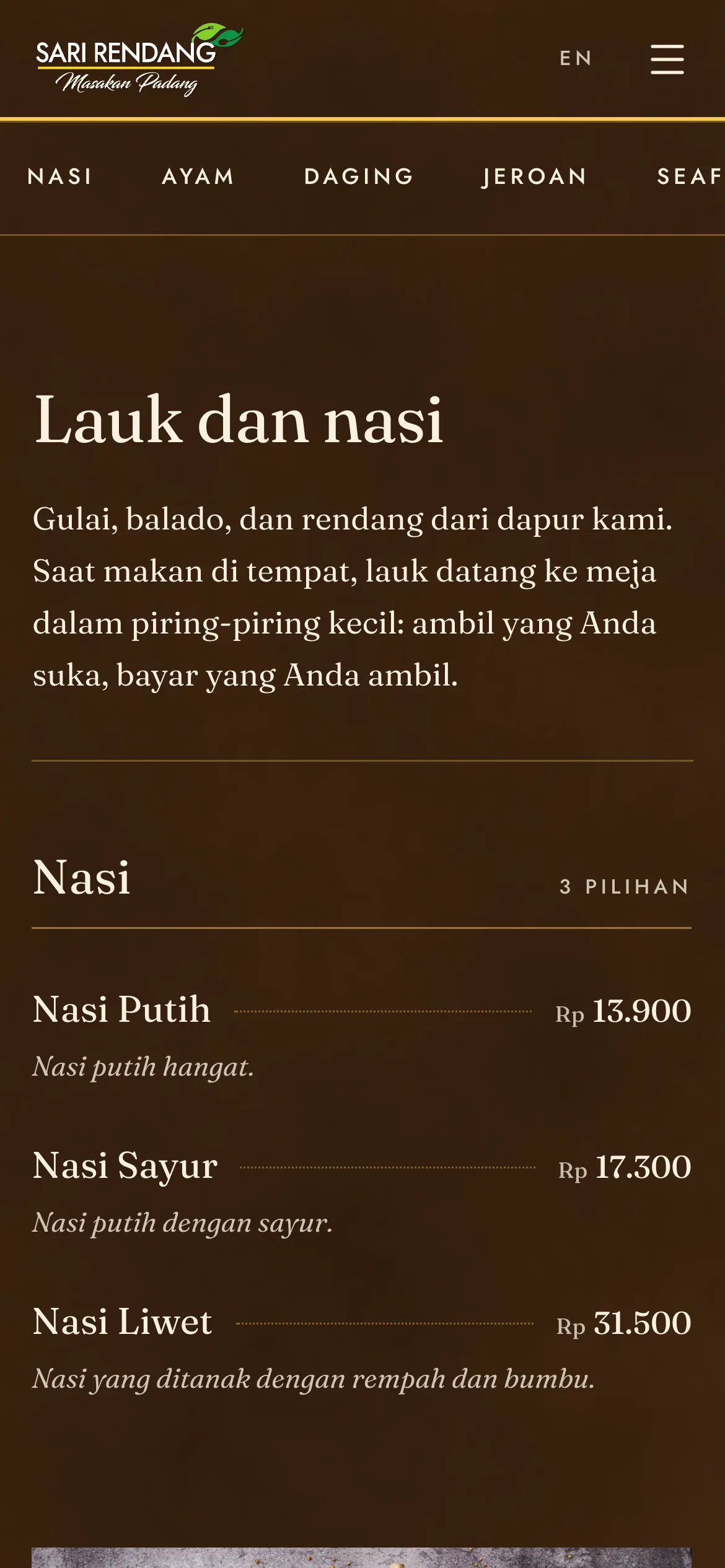
Coklat After the Photoshoot