The website of IntLabs, a business simulation company, with the admin its team writes in and the database behind both.
76 pages, an admin with four roles, ten emails; no serious axe finding on any page.
Project facts
- Role
- Design engineer: designed in Figma, built with Claude Code
- Timeline
- 11 weeks, Aug to Nov 2026
- Built with
- Figma
- Claude Code
- Stack
- React Router 8
- React 19
- Vite 8
- TypeScript
- Base UI
- MDX
- IntLabs design system
- Supabase: Postgres, Auth, Storage, Edge Functions
- Resend
- Vercel
A Site That Sold the Wrong Thing, Then a Team That Had to Run It
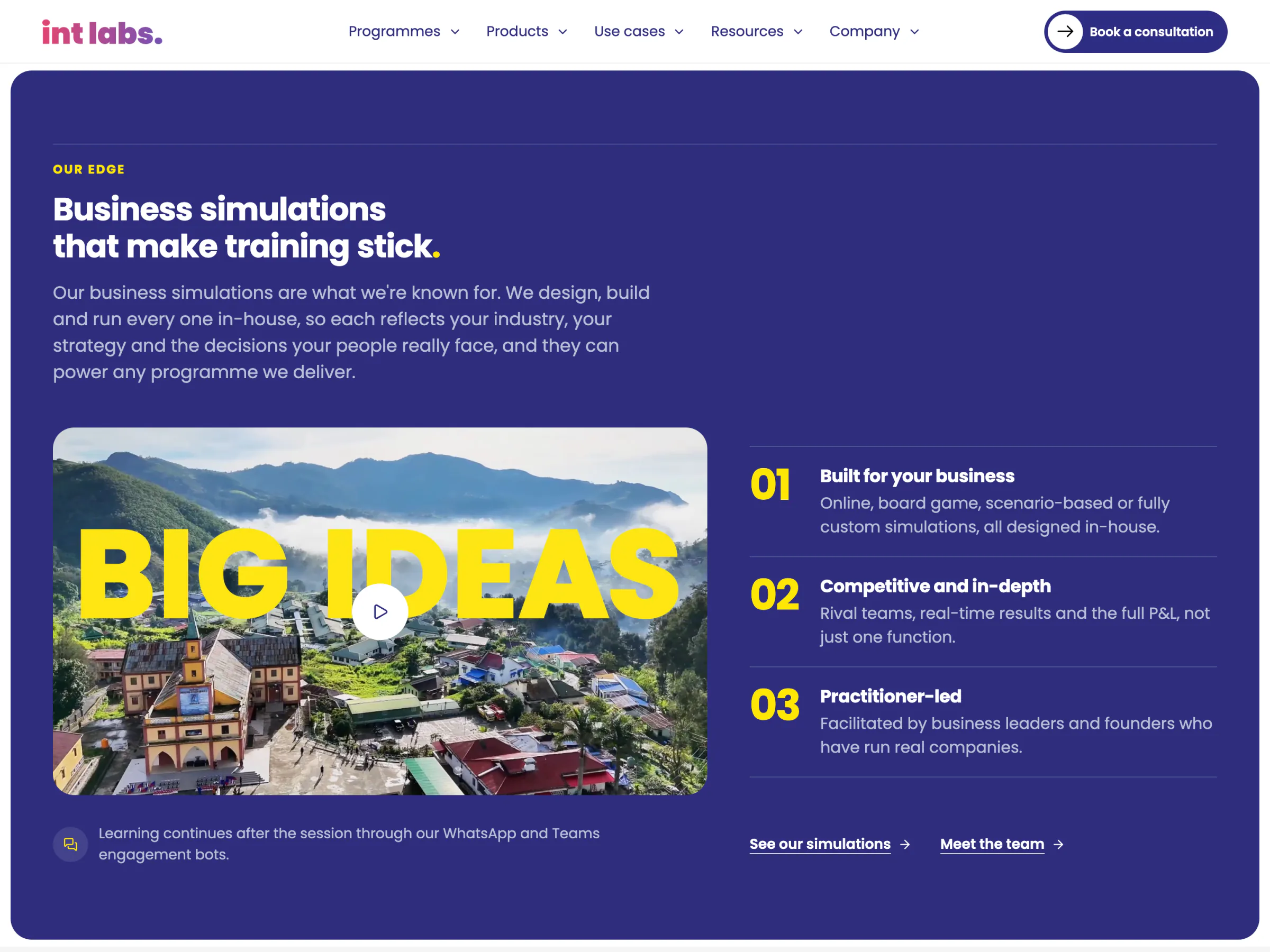
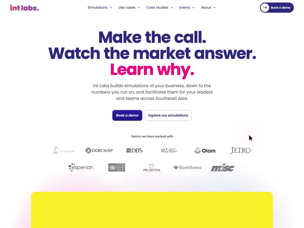
IntLabs designs and facilitates business simulations for leaders and their teams: it builds a working simulation of a client's business, then puts the client's leaders inside it. It mostly sells those programmes. Its old website said innovation consulting.
That mismatch is the entire reason for this rebuild.
The foundation brief, September 2026
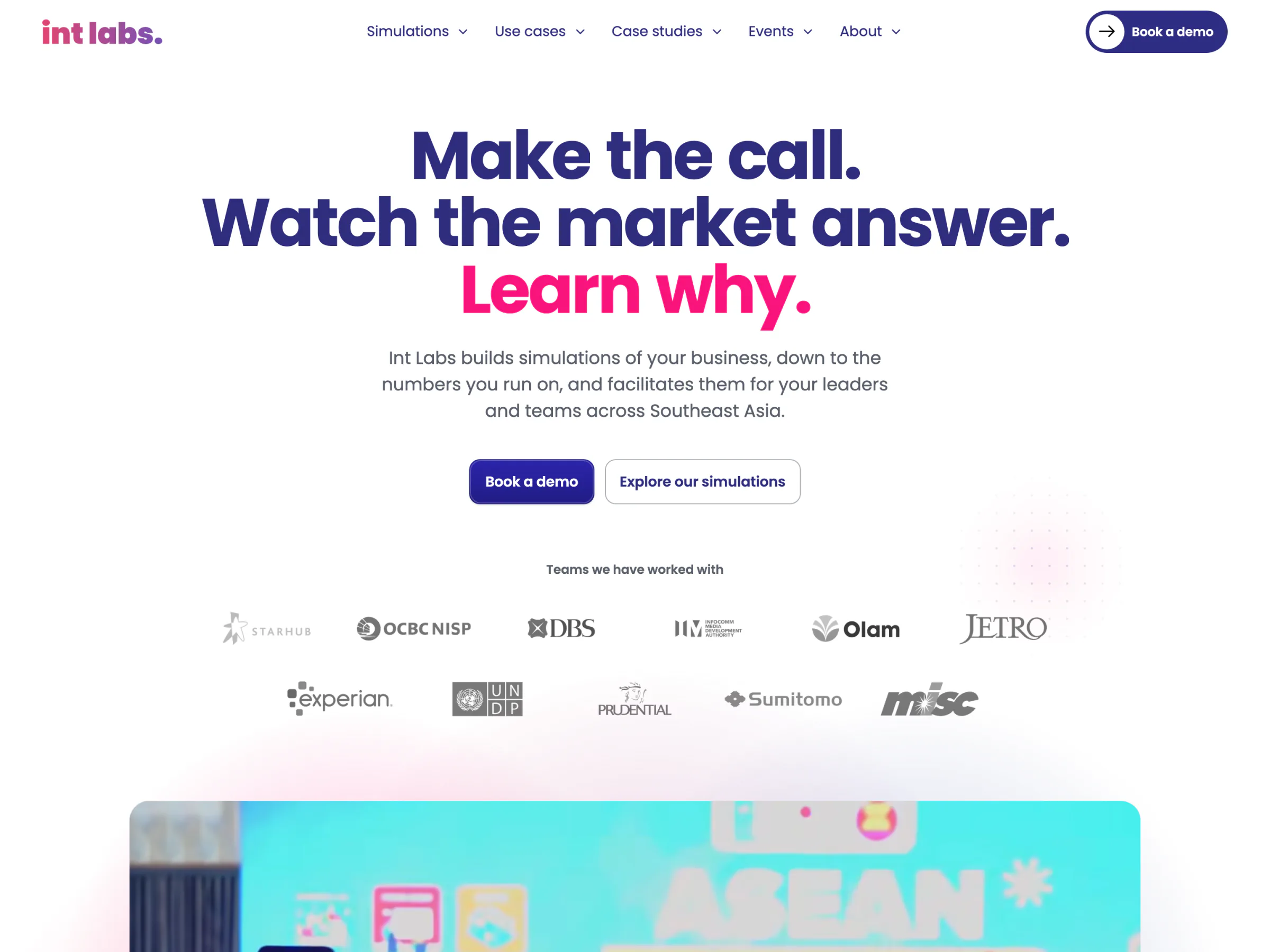
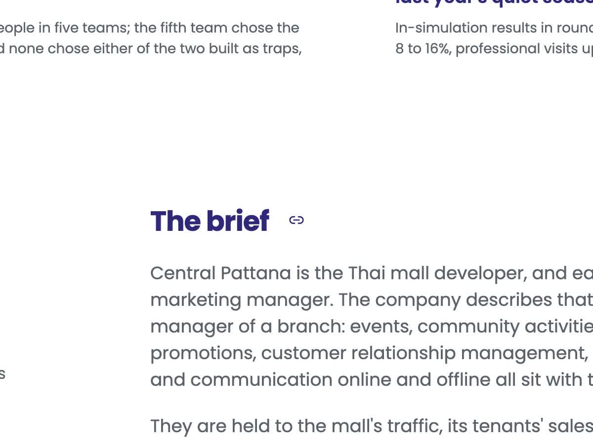
The old site was a shell framing a site built in a design tool, and its proof was invisible. Its sitemap listed 5 of its 18 routes and no case study. All eight case studies shared one title. Navigation ran on div elements with no href, so search engines followed nothing, and the simulation page told them it was the home page. It showed no room: not one photograph of a workshop.
The first version answered that, and was a review draft by 16 October: 57 pre-rendered pages, every call a booked conversation, nothing sent from the site. Then the people who would run it reviewed it, and four asks changed what it had to be.
- One article a day. The marketing team wanted to publish daily without a developer. A site of static files had nowhere to write.
- Every enquiry kept. A call that only opened a calendar lost the people who were not ready to book. They needed a form, an inbox for the team and a reply.
- Calmer. The founder found the motion too much to scale across phones and screens, and the first build of v1.1 then looked "plain and boring" in its own design review. The site needed to be both richer and quieter.
- No client named without permission. On 30 October a colleague asked for the case studies to be shorter and anonymous, since "potential leads don't want their name shown". Fifteen case studies had to change shape and lose every name, and the build had to make sure they stayed that way.
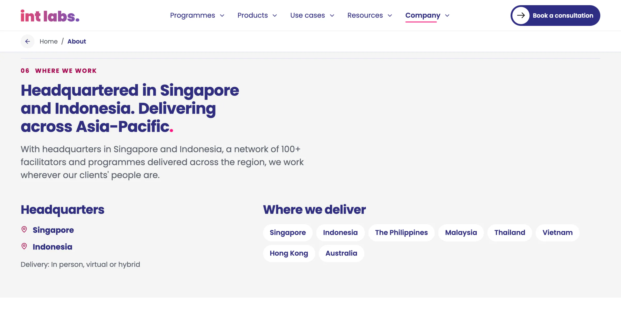
The people the site is written for are Heads of Learning and Development, Talent or Learning at banks, insurers, telcos, platforms and logistics groups across Singapore, Indonesia, Malaysia, Thailand and the Philippines. They rarely buy alone, so every page is written to be forwarded inside their organisation. The people the admin is written for are not developers: every screen says what happened and what to do next in plain words.
A Simulation Company That Behaves Like One
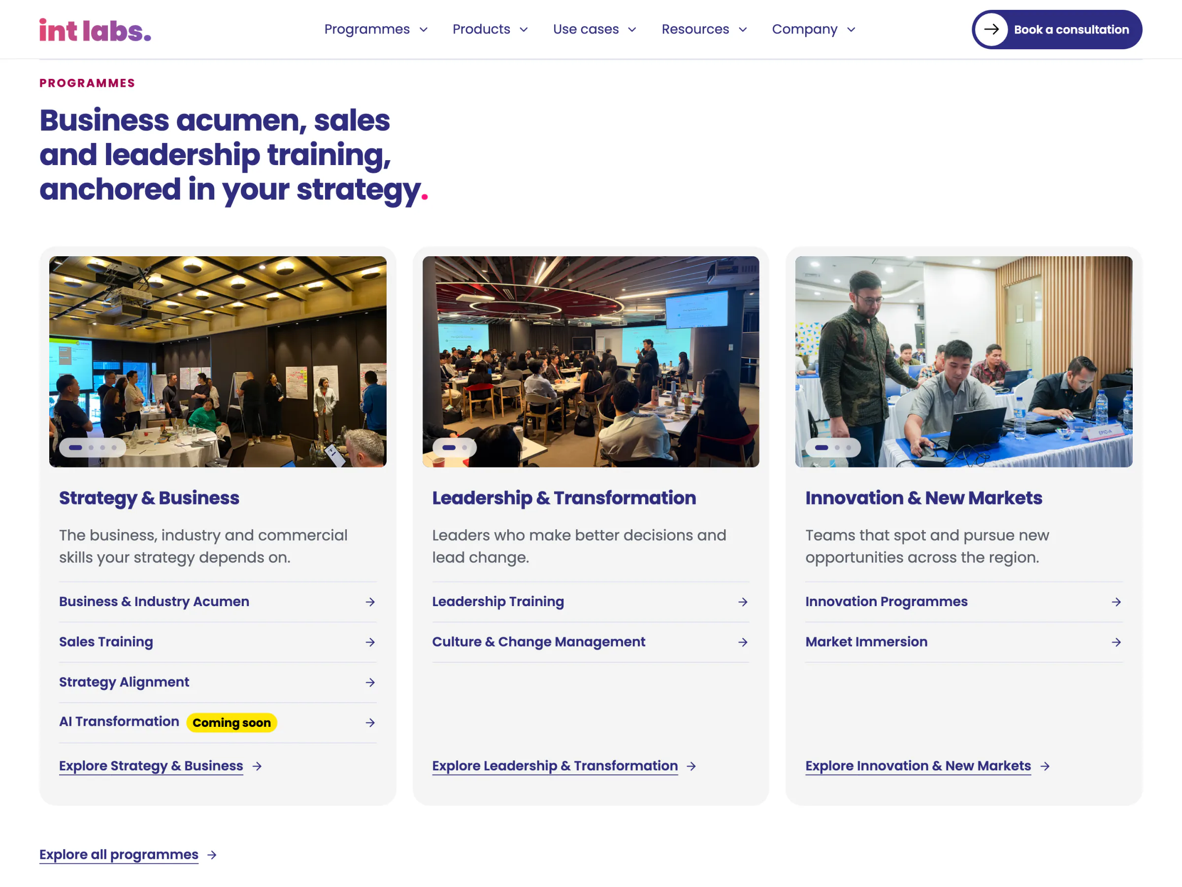
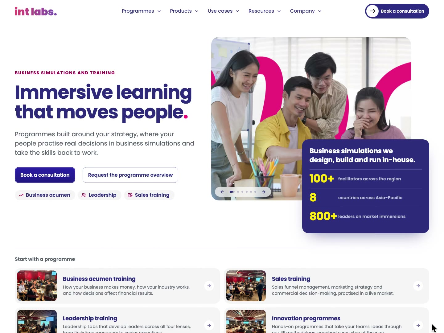
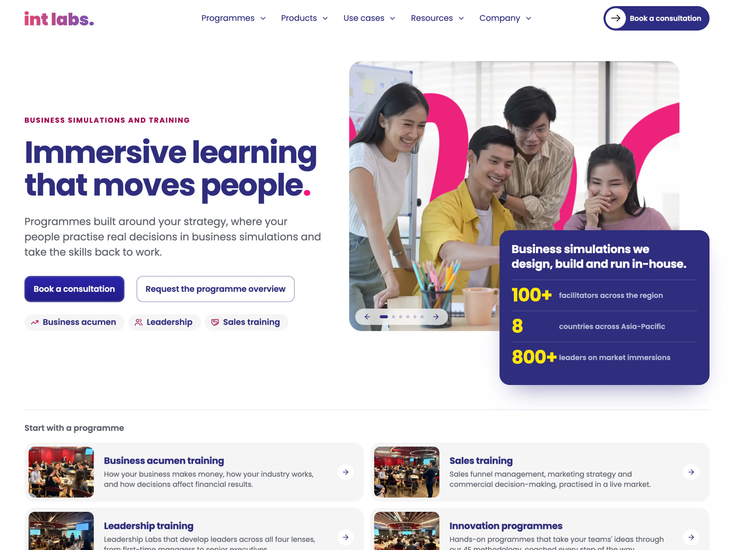
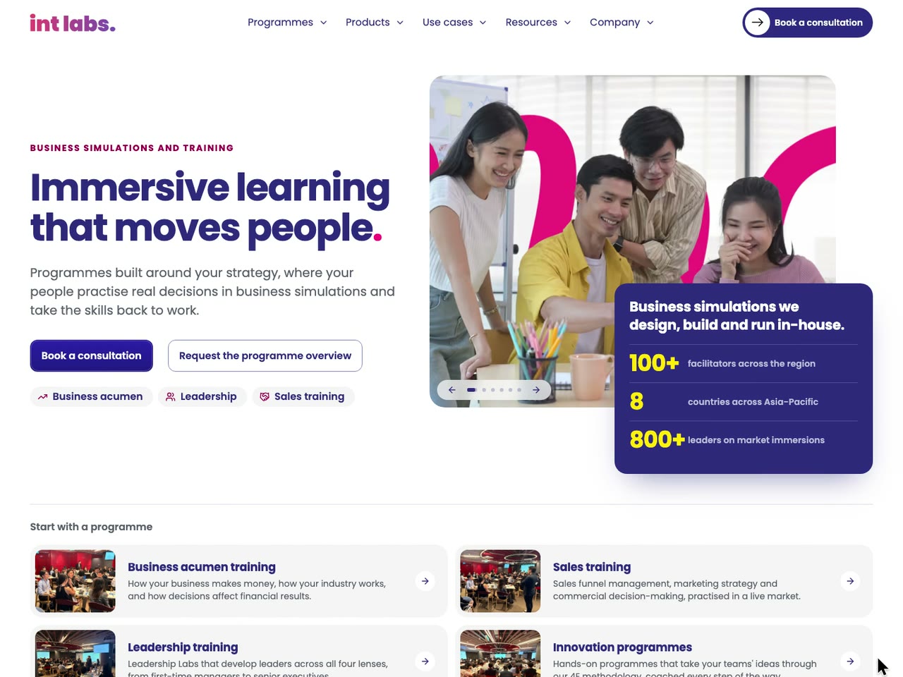
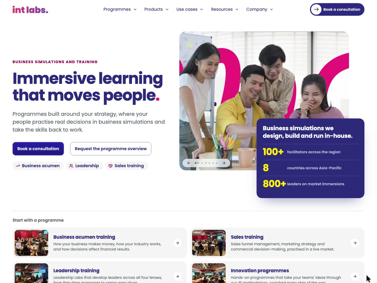
The reader's side, page by page. The site is 76 pre-rendered pages in five sections, each with a page of its own: Programmes, Products, Use cases, Resources and Company.
- The first visit opens with the brand. The wordmark's letters spring up on a navy disc, the dot of the i and the pink full stop drop in and bounce, and the disc closes into the full stop: about 1.6 seconds, once a tab, only on the home page, never under reduced motion.
- The bar previews each section. A pointer resting on a link for 90 ms opens its section's preview; the arrow beside it opens its pages. On a phone, where nothing rests on a link, each section opens its pages inside the menu, its overview first.
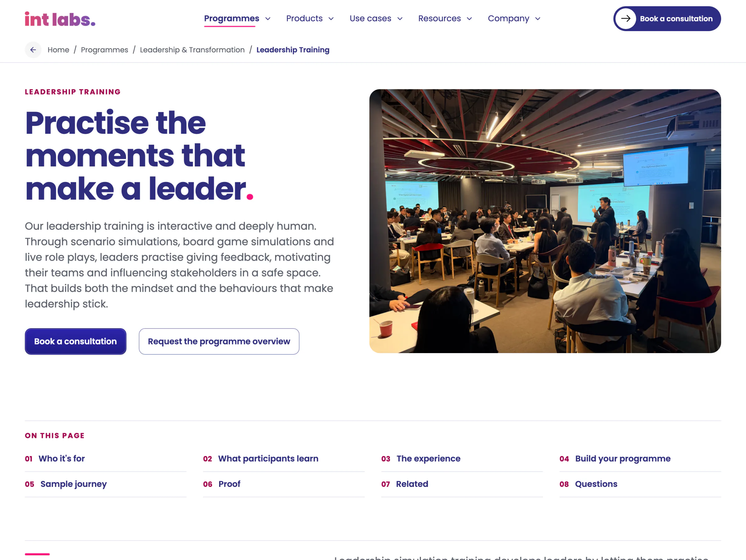
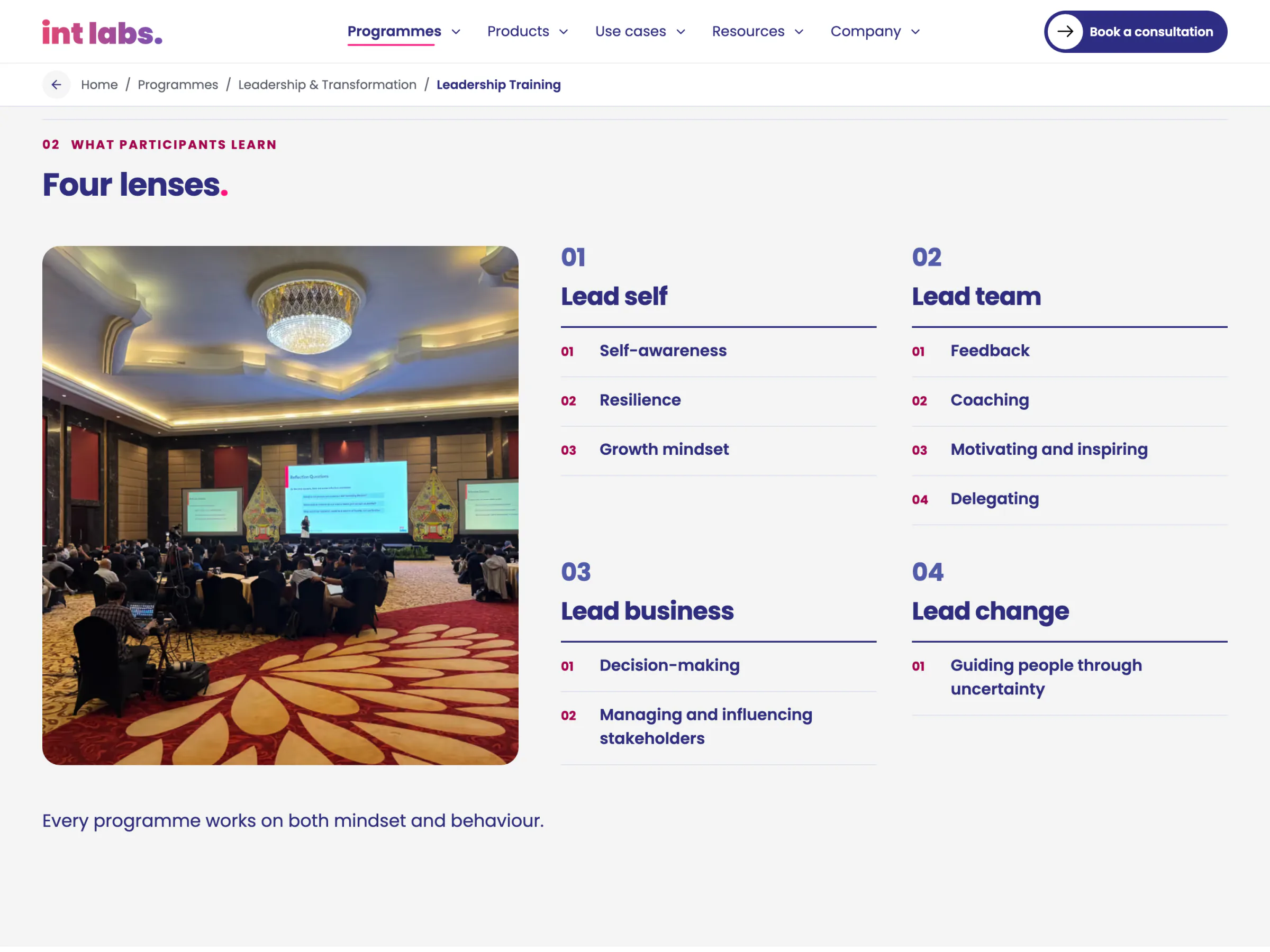
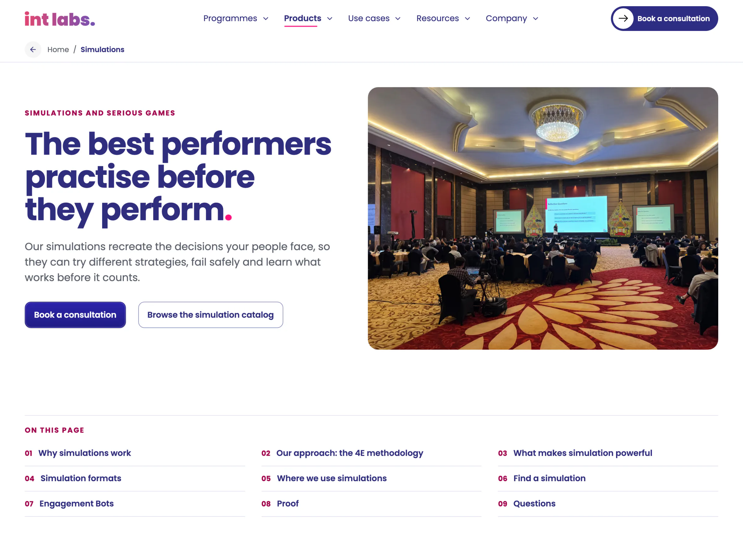
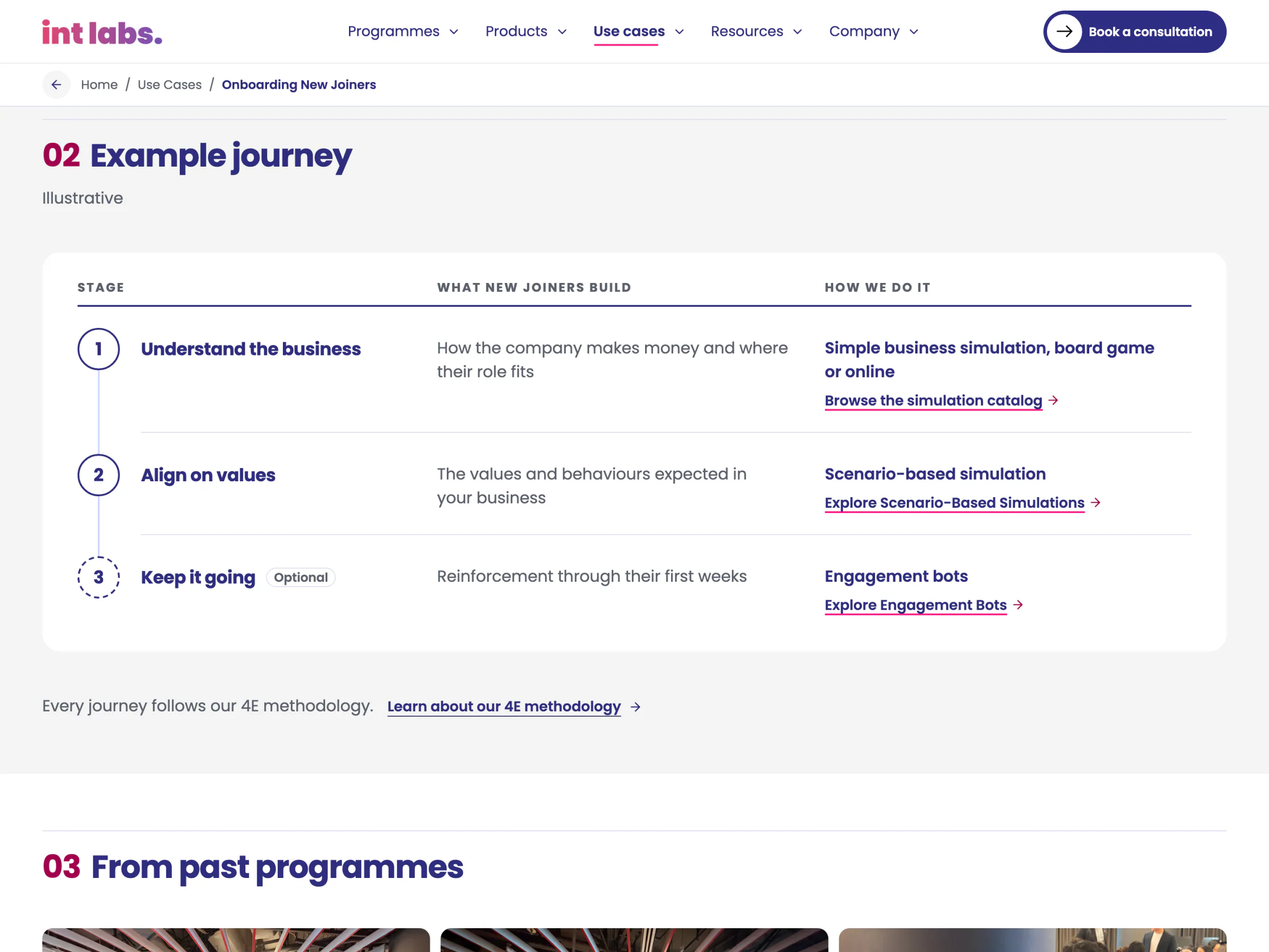
- Every page reads in steps. A long page opens on "On this page", each part numbered under a hairline label, at most two parts beside a photograph from a real room, taking turns left and right.
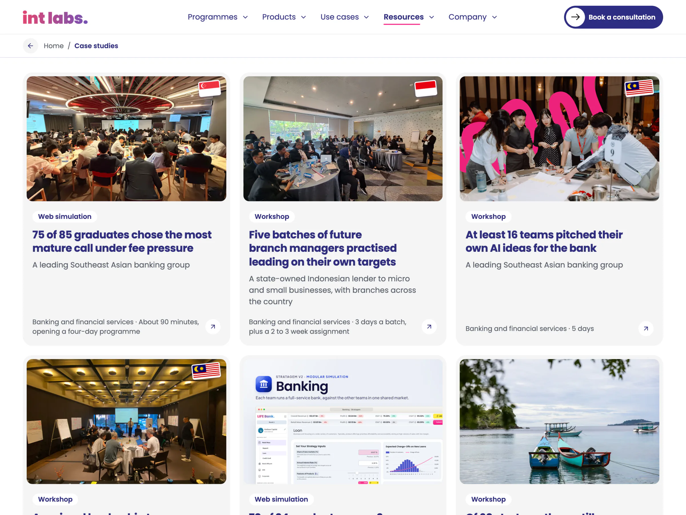
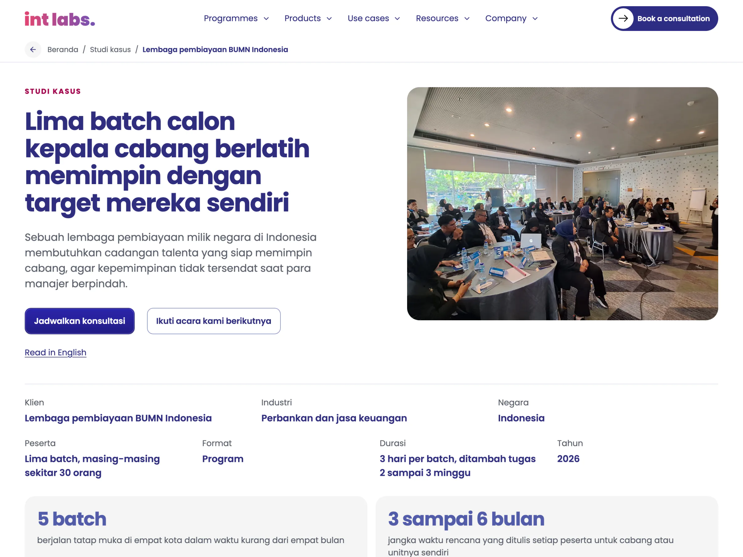
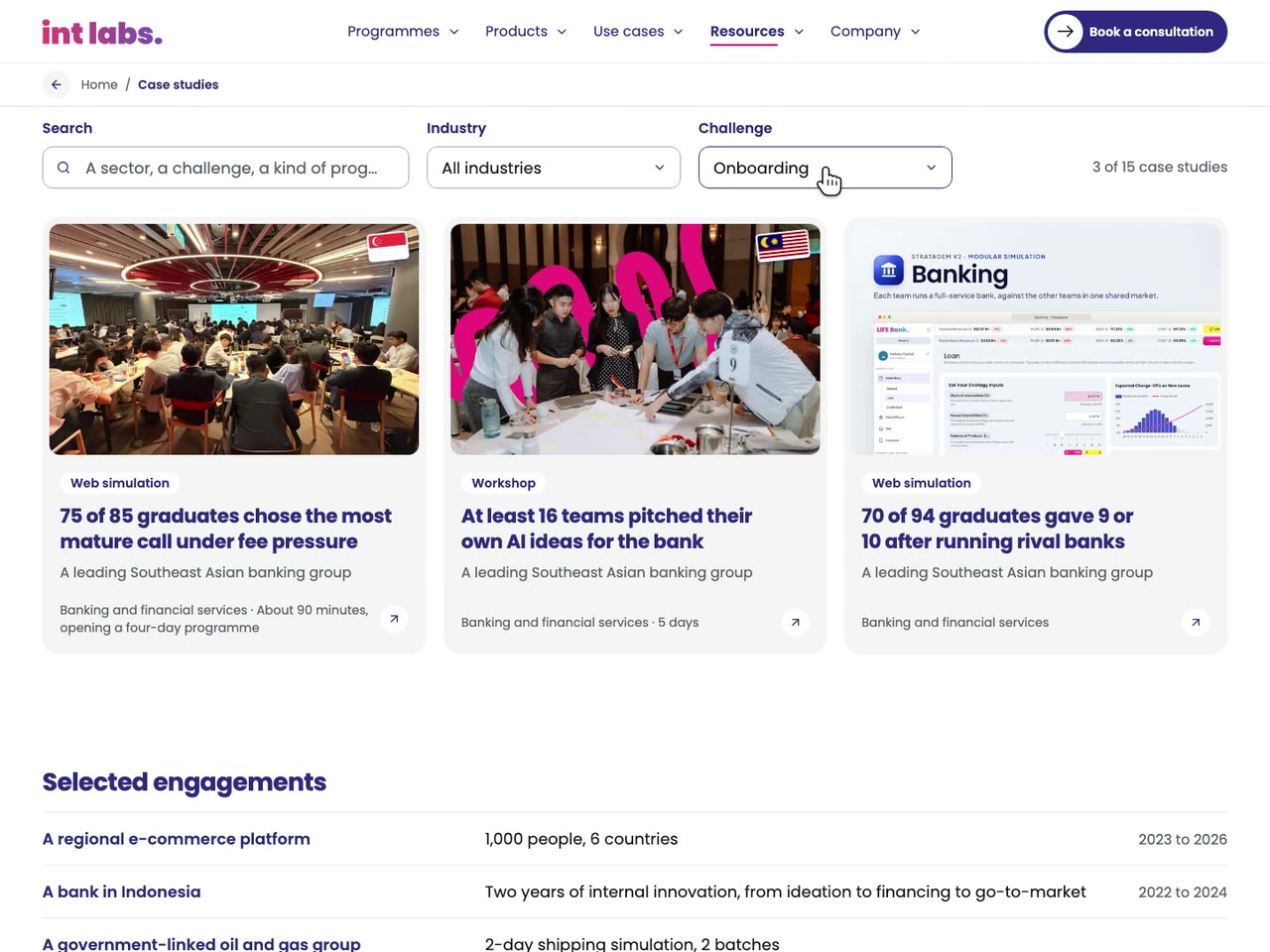
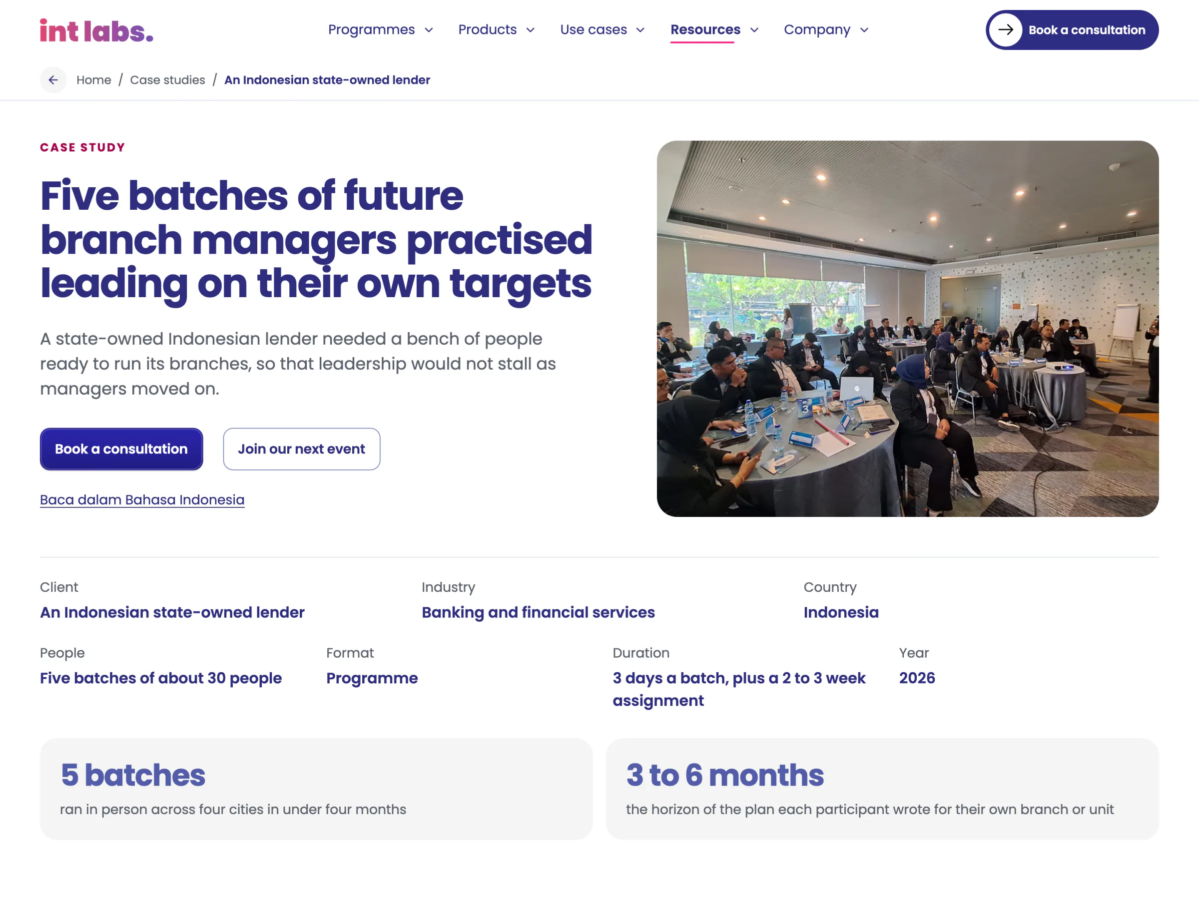
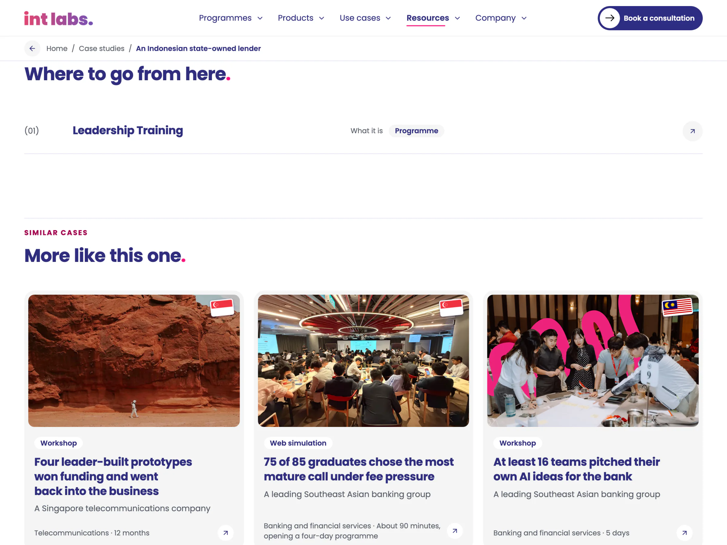
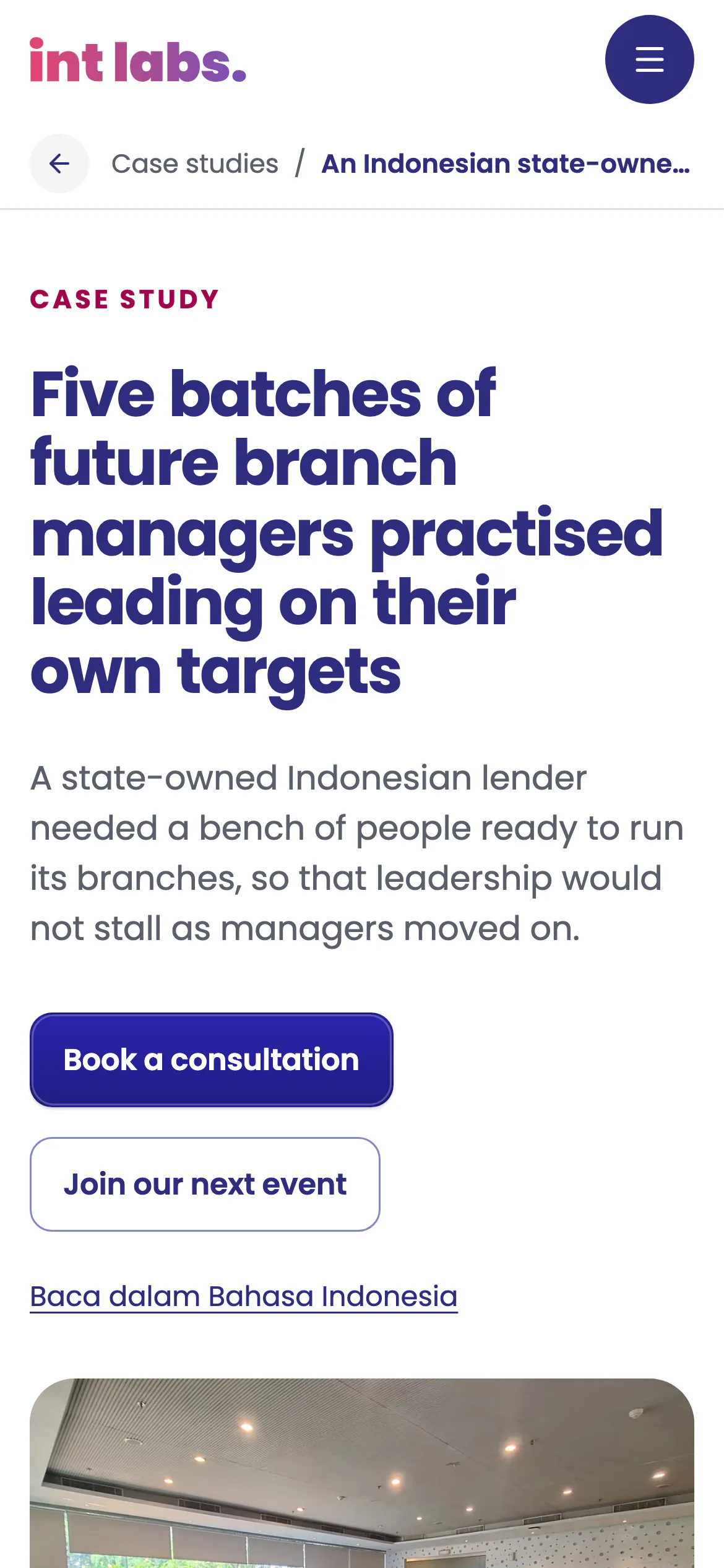
- The proof is real and anonymous. Fifteen case studies in nine sections each, filtered by industry and by the buyer's own problem, two of them in Bahasa Indonesia, none naming a client.
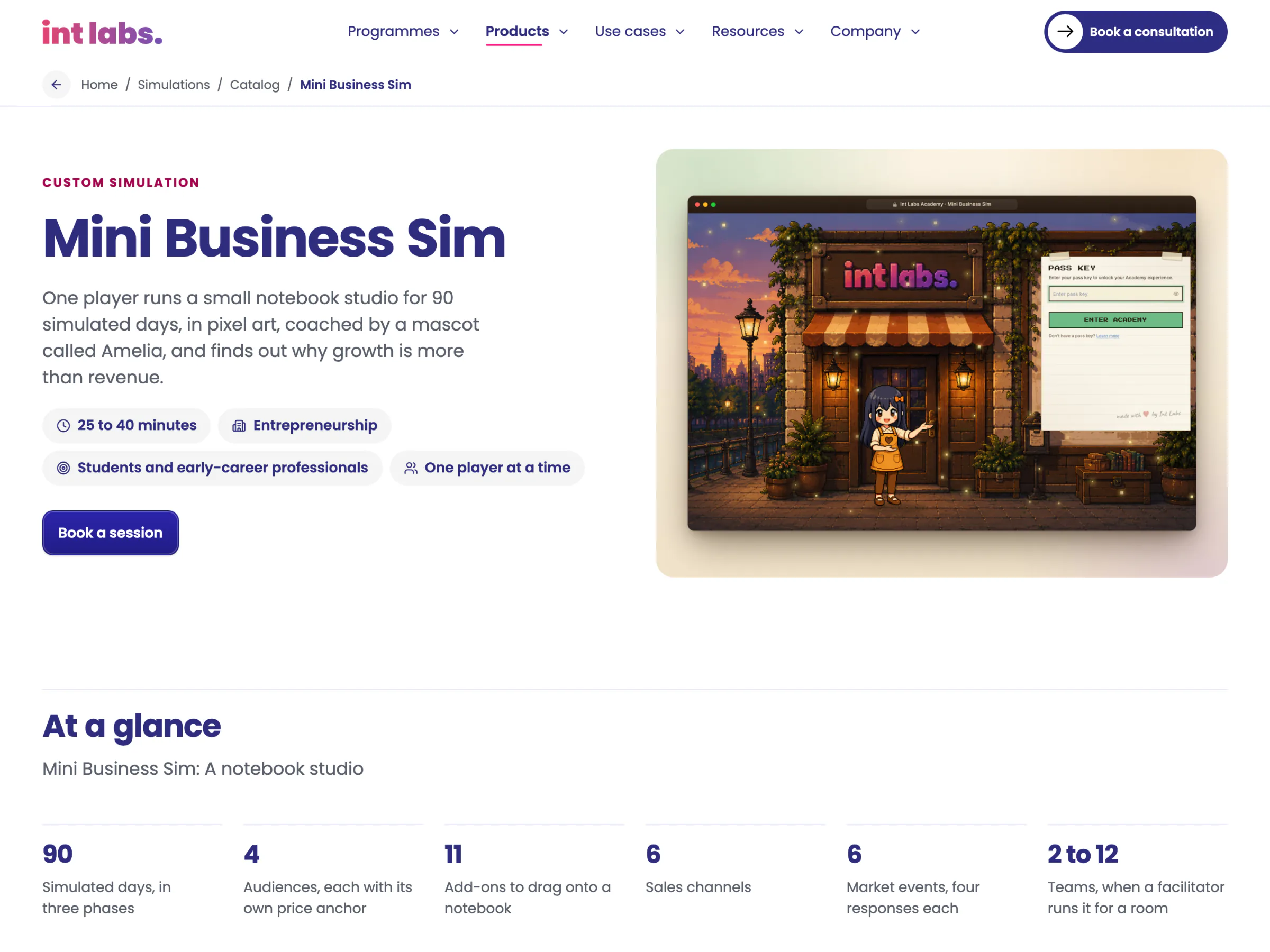
- Every call names what it asks for. "Book a consultation", "Request a demo", "Request the programme overview" and "Book a session" each open the contact form with that enquiry chosen, so each counts as its own conversion; the calendar is beside it.
Every Section Has a Page, on Any Screen
Five links and a call. Each link is a plain link to its section's own page, which reaches every page its panel lists, so nothing is only in a menu. A preview opens after a 90 ms rest and closes 220 ms after the pointer leaves; it is written into the page only once a pointer first comes onto the bar, so the script every page loads does not carry it. Between 900 and 1,100 px the bar keeps its menu button instead of crowding.
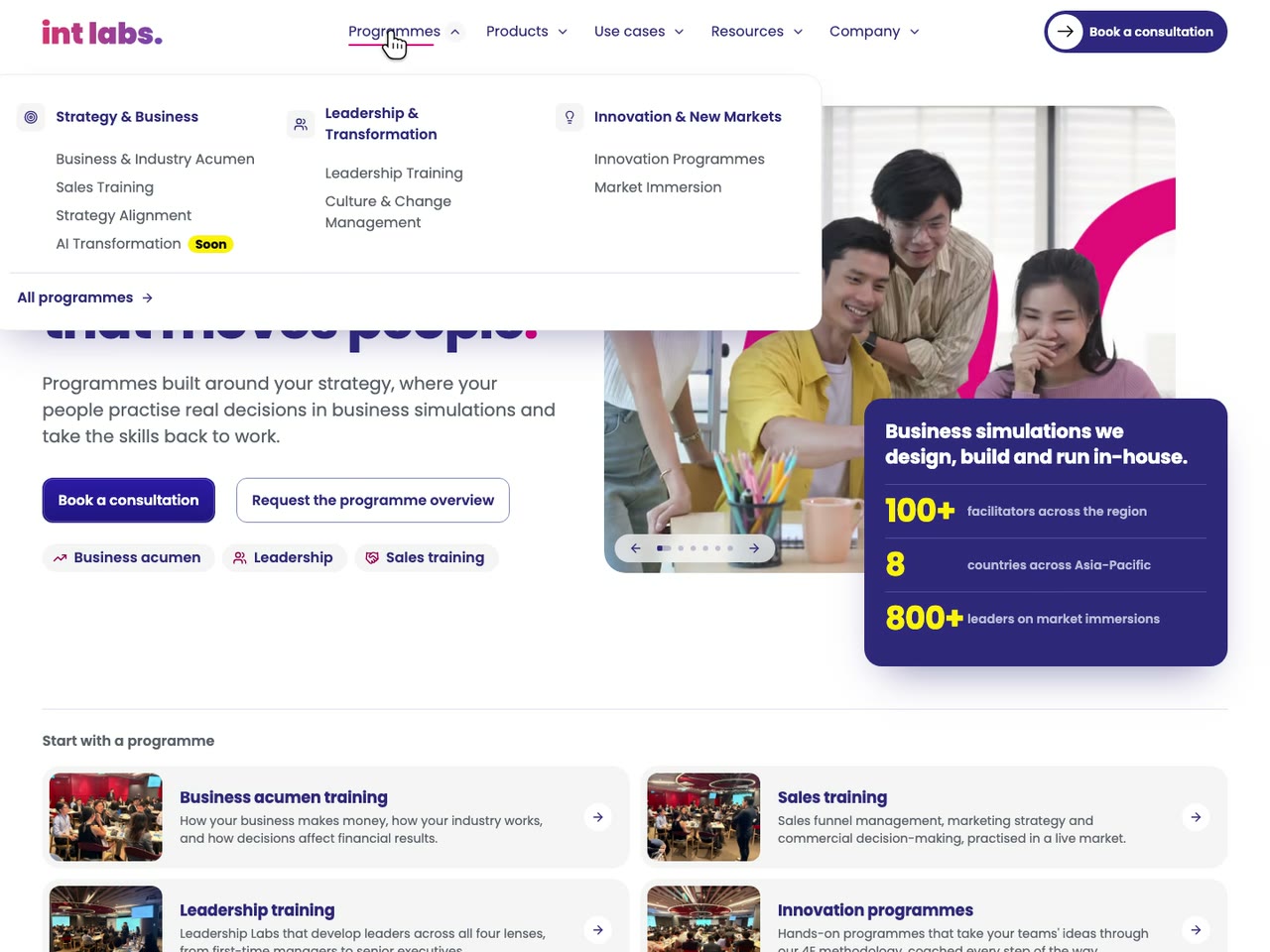
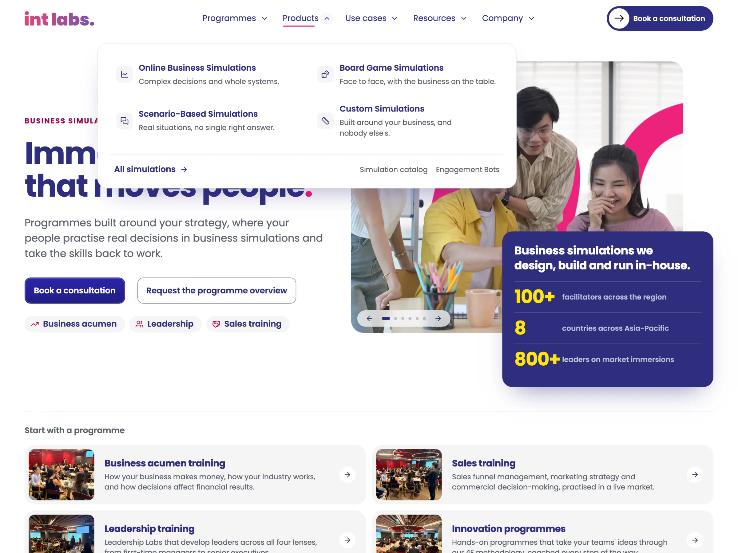
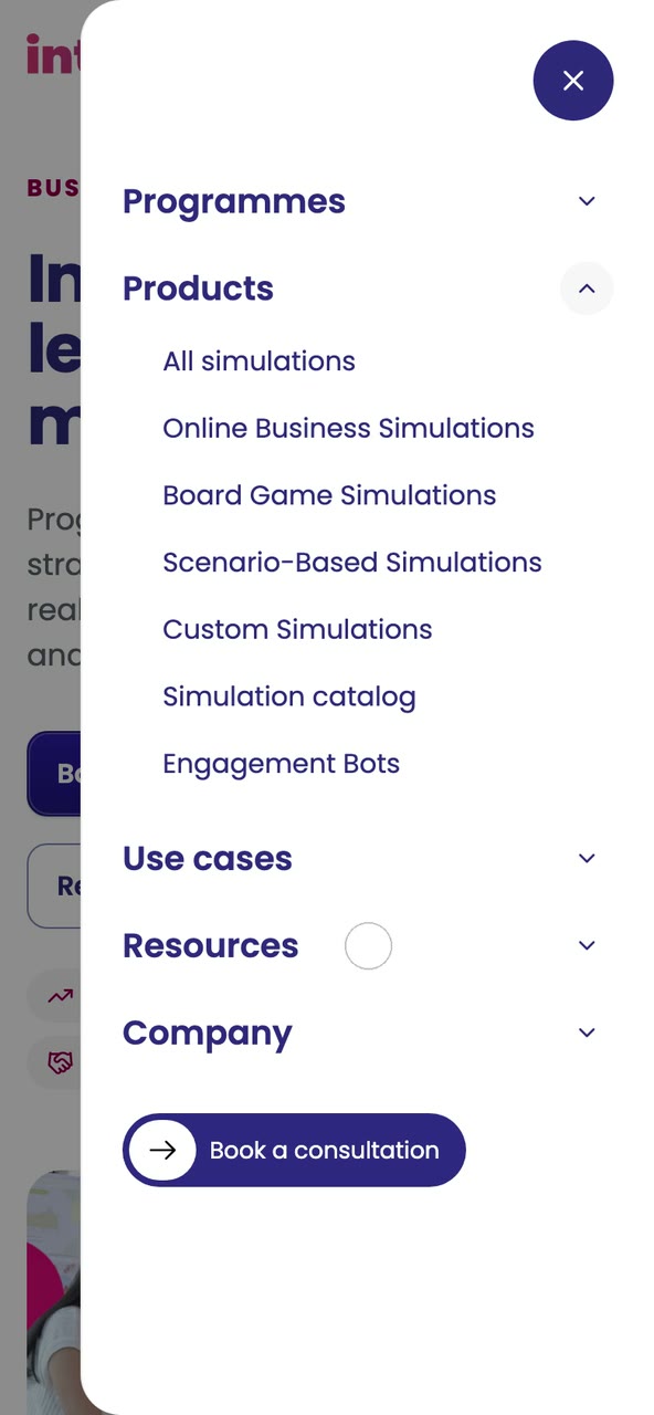
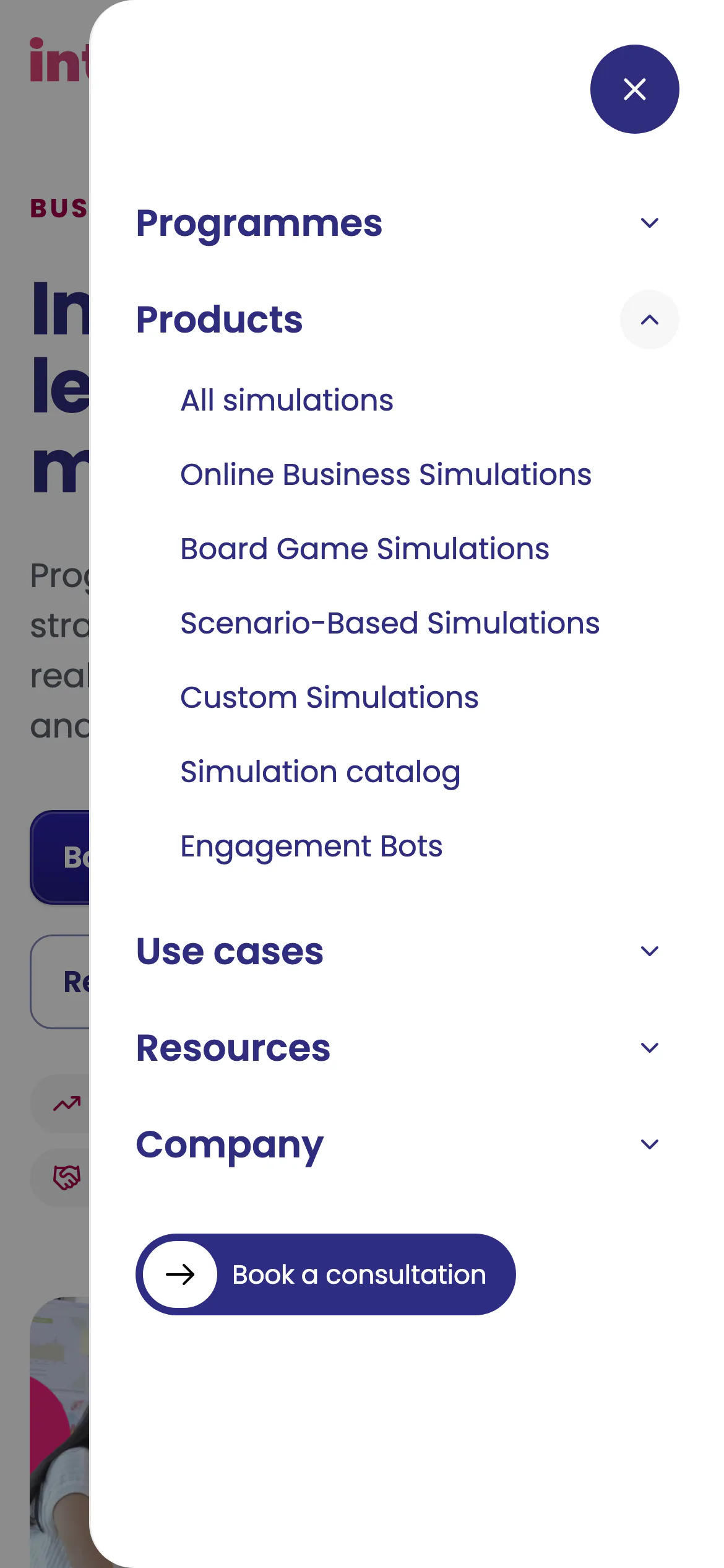
Programmes, Products, Use Cases | The Pages That Sell
Most of the site's pages are data: the founder's site map and copy, written as page objects and drawn by one renderer, so a page's length follows its template and nothing more. Where the copy left a gap (a result not yet confirmed), the page leaves the sentence out and lists it as pending, rather than showing a placeholder.
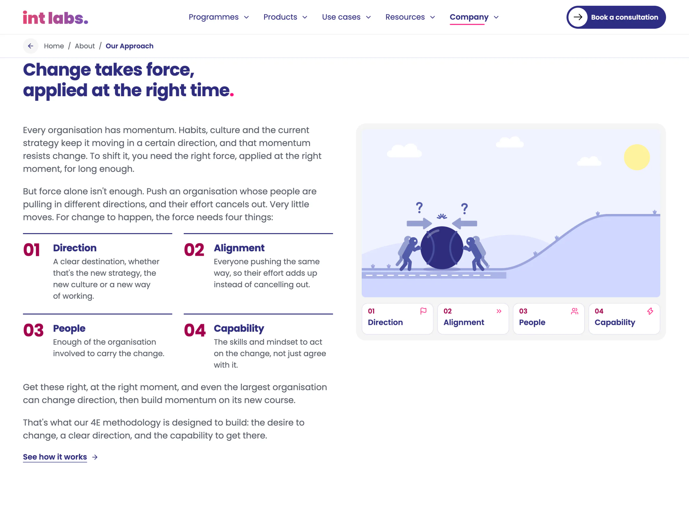
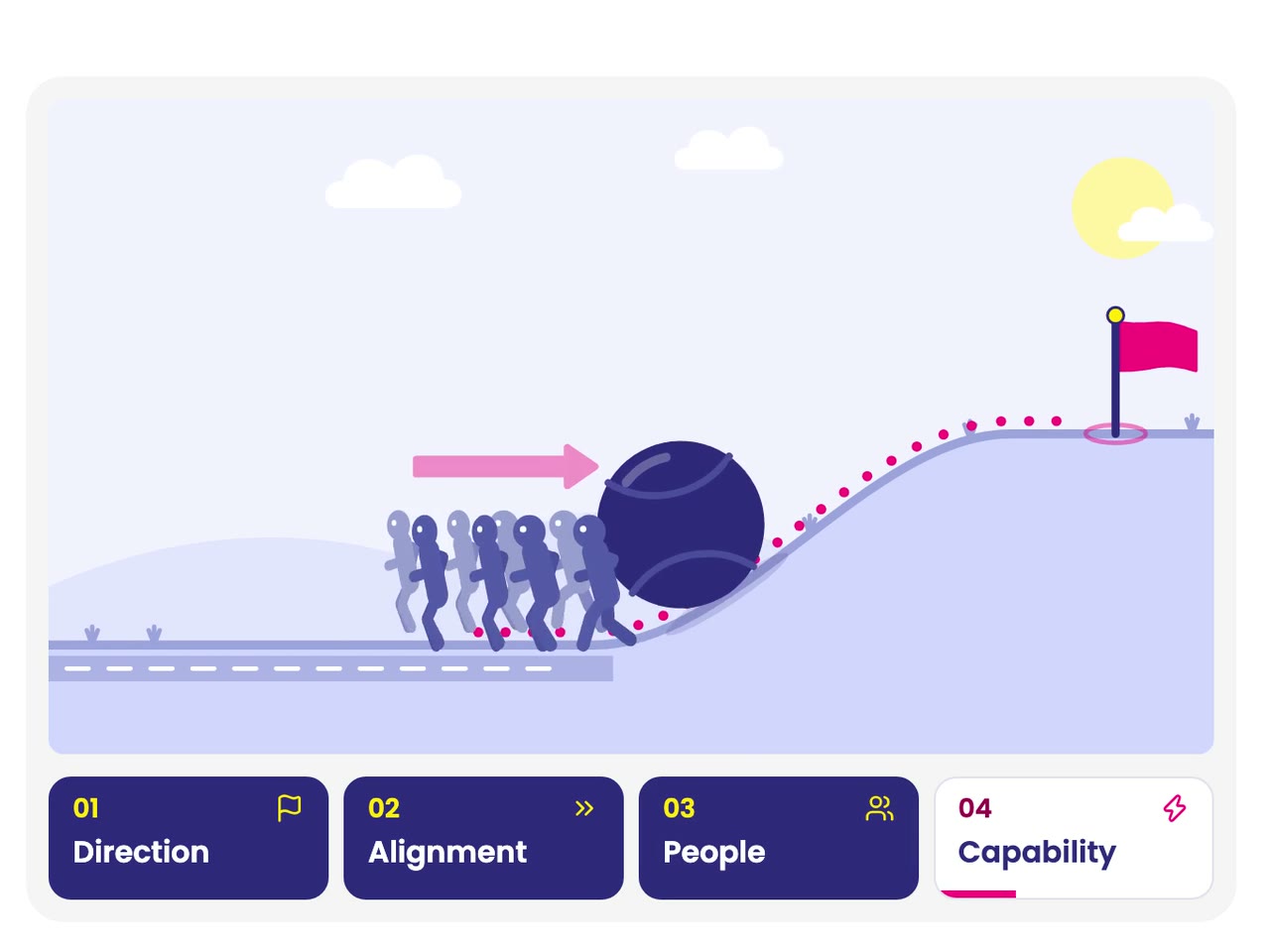
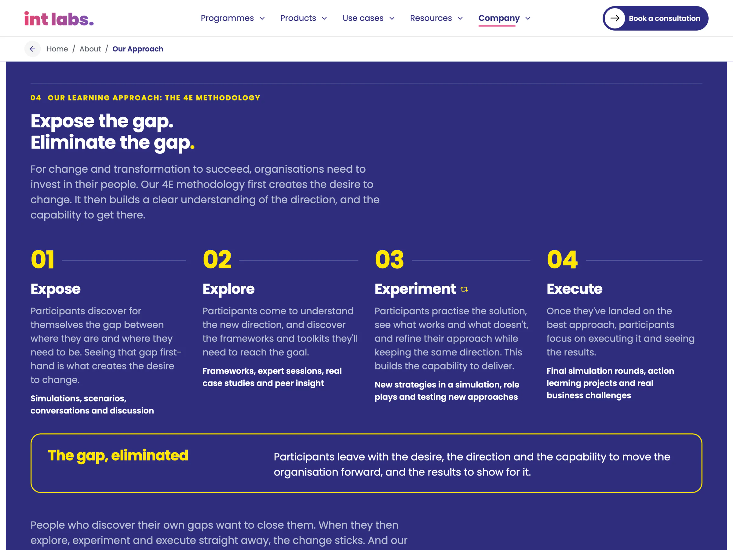
An Idea Drawn so It Needs No Words
The company's approach starts from momentum: every organisation has some, and change means redirecting it. Earlier drawings of it failed review; this one is a short film played from a small model, frame by frame. A team pushes a heavy navy ball beside a hill with a pink flag on top. Pushed from both sides it only shakes; with a direction it climbs a little and rolls back; with more people it gets halfway; with capability it reaches the flag. The four steps are buttons too: any one, in any order, and the scene answers by the same model. It plays only while on screen, the scene is its own pause control, and under reduced motion a press redraws it still.
Shorter, Anonymous, and Held to It by the Build
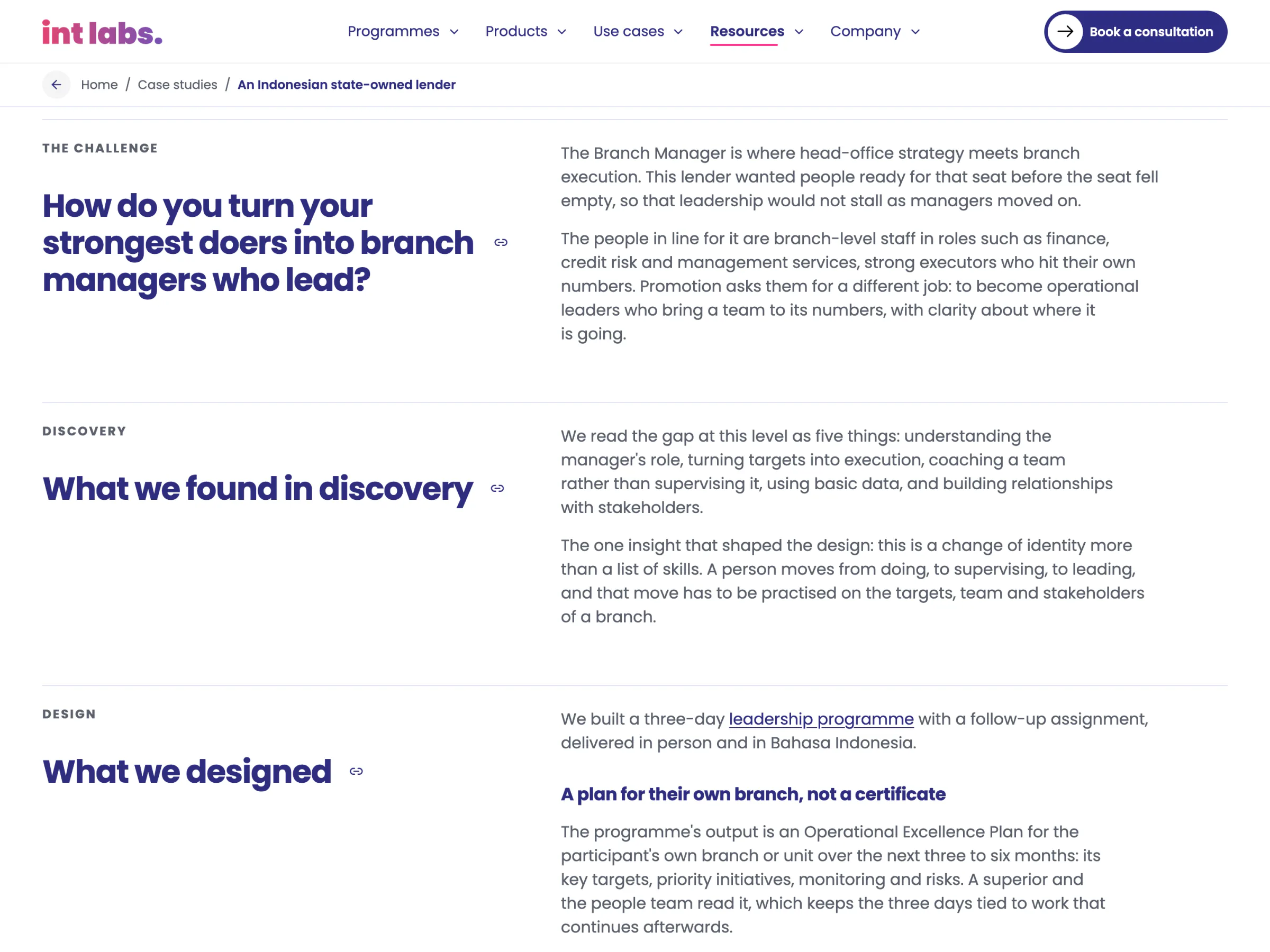
On 30 October a colleague sent a blueprint for the case studies: about 1,100 words in nine sections, the challenge written under the buyer's own question, results numbers first with when and how they were measured, three lessons for the reader, and no client named without written sign-off. Words such as "on file" or "photograph shows" are never published.
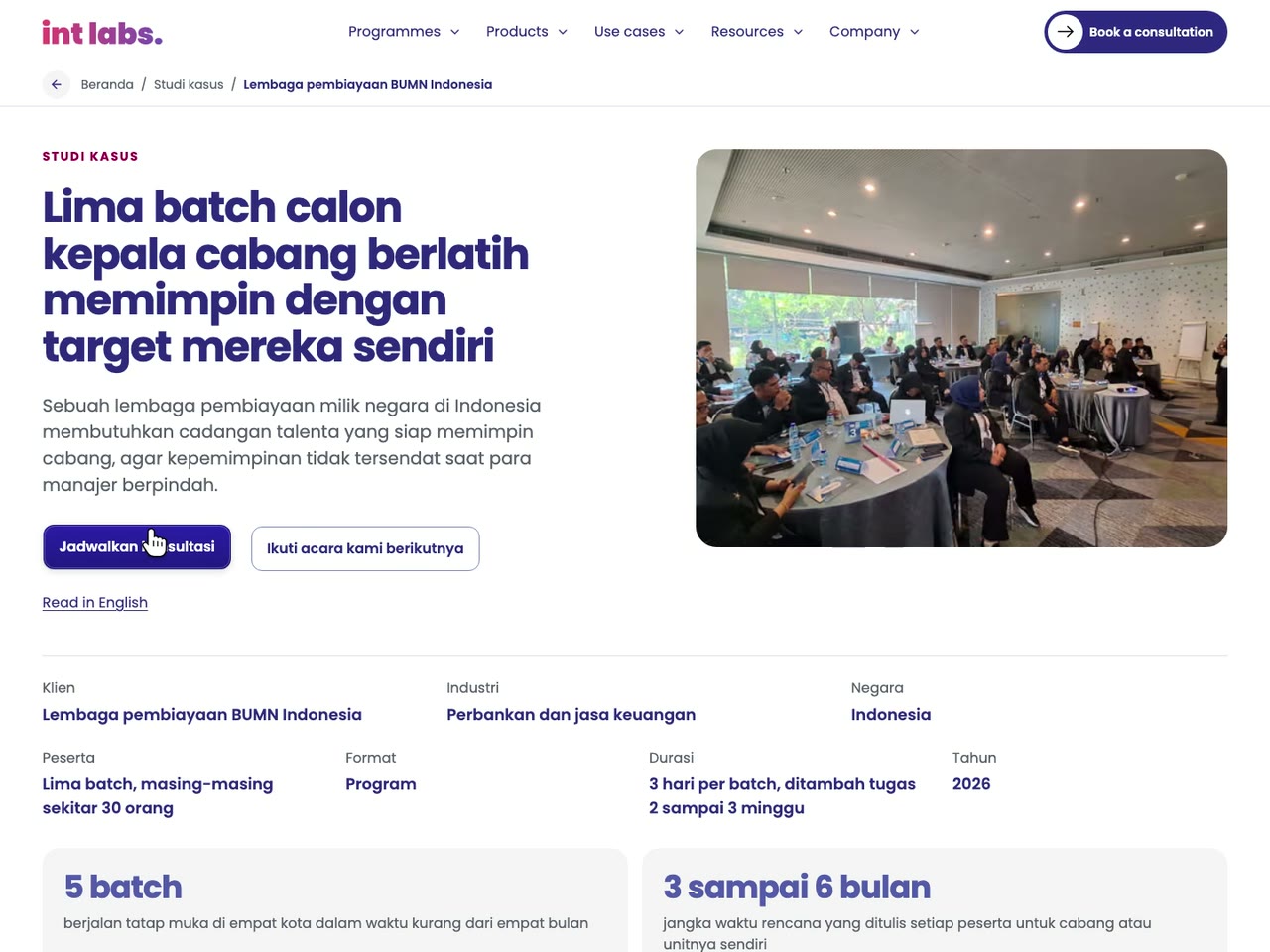
All fifteen were rewritten to it on 2 November, each with a new address in the blueprint's form, the three pages for one bank linked as a series. The index filters by industry and by challenge: onboarding, leadership, strategy alignment, sales and innovation. The two first-rollout Indonesian cases have a Bahasa Indonesia version, linked both ways for search engines.
The build holds the rules, so they cannot drift. Before a page is written, a case's words fail the build on a client's name, a banned phrase, "Int Labs" in the story, a clock time, a headline over 12 words or a page over 1,300 words; after it, a check reads every built page's words, alt text, head and structured data for a name. Photographs reach a case only from a list of frames each opened and found to show no name or mark.
Written in the Admin, Read on the Site
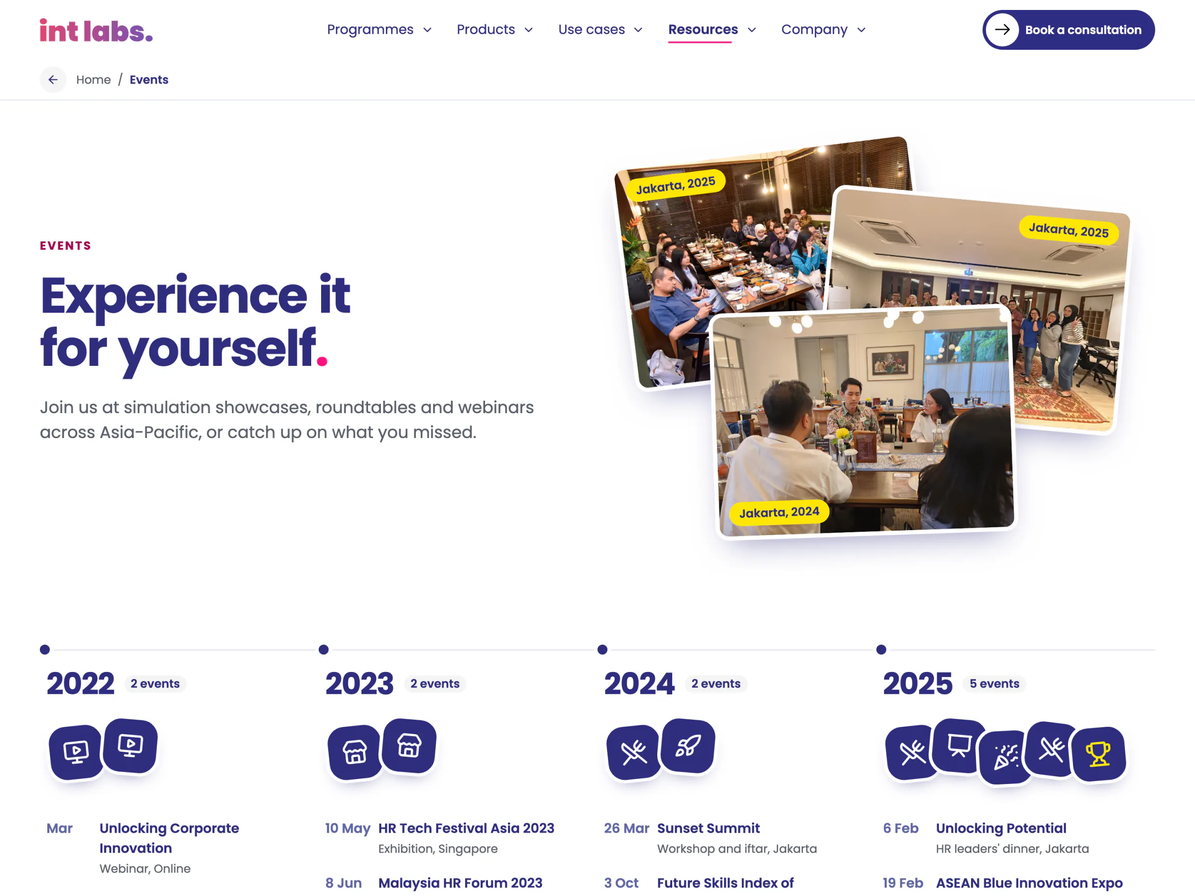
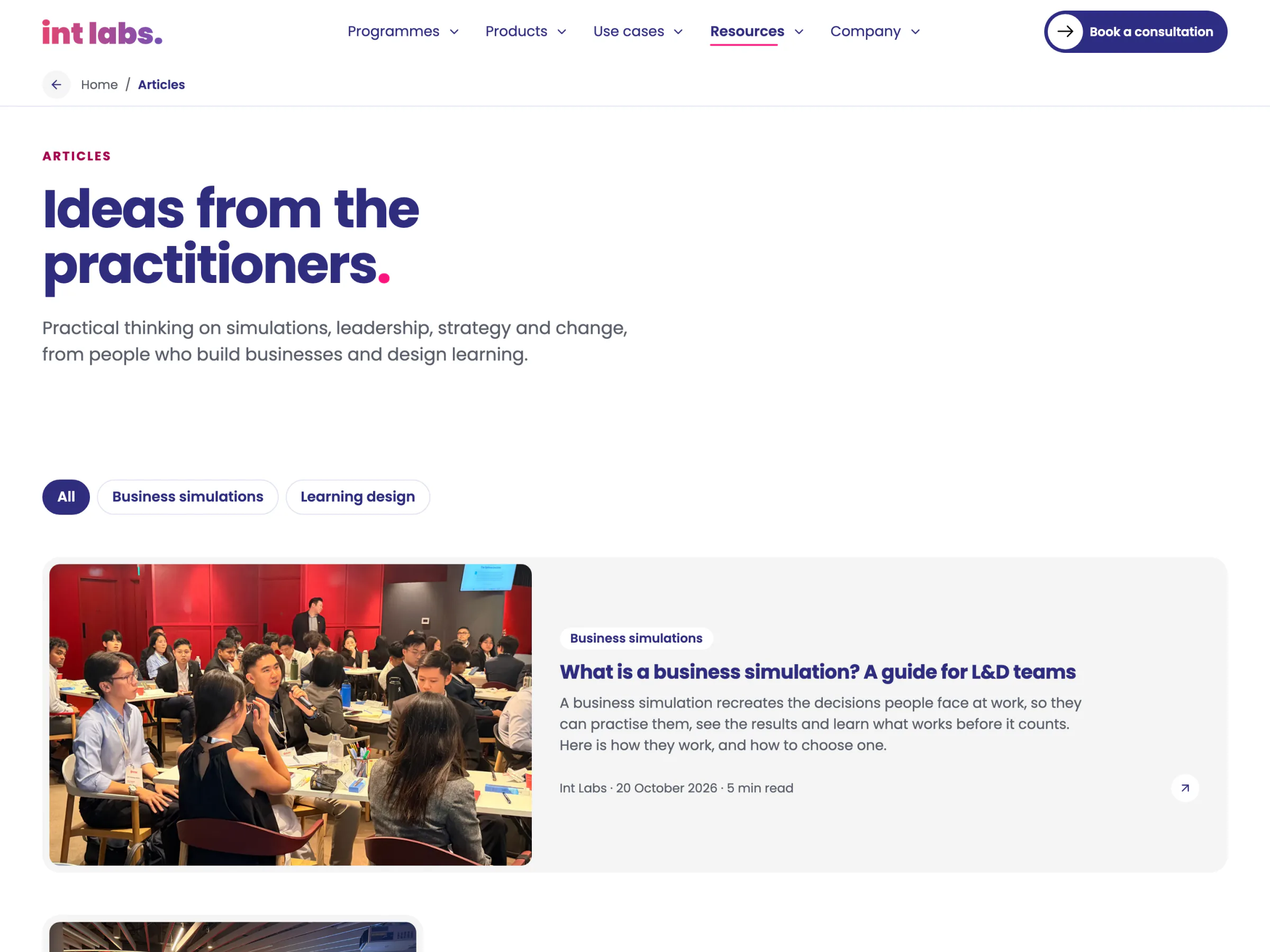
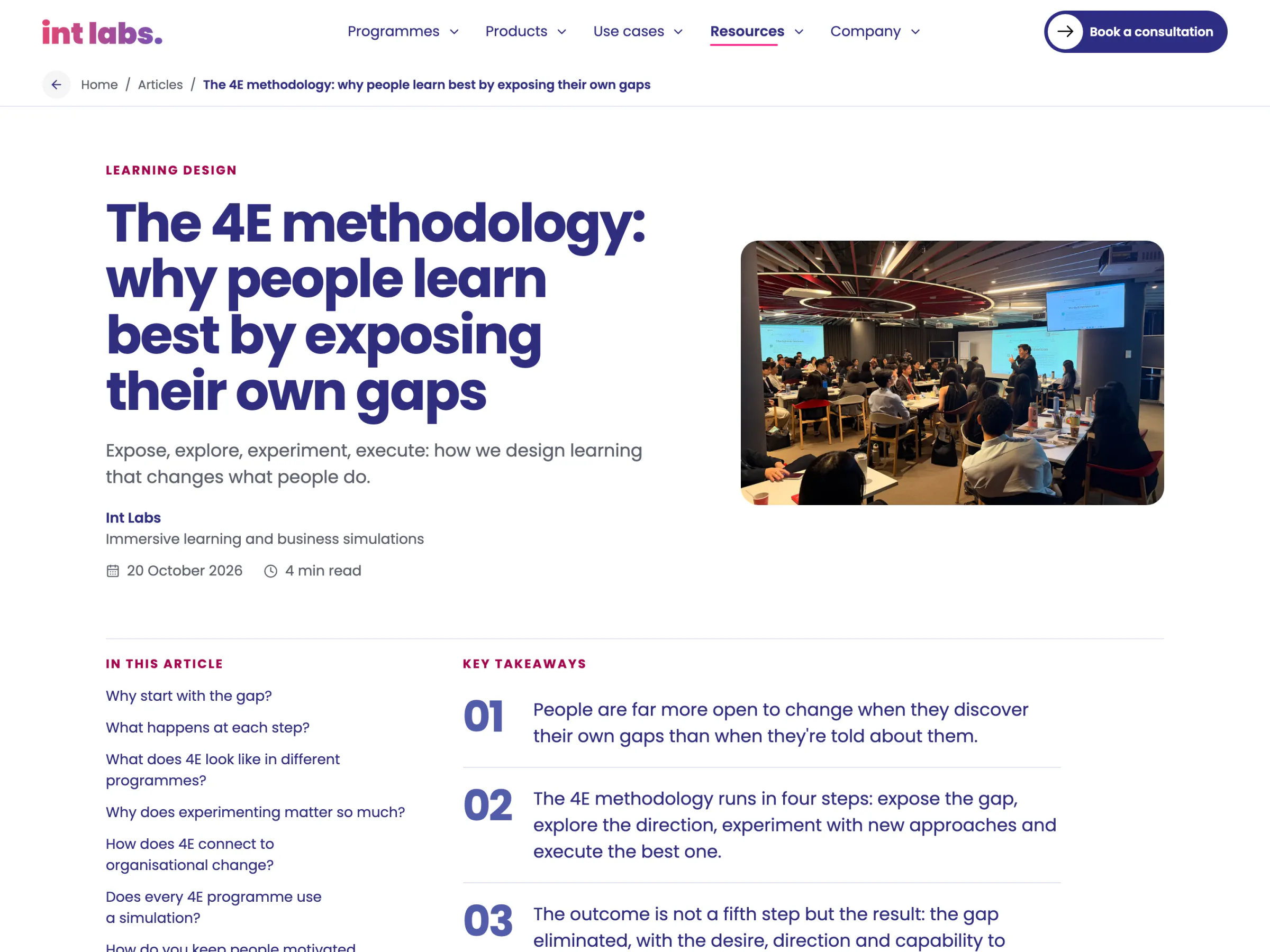
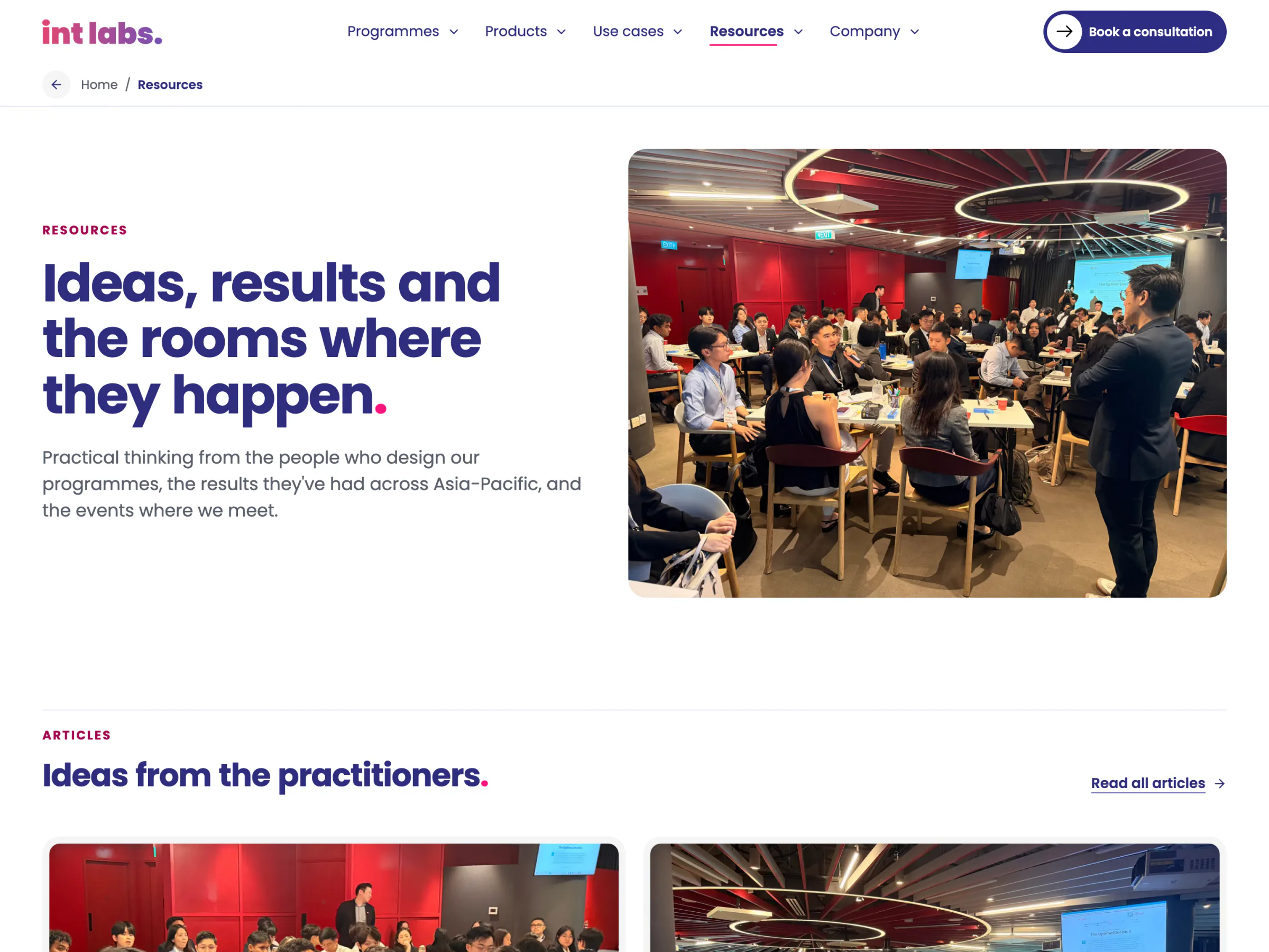
The articles are written in the admin and live in the database. The build pre-renders the hub, every topic and every article published by then, with structured data for search engines and AI assistants; the hub then reads the list live, so a reader sees a new article at once. An article published after the build is still served: the host sends its address to a shell page that fetches it. Resources, since 22 October, gathers the newest articles, three cases and three events on one page.
One Form, Every Kind of Enquiry
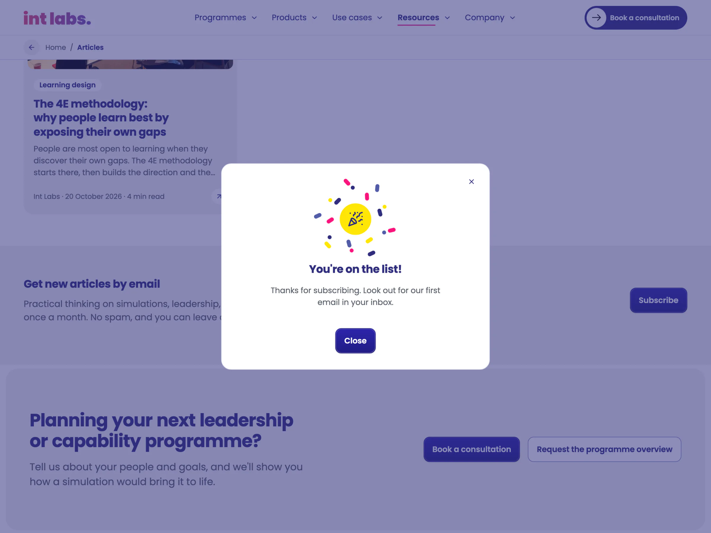
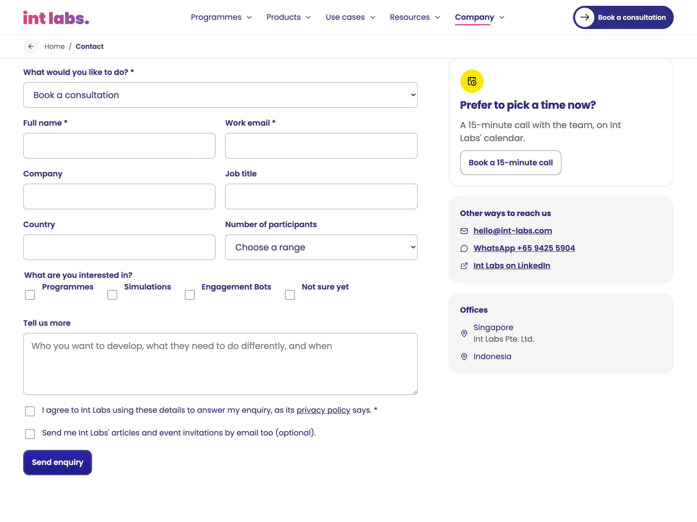
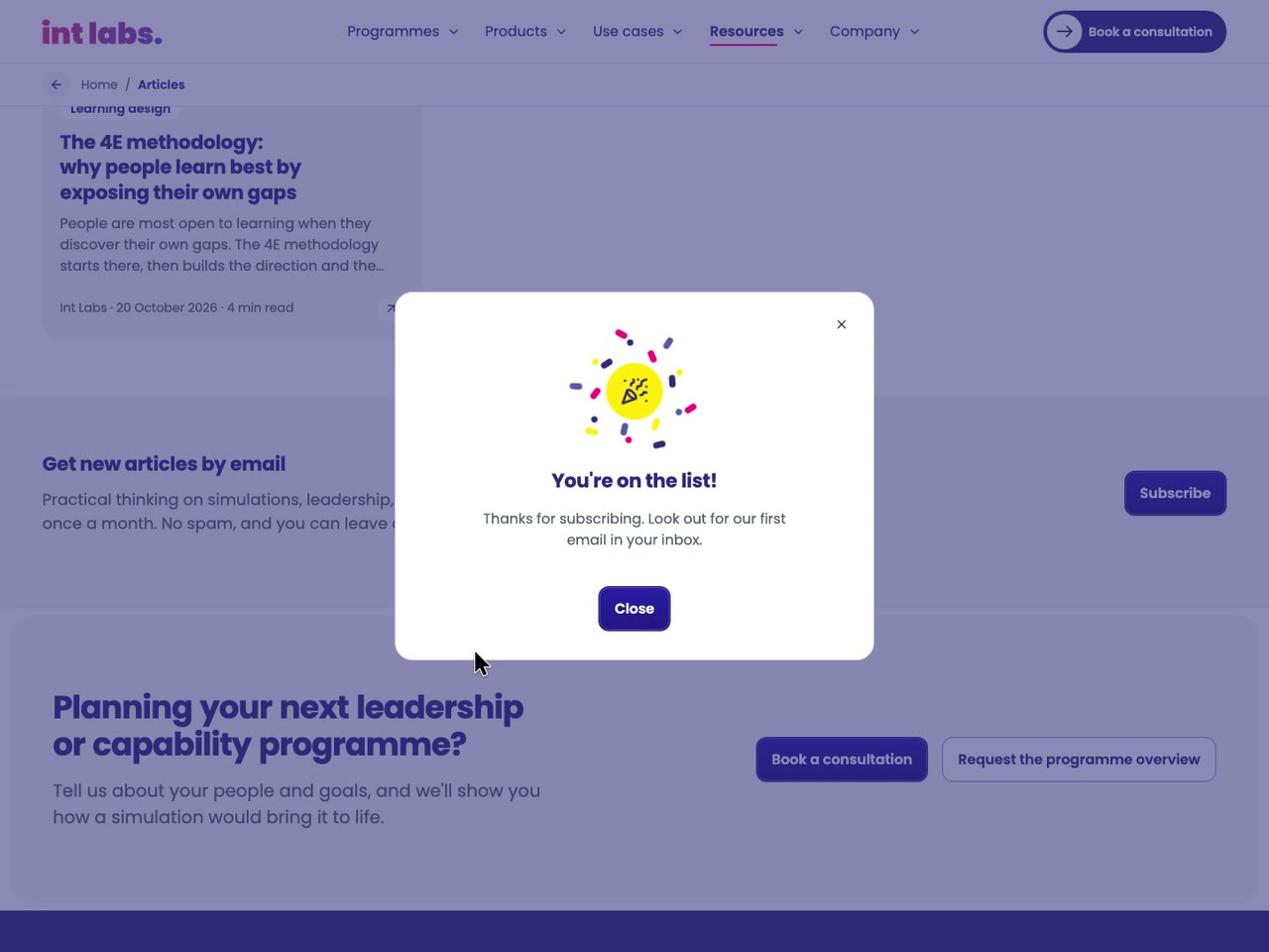
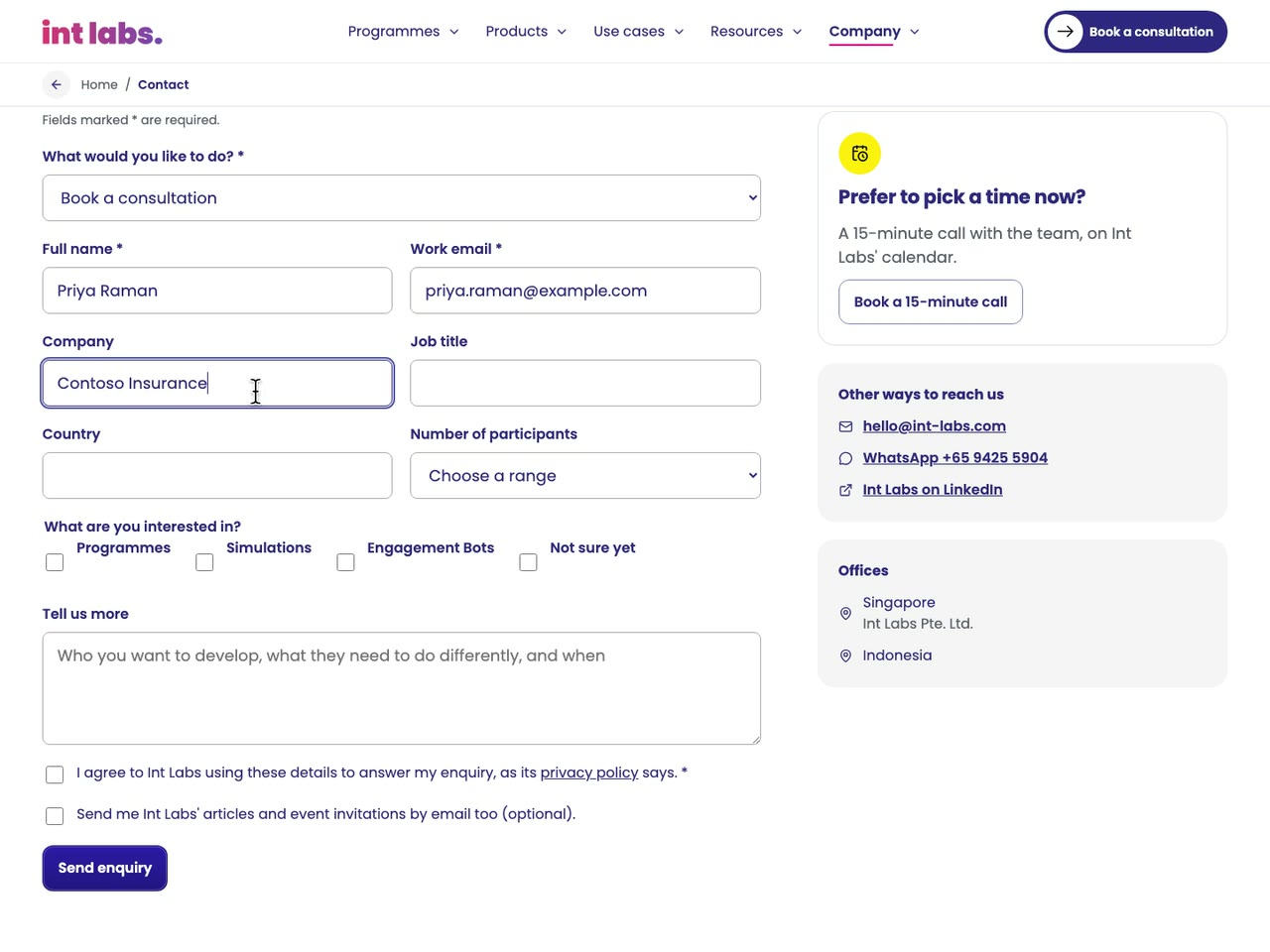
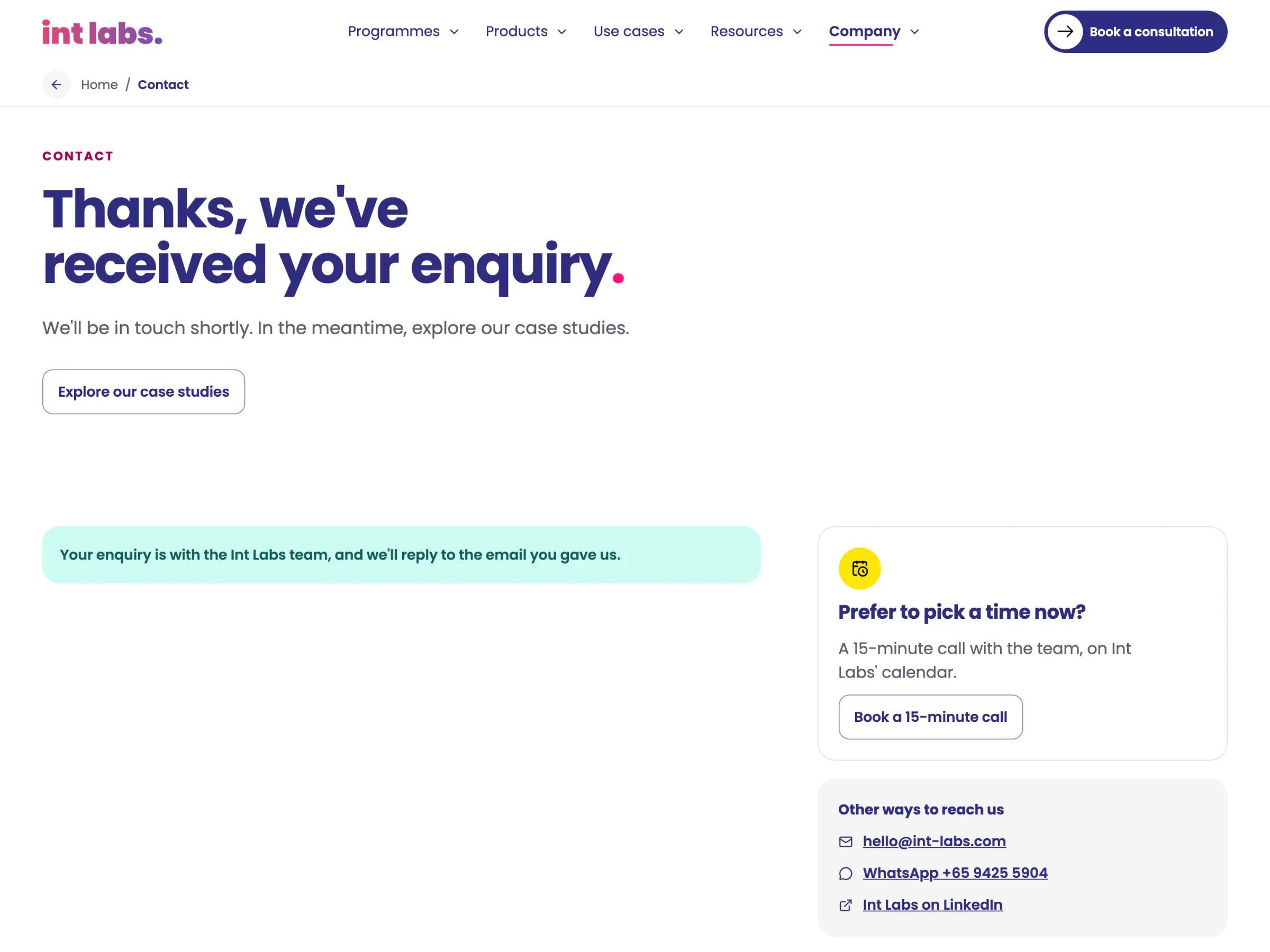
The contact form is the one place the site asks for anything. Its kind of enquiry is already chosen by the call that opened it. Only a name, a work email and the privacy consent are required; company, role, country, group size, interests and a message are optional. A hidden field catches bots, and the database answers a filled one with a fake success. The answer is a sentence in the page: the thanks, or the database's own reason in plain words.
A Board With a Square Missing
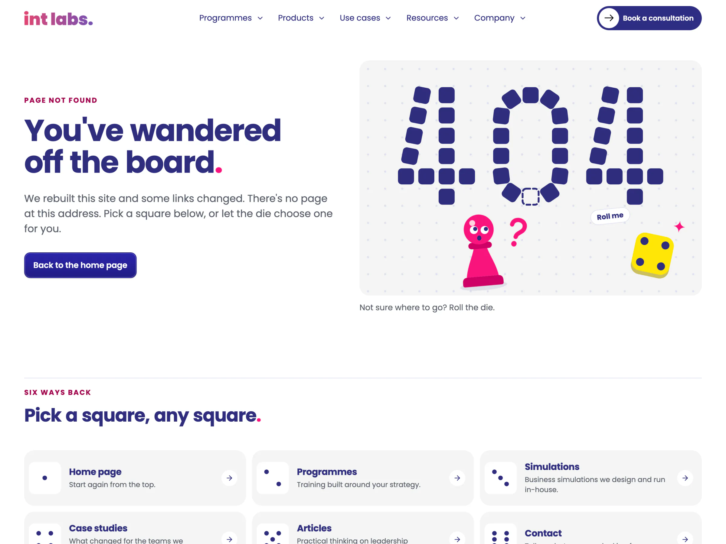
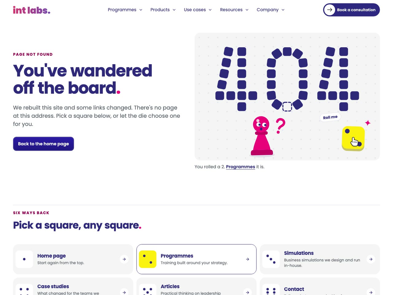
A wrong address lands on a game board: "404" in navy squares with one square missing, a pink pawn that watches the pointer, and a die that is a real button and rolls one of six ways back into the site. Everything still works under reduced motion. When something breaks on the site's side, the same board is knocked over.
Nine Screens, Each One Task
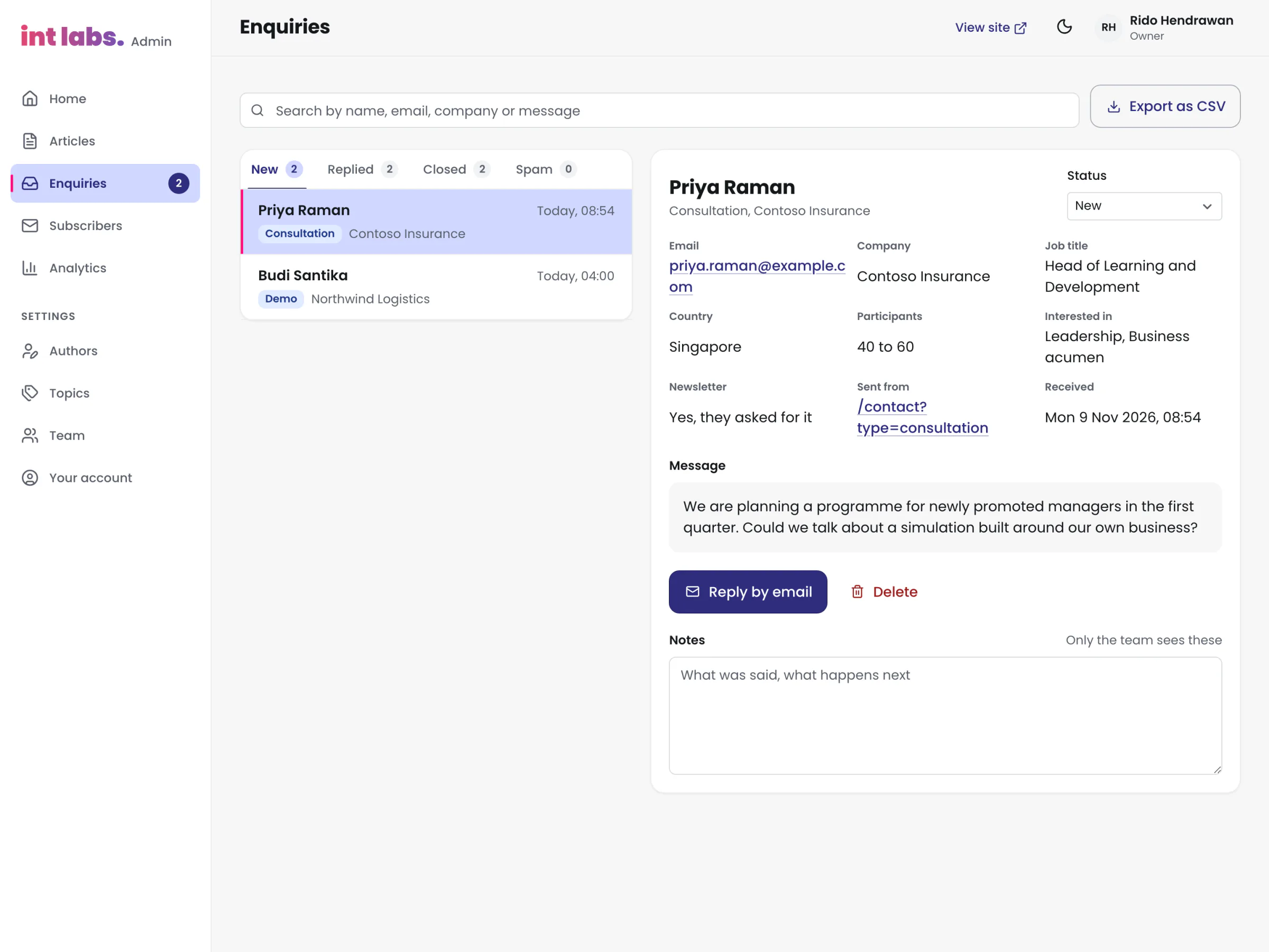
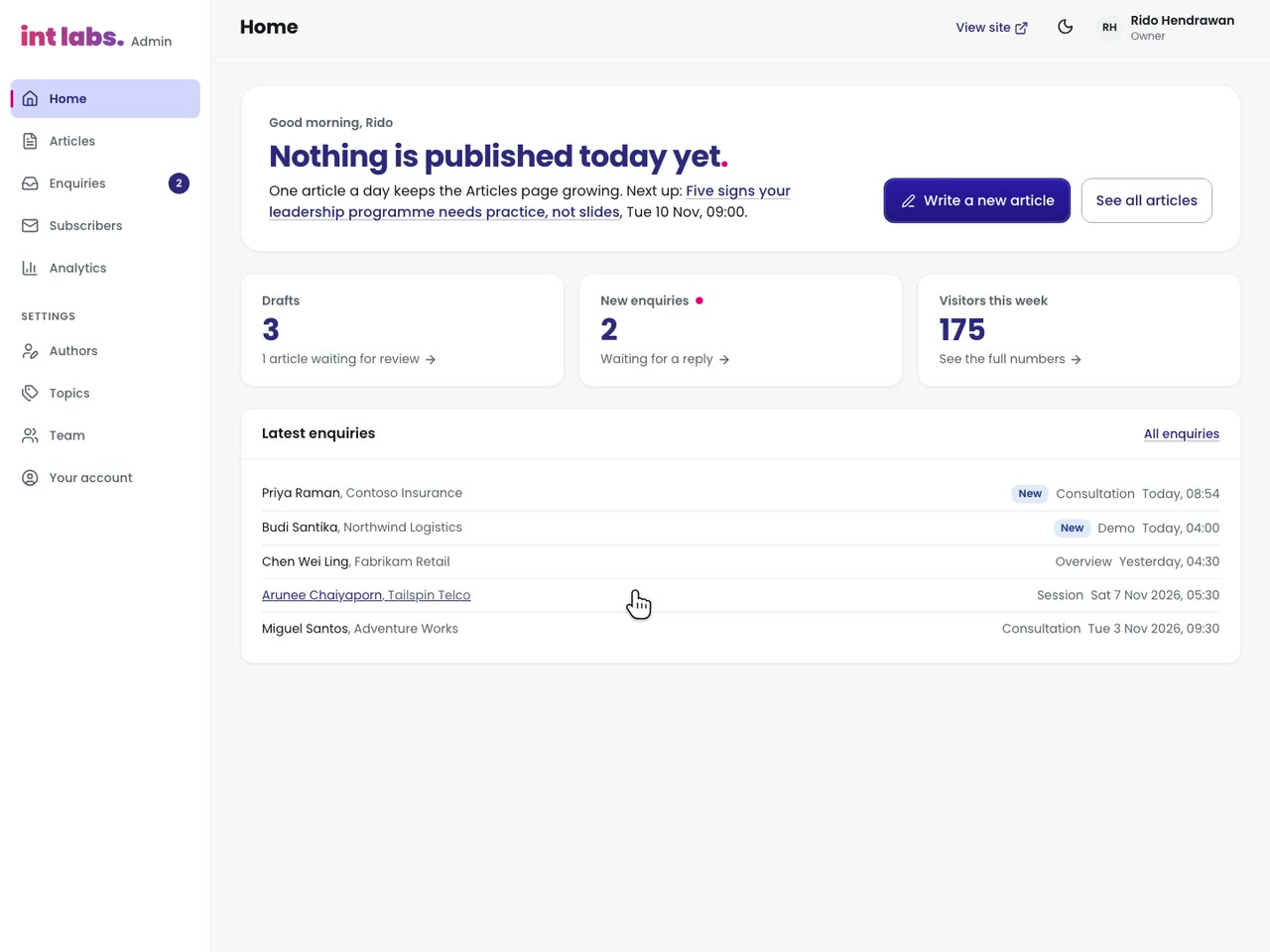
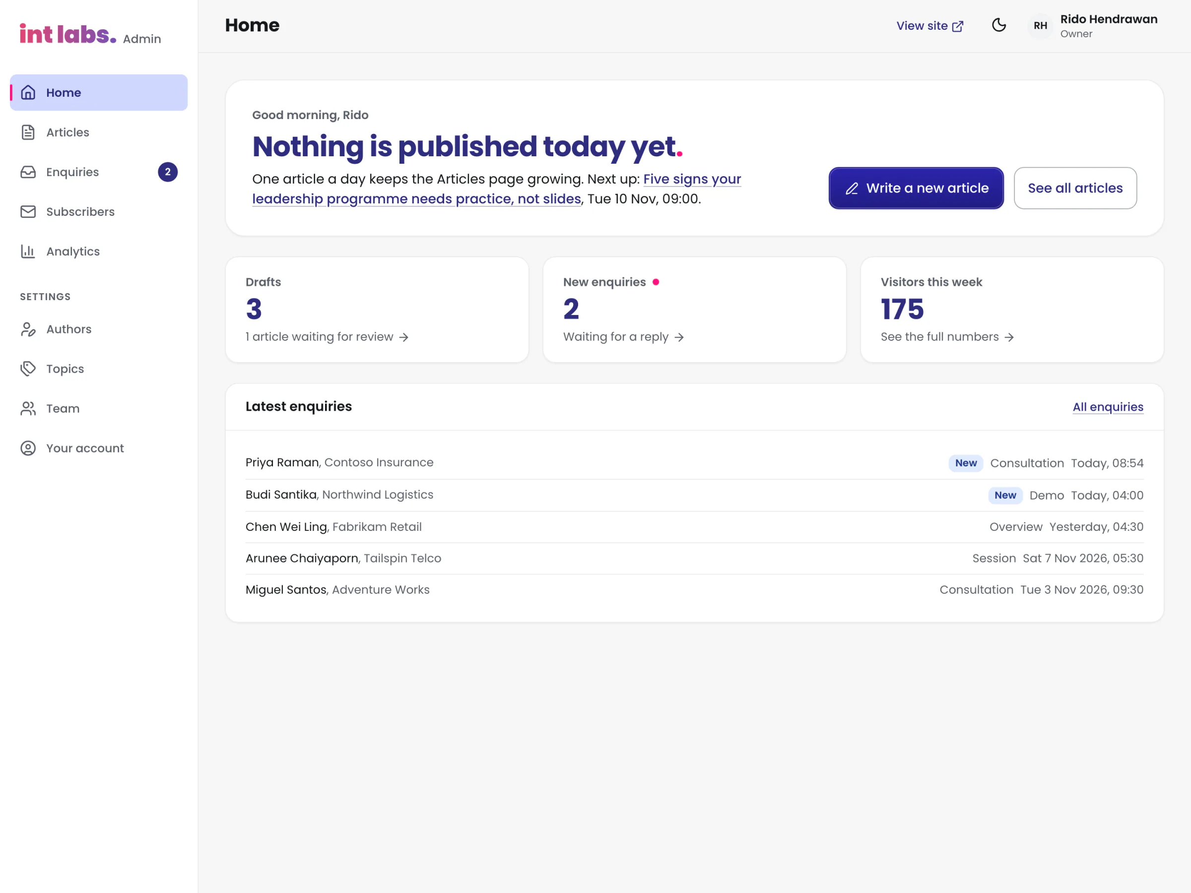
The admin is where the team signs in to write, schedule and publish the articles, read the site's own analytics, and handle enquiries and newsletter sign-ups. It is simple on purpose: its first review called it "a bit overwhelming and hard to understand", so Home became one thing to do, written large, and everything set up once moved under Settings.
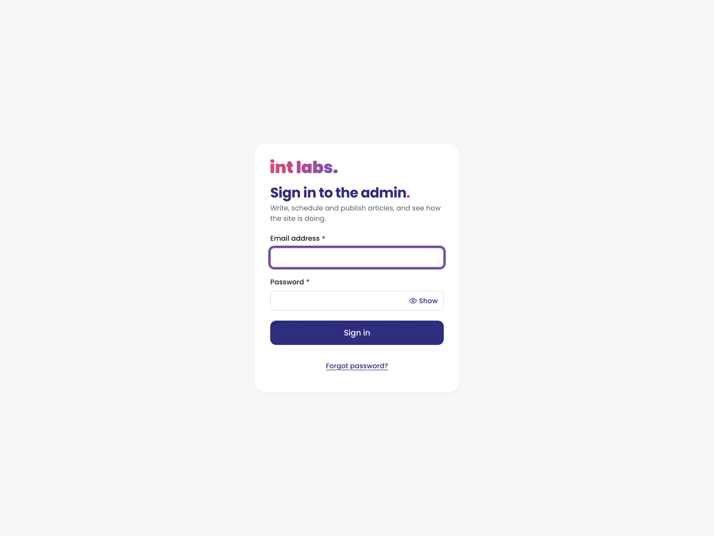
- Sign in. Email and password; nobody can sign up on their own, and an account without a row on the team is signed out with a sentence saying so.
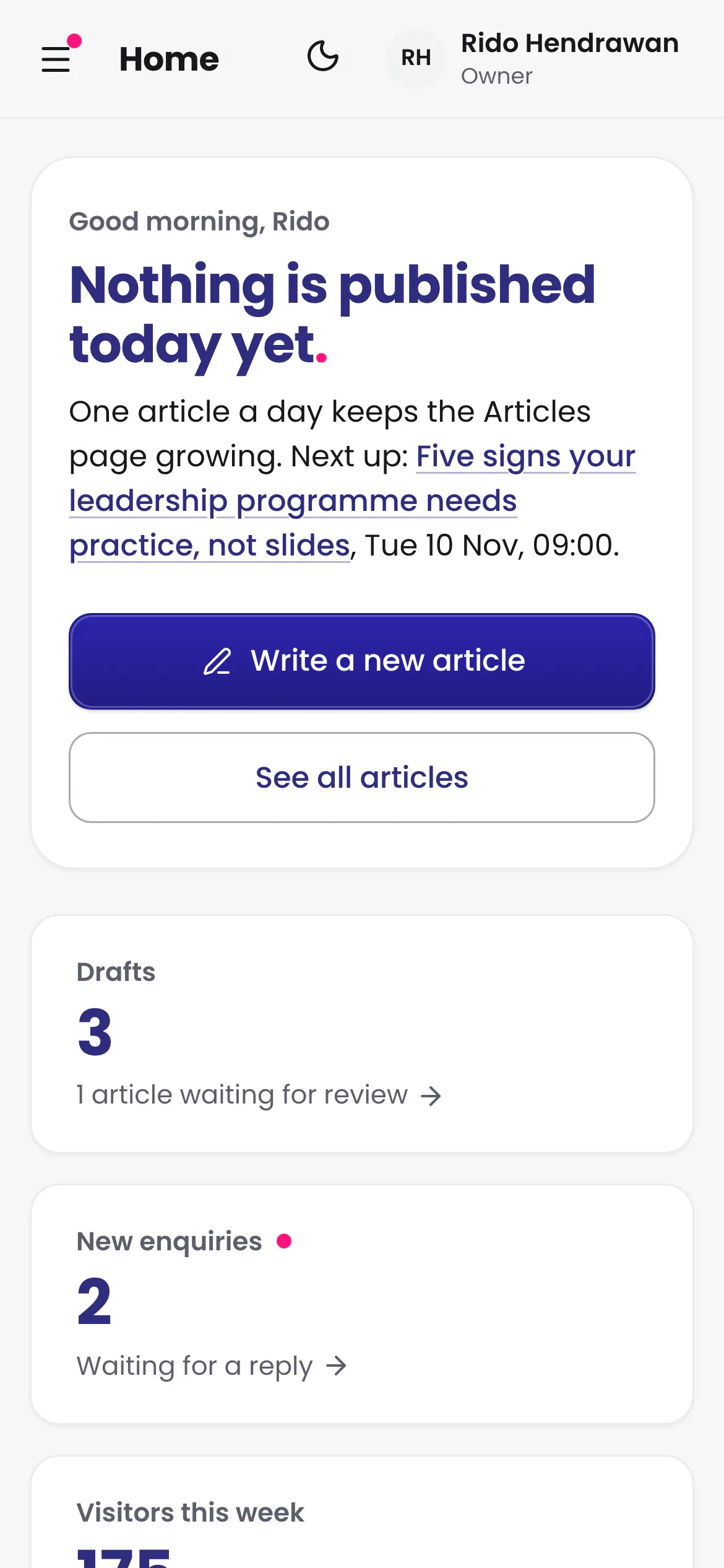
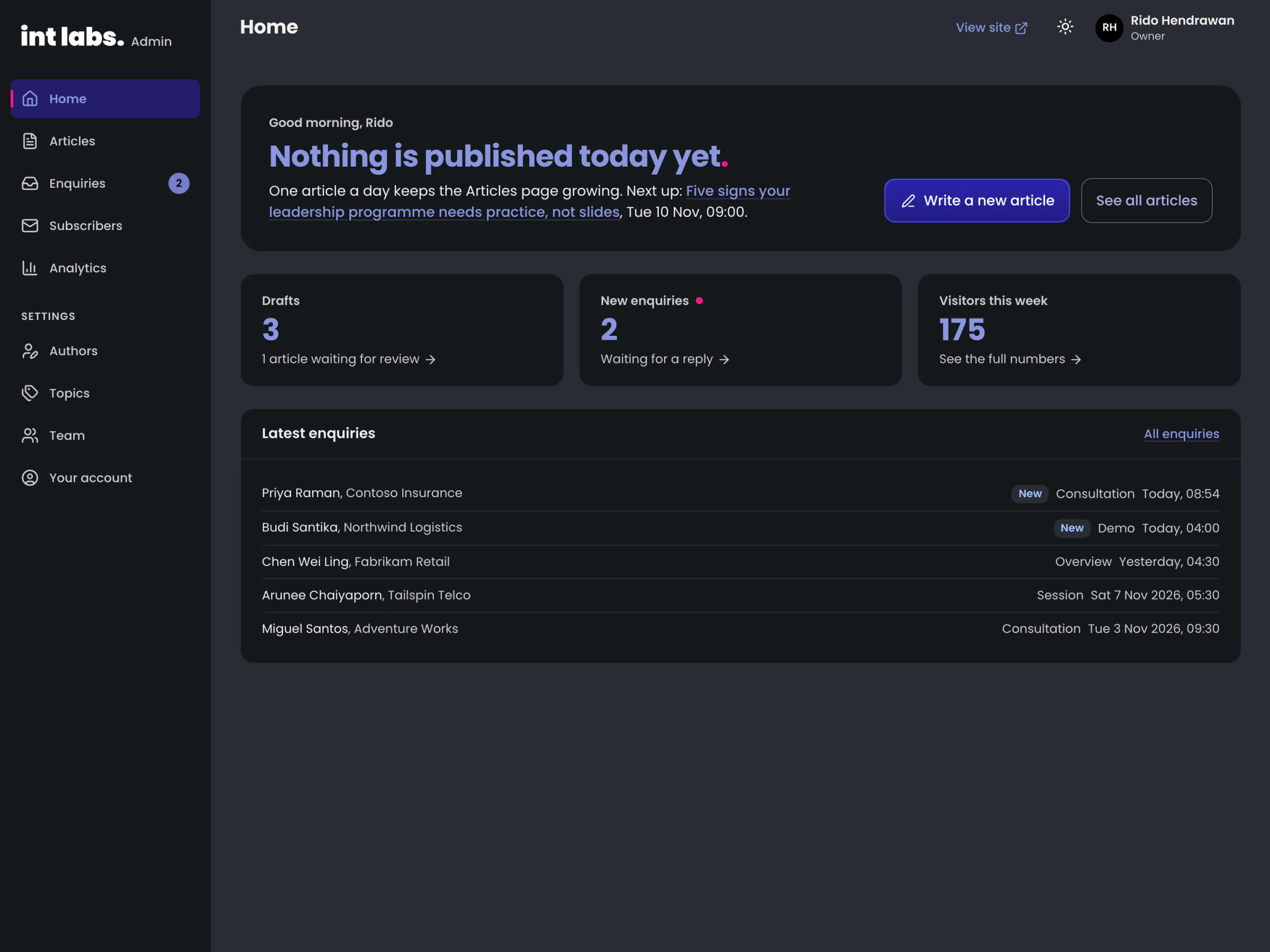
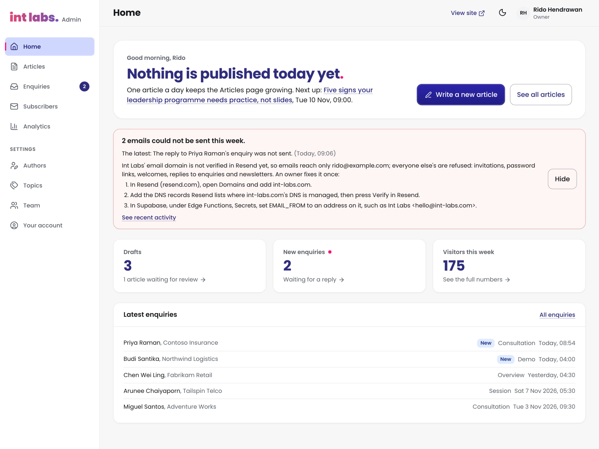
- Home. Today in one sentence (is today's article live, what is next), one large "Write a new article", and three numbers that each open their page: drafts, new enquiries, visitors this week.
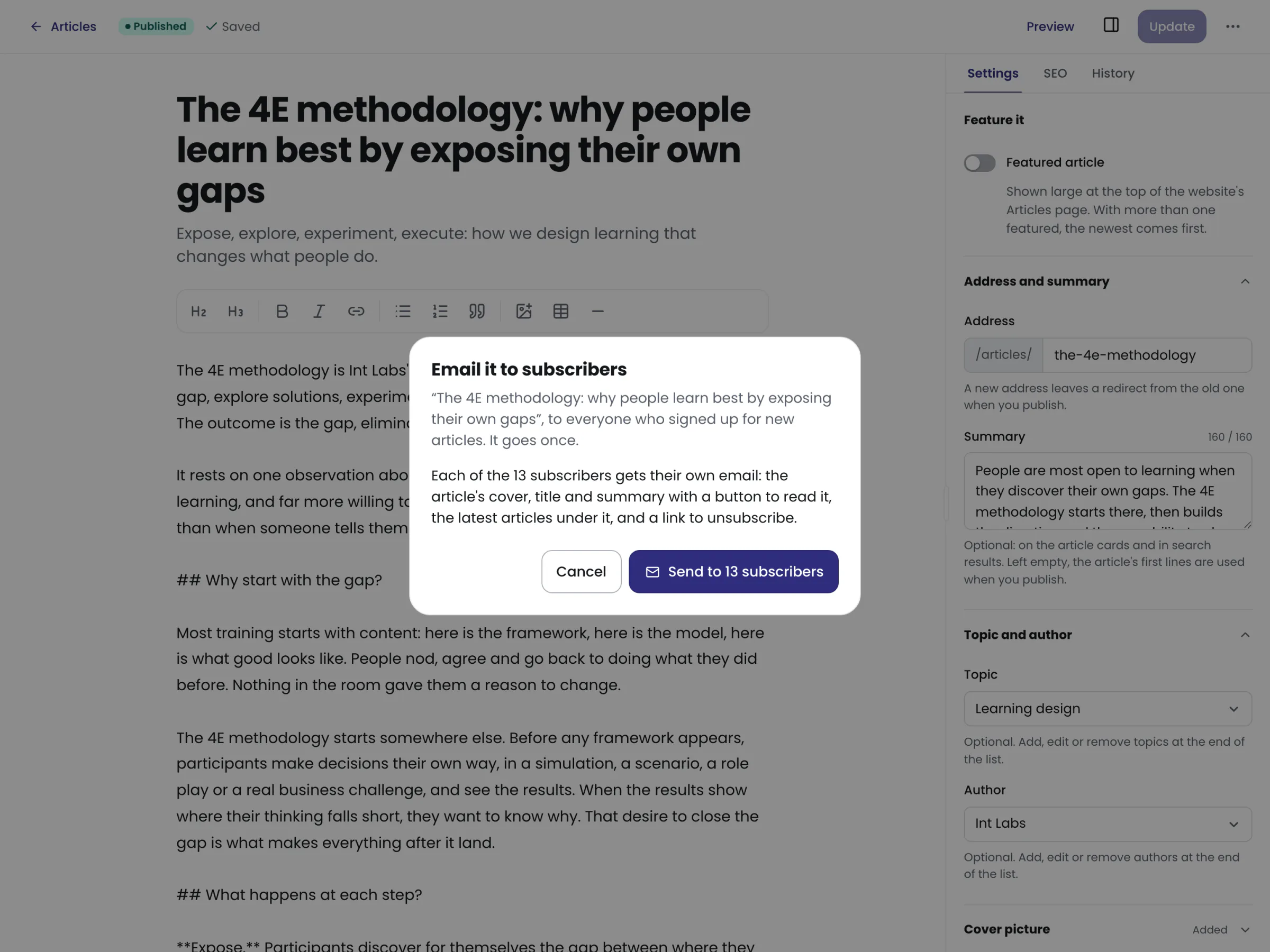
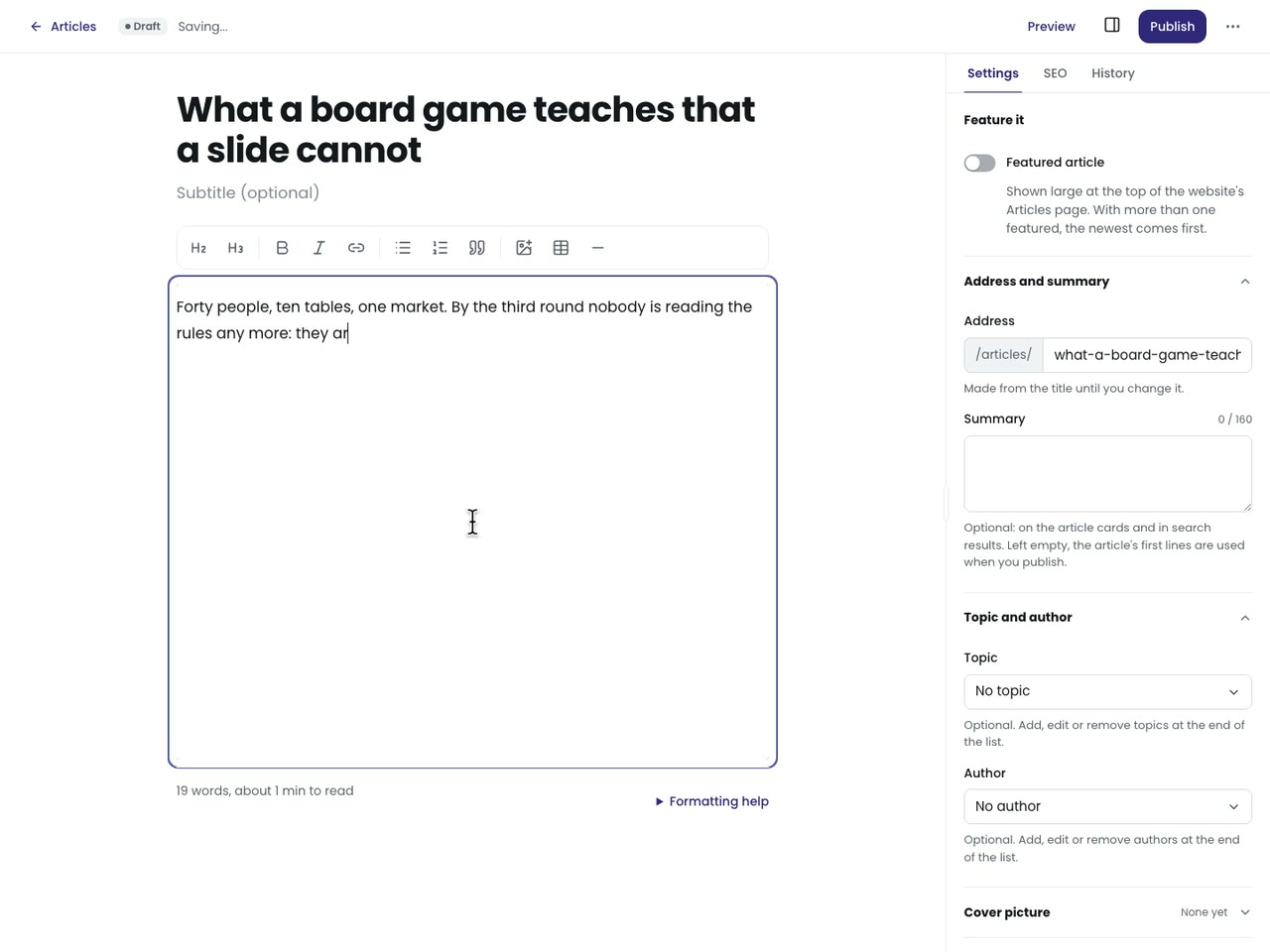
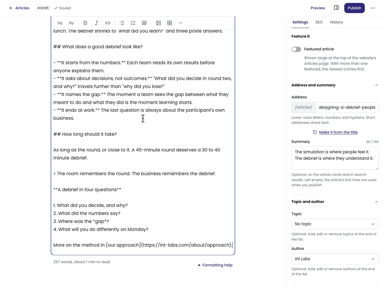
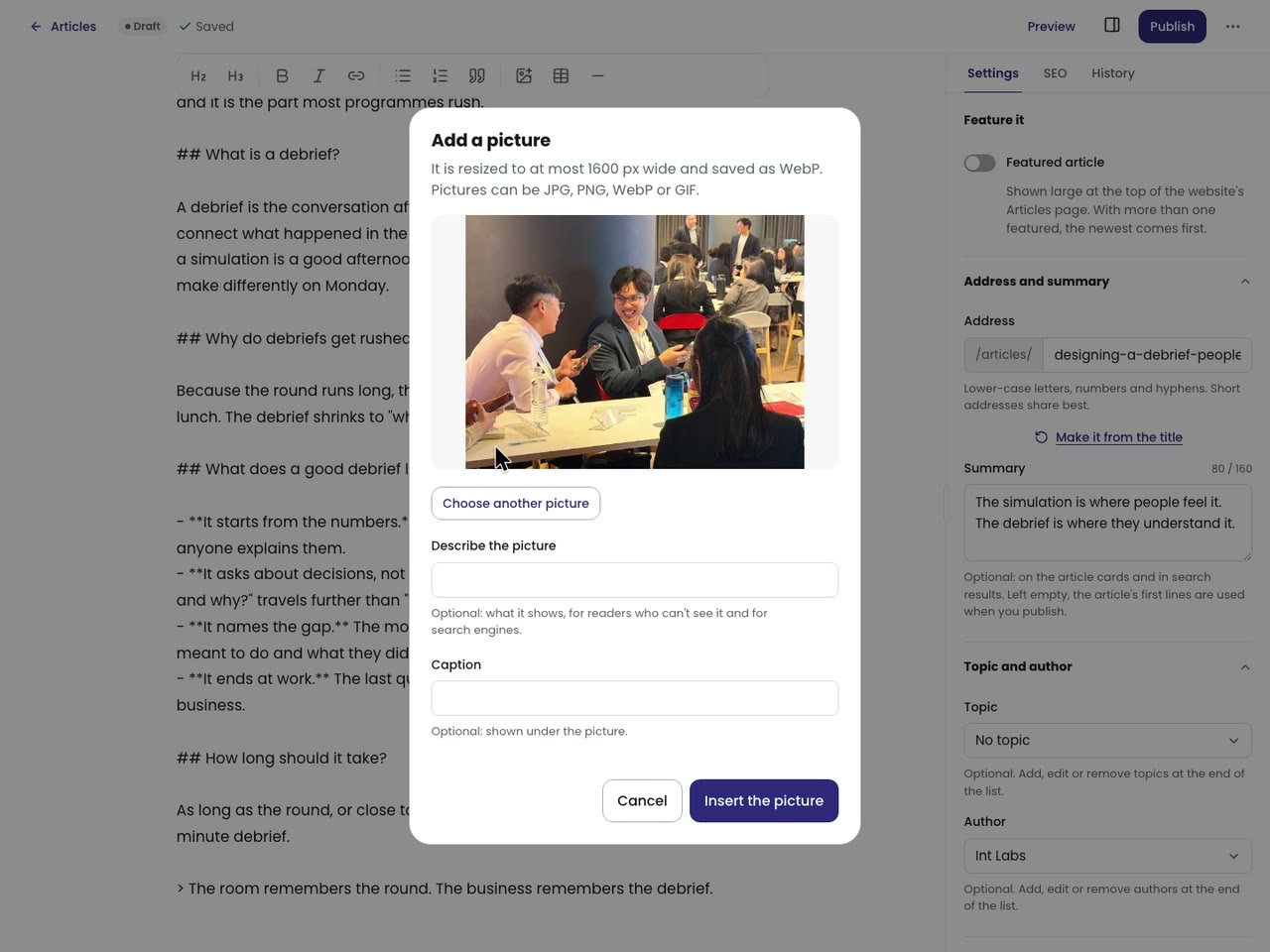
- Write. The title, then Markdown with a toolbar; pasting from Google Docs or Word keeps headings, bold, lists and links. The preview beside it is the website's own renderer and type, so the preview is the page.
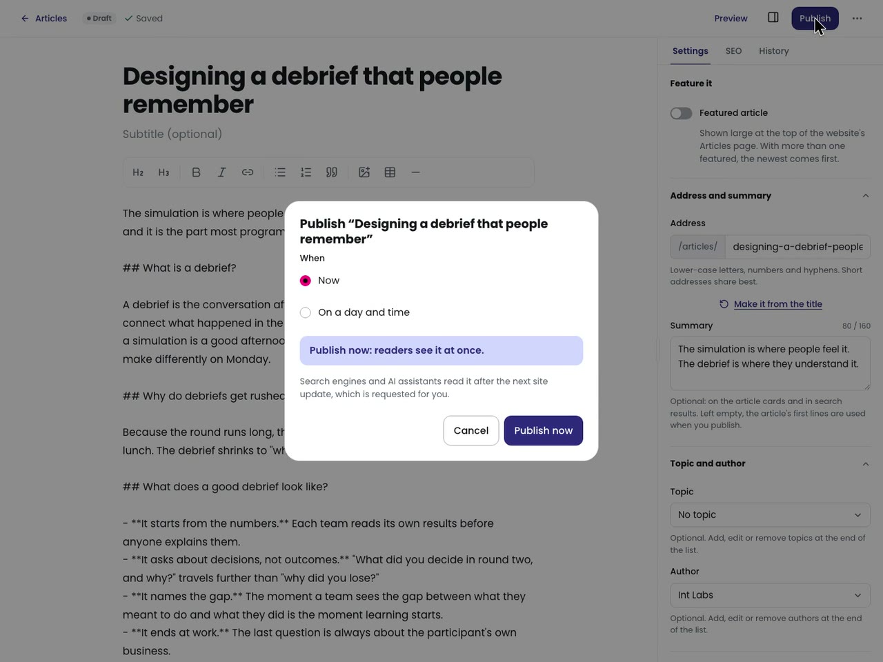
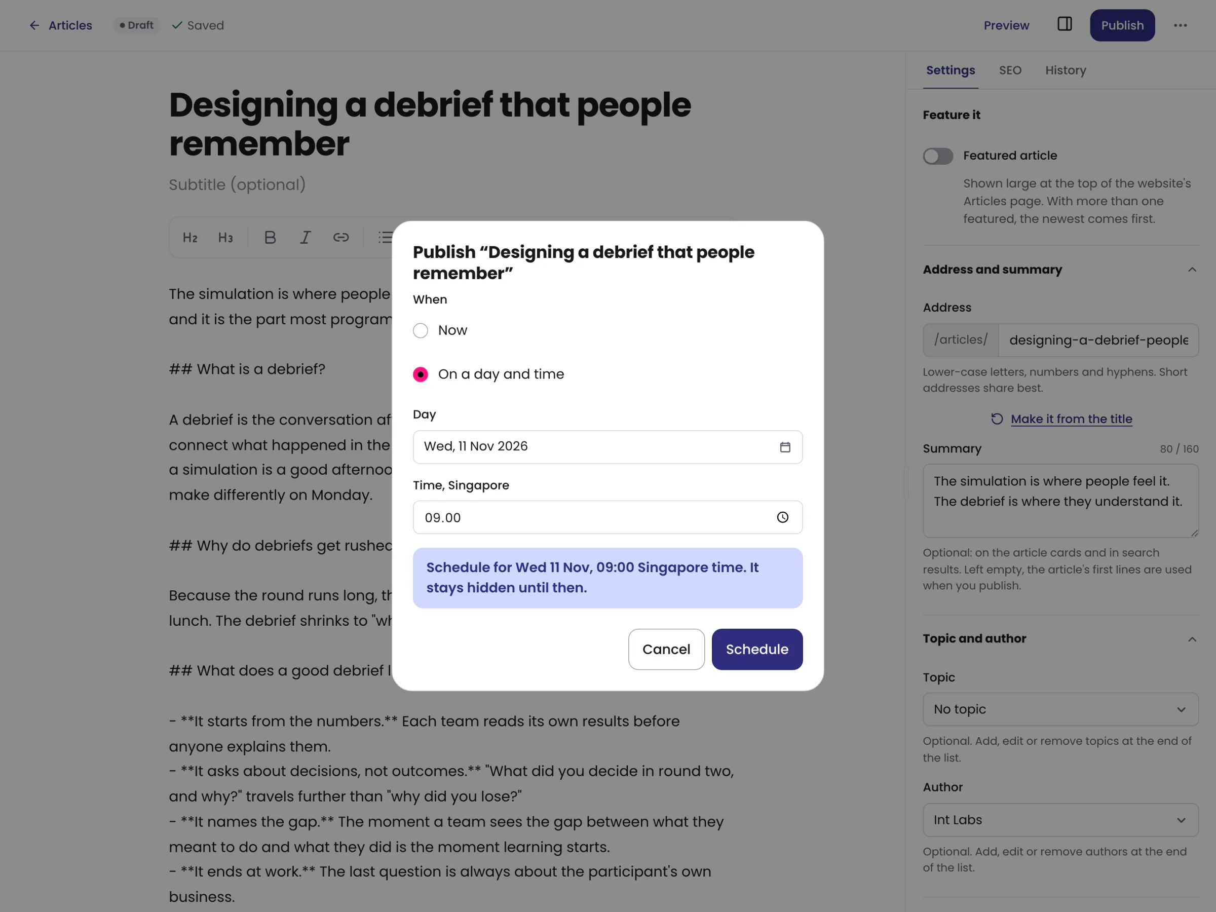
- Publish. Now, or on a day and time in Singapore. A title and some words are all it asks for.
- Everything after. Enquiries, subscribers, analytics, the team.
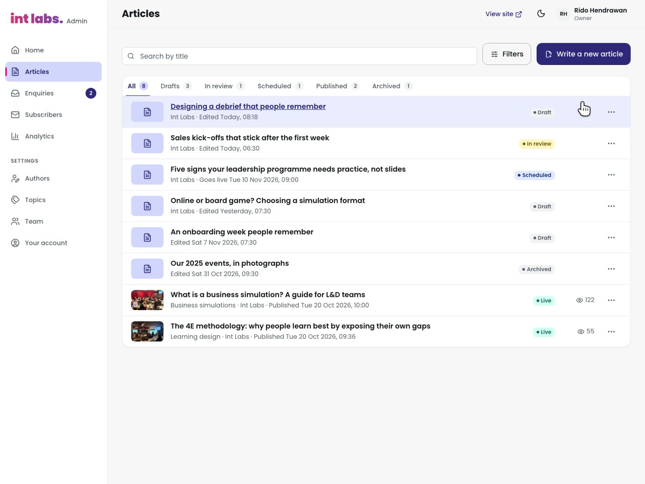
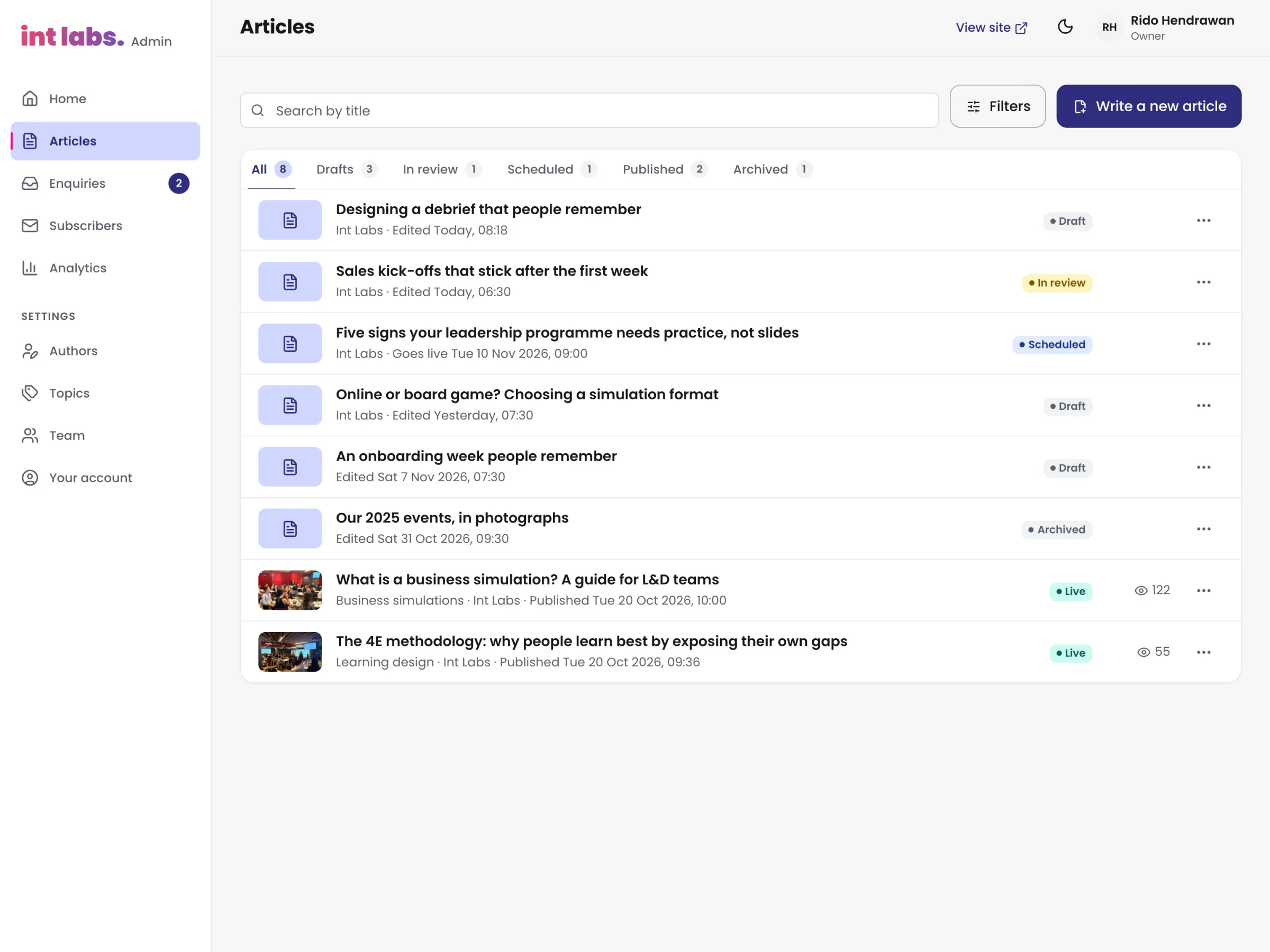
Every State on Its Own Tab
Room to Write, and a Preview That Is the Page
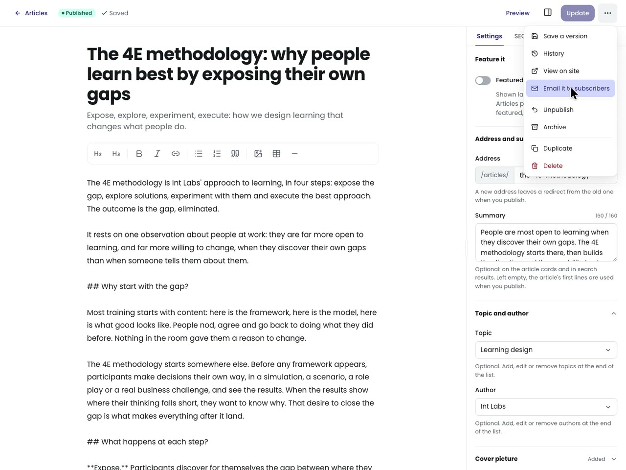
The editor is full screen. On a wide screen the writing, the preview and a side panel sit side by side, the preview following the writing's scroll; narrower, a Write and Preview switch and the panel in a drawer. It saves 1.2 seconds after the last change, only the columns that differ, never two writes at once. Before each write it checks whether someone else has changed the article since: if so, saving stops and a banner says who and when, with "Copy your text" and "Reload their version". A failed save keeps the words, says why, and retries.
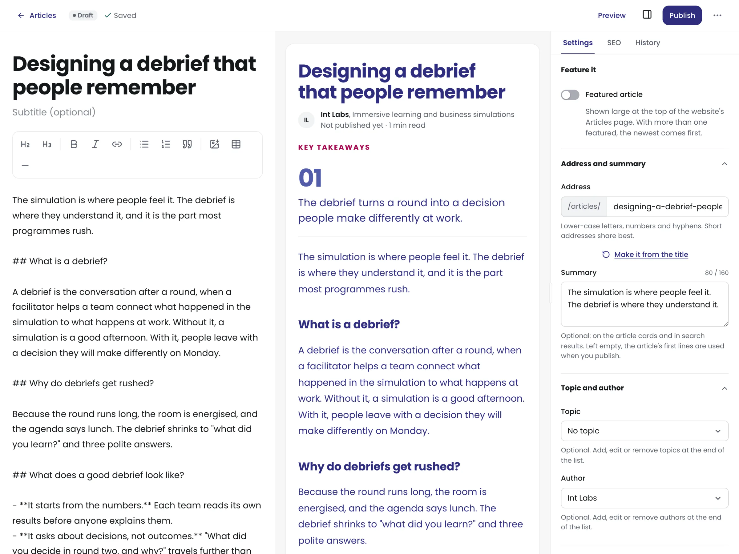
Pasting from a document is the common case, so the paste is cleaned: Google Docs' wrapping and its "font-weight: normal" bold are undone, Word's styled paragraphs become real lists, Google's redirect links become the address they point to, a pasted document title moves every heading down a level, and pictures from elsewhere are counted and flagged for upload.
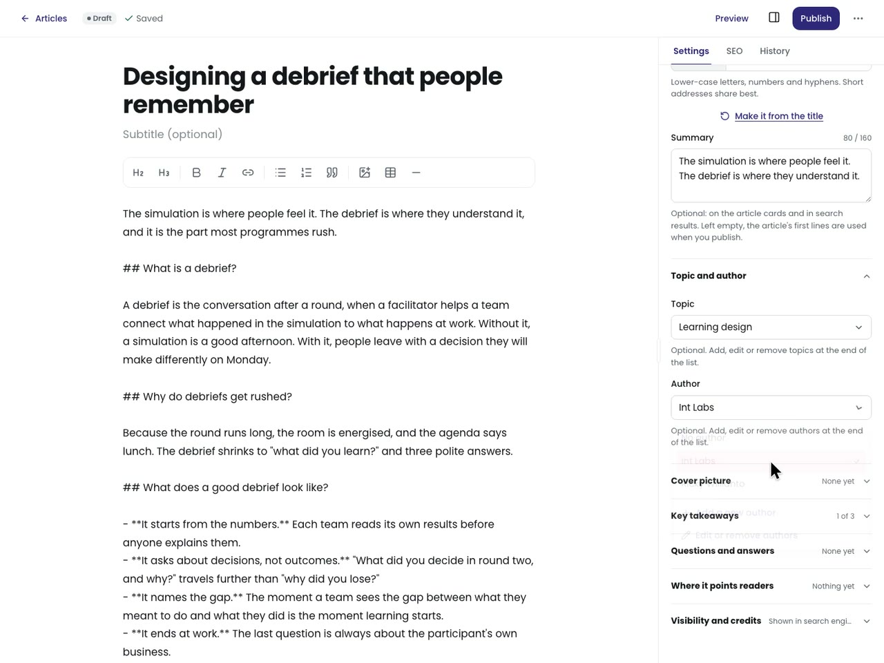
Optional, Folded, Never a Gate
Every setting is optional and folds away: feature it, the address and summary, topic and author, the cover, key takeaways, questions and answers, where it points readers. A topic or author that does not exist yet is added from the end of its own list. The panel is as wide as the writer makes it: its edge drags, takes the arrow keys, and remembers its width.
The SEO tab shows the article as Google and a shared link would, and, folded away, "Help it get found": ideas for search engines and for AI assistants such as ChatGPT, Perplexity and Copilot. Each is done or an idea; there is no score and no word count. Until 20 October a list of checks held Publish back; the owner found it "too much validation", and the advice now rests on first-party guidance from Google Search Central and Microsoft Bing, read that day.
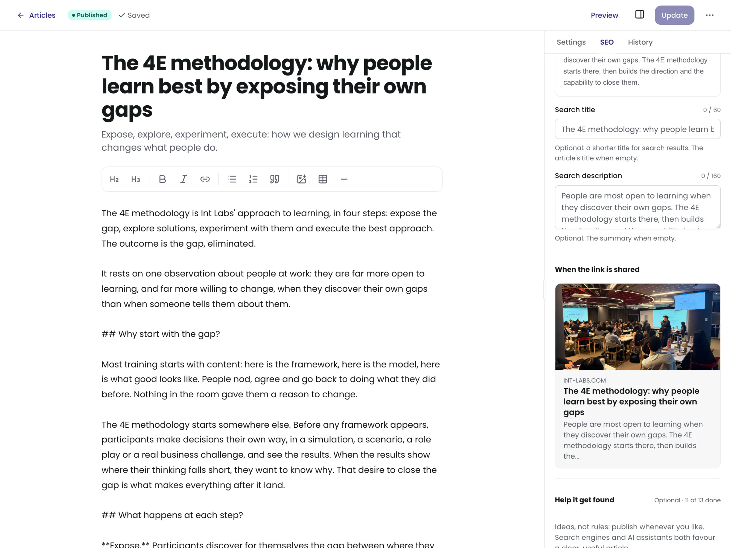
Now, or Wednesday at Nine
Publishing copies the working copy into the live copy through one database function, which keeps a revision, keeps the old address working if it changed, and logs it. A scheduled article needs nothing to run at its time: readers may only read rows already due, so it appears when its time passes. Publishing now also asks the host to rebuild, so search engines read the change; readers see it at once either way.
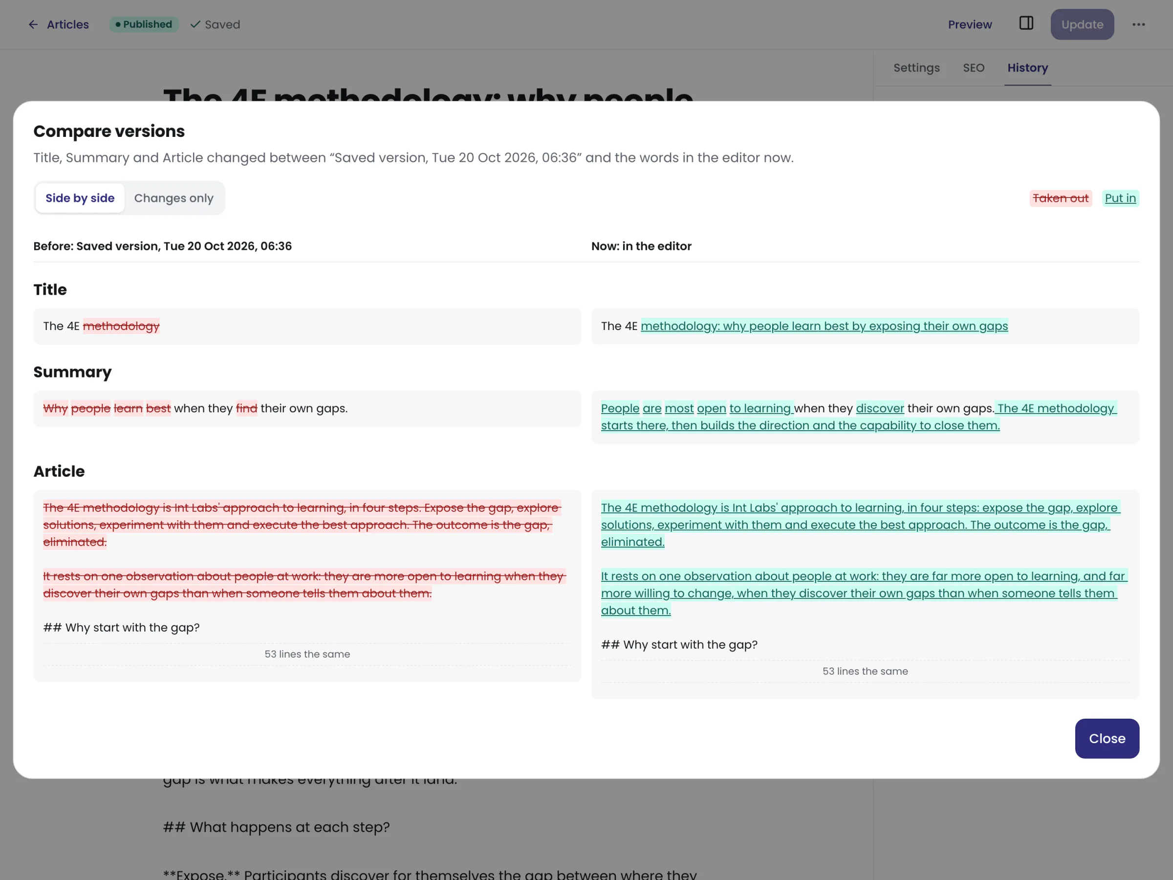
History keeps the last 100 versions: each publish, each saved version, and the state before a restore. Compare shows a version beside the words now, field by field, with a word diff for fields and a line diff for the body; Restore puts it back and keeps the words it replaced.
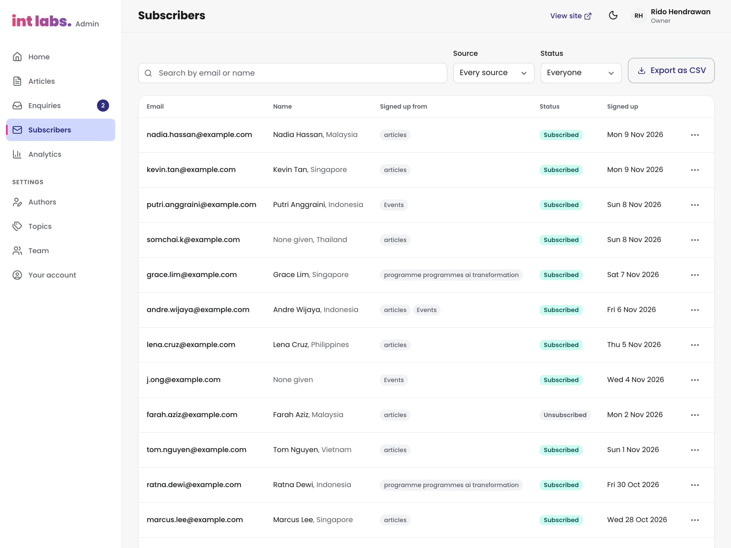
Enquiries, Subscribers, Analytics, the Team
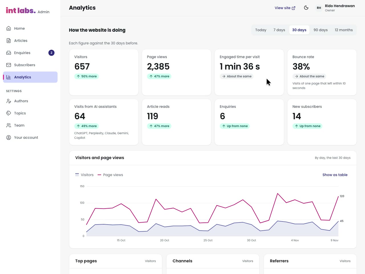
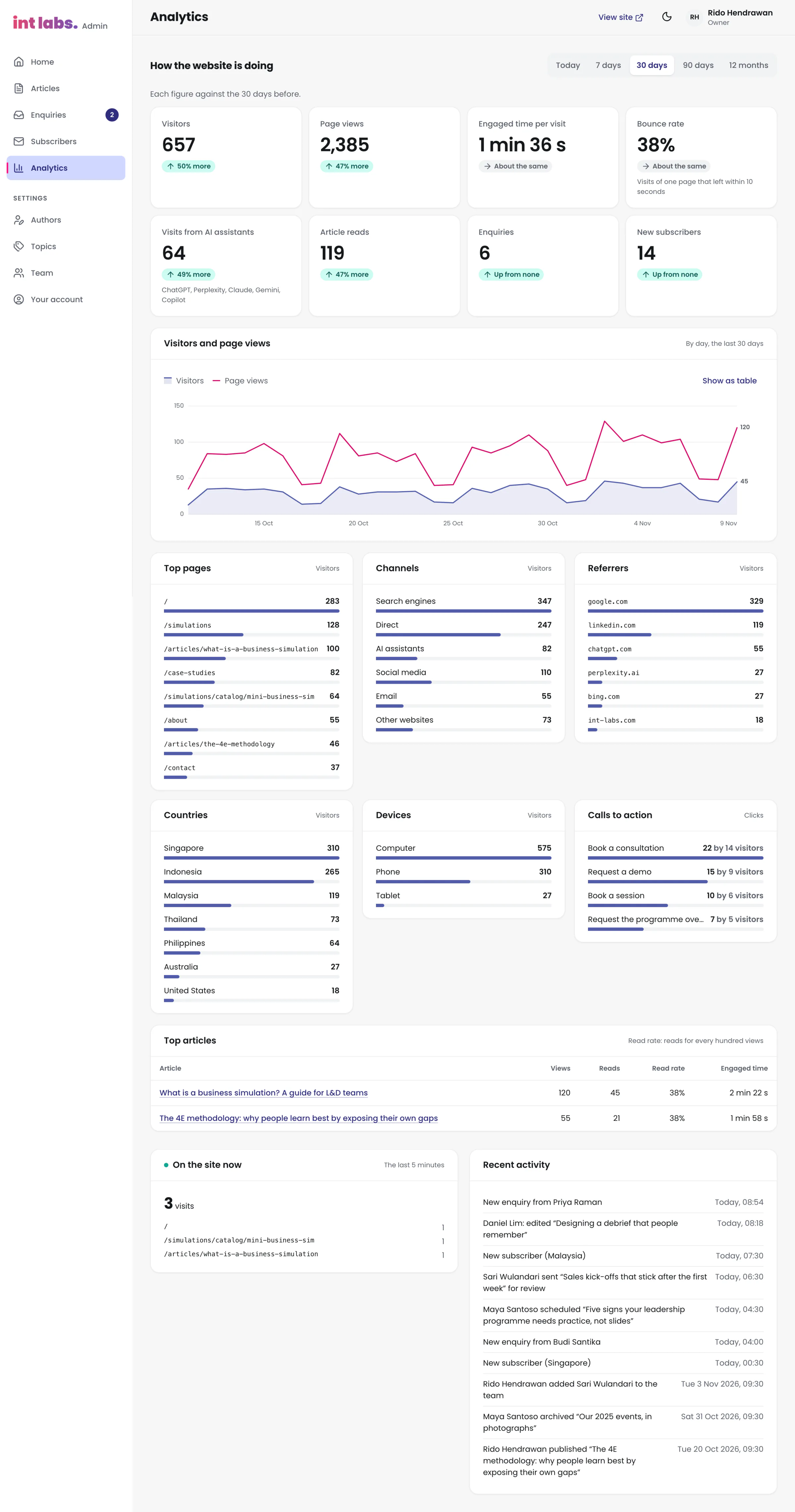
Analytics holds how the site is doing for today, 7, 30 or 90 days or 12 months, each figure against the same span before it: visitors, page views, engaged time, bounce, visits from AI assistants, article reads, enquiries and sign-ups. The chart is drawn by hand in SVG, visitors as an area and page views as a line on one axis, with a crosshair that follows the pointer and the arrow keys, each day announced, and a "Show as table". Six breakdowns, the top articles, who is on the site now and the activity feed follow.
Static Pages, an Admin, One Database
The site has no server of its own. React Router 8 pre-renders every route to a static file, so a page reads whole before any script runs; the host, Vercel, builds the draft from the repository's main branch and serves the pages and the admin, with a noindex header on every path of the draft. Behind them is one Supabase project: Postgres with row level security on every table, Auth, Storage for article pictures, and six edge functions.

The site's pages talk to the database with plain fetch and the publishable key alone, so no page loads the Supabase client library. Everything a visitor may do is a database function that checks its caller itself: the contact form, the newsletter, unsubscribing and the analytics beacon. The admin uses the client library, signed in, and row level security decides what each person may read and write. The secret key never reaches the browser, a build or a file.
The life of one enquiry, end to end:
- The reader sends the form; the page posts it to
submit_enquirywith the publishable key. - The function checks consent, the email and the hidden field, and two rate limits: five an hour from one visitor, three an hour for one address.
- It saves the row and writes a line to the activity feed.
- After the transaction commits, a trigger calls the
notify-enquiryedge function, which claims the enquiry once and emails the team, reply-to the reader. - A second trigger queues the reader's thank-you; the
notifyfunction claims it once and sends it, with the team's calendar. - The page shows the thanks; the reader's copy arrives.
- If either email is refused, the refusal becomes a sentence in the activity feed and on the admin's Home.
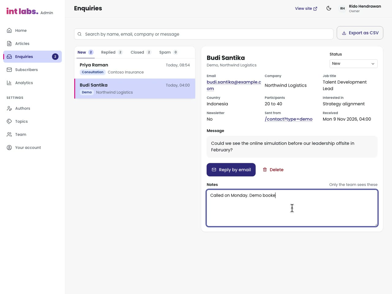
- The admin's count of new enquiries updates within a minute, and an editor reads, notes and replies.

Two Copies of Every Article
The schema is ten migrations, 1,635 lines of SQL, replayed into a new project once already (on 20 October, when the site moved to IntLabs' own organisation, every table counted on both sides). Its central idea is two copies of an article: articles, the staff's working copy, and published_articles, the live copy readers get, which only database functions write. Staff may edit only the eighteen content columns of the working copy; the status and the dates change only through the functions. So an unfinished edit never leaks onto the site, and scheduling needs no job.


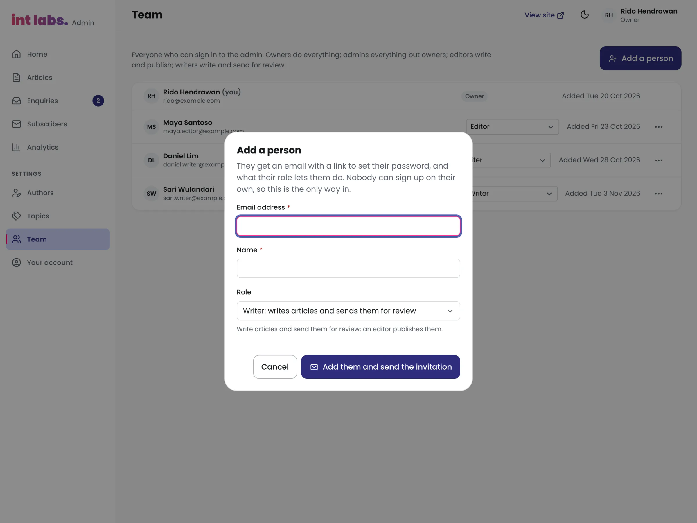
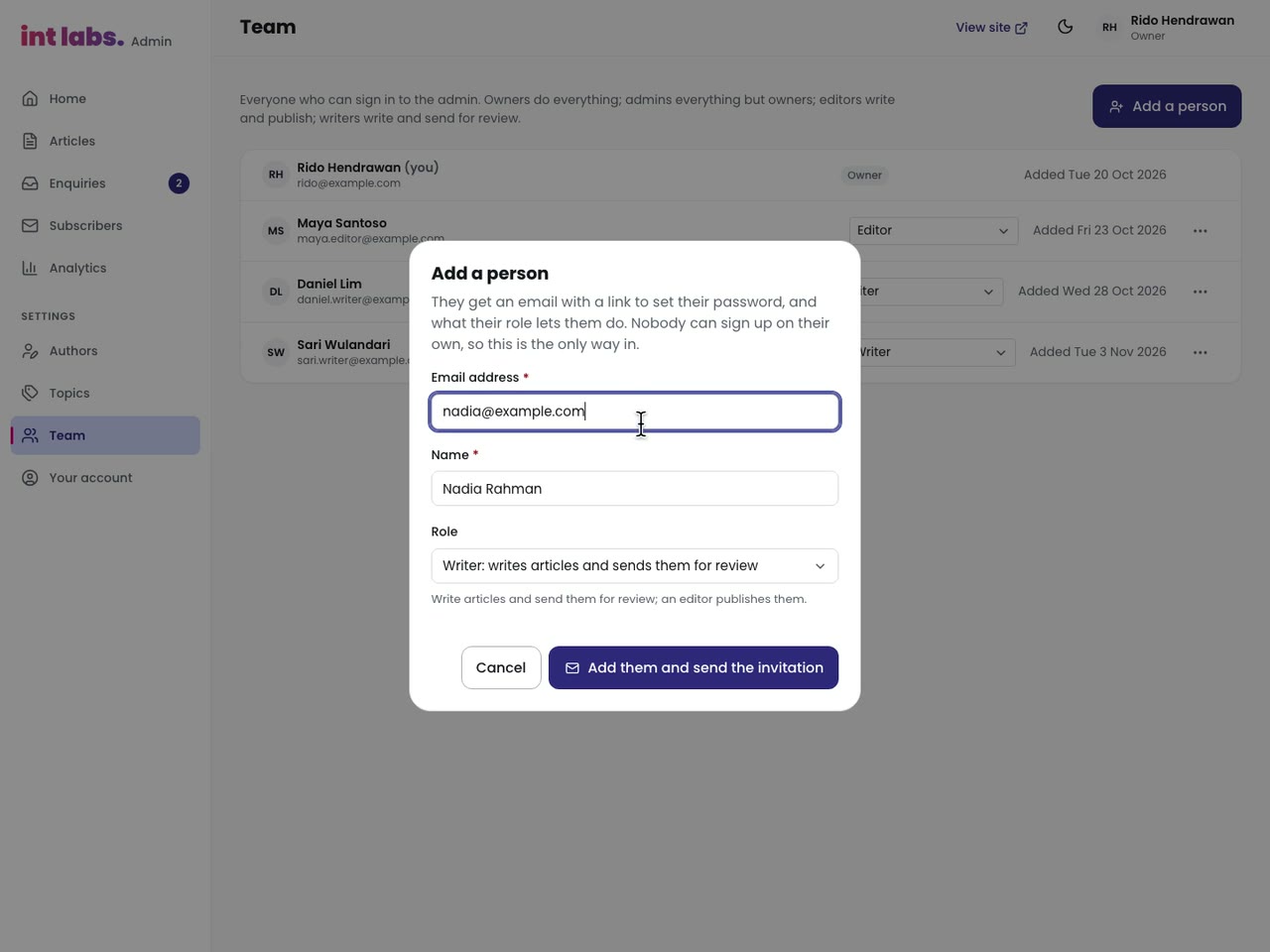
Four roles mirror the database's own policies: owner, admin, editor and writer. The admin offers only what will succeed, and a route a role may not use says so, but the database enforces it either way: 32 policies, column grants that limit what an update may touch, a role check inside each function, and a guard that keeps the last owner.
Counting Visits, Not People
The site counts its own visits, so there is no tracking script and no consent banner. A visitor is a 32-character hash of the address and the browser with a salt made each day and deleted the day after next, so the same person cannot be followed from one day to the next and the hash cannot be recomputed once the salt is gone. The visit's id is random and lives only in the tab. Nothing is sent under Do Not Track or Global Privacy Control, or from a browser a script drives. The reasoning was checked against the Singapore regulator's guidance on anonymised data; it is the design's rationale, not legal advice, and it was not assessed for other countries.
Ten Templates, None Failing Silently
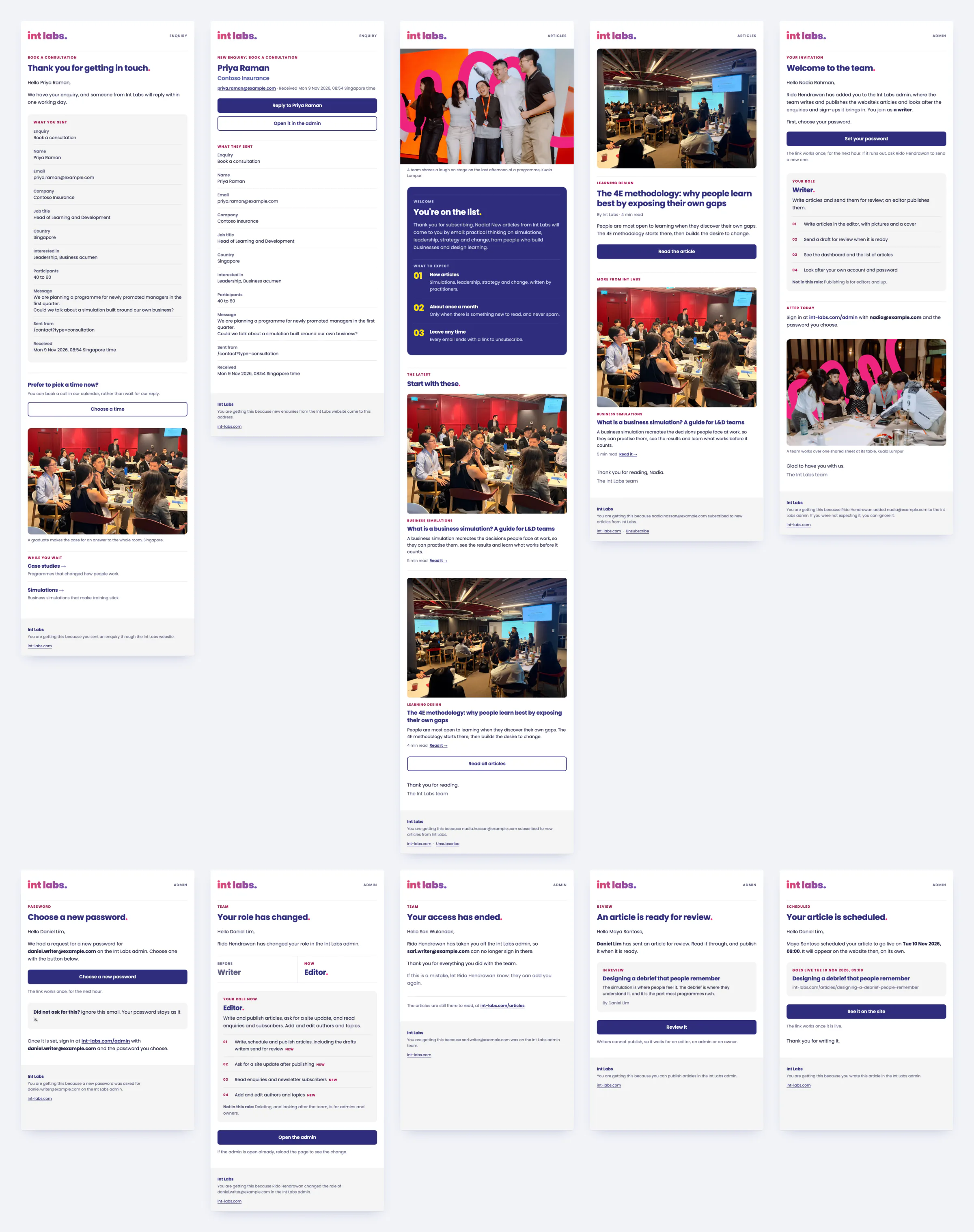
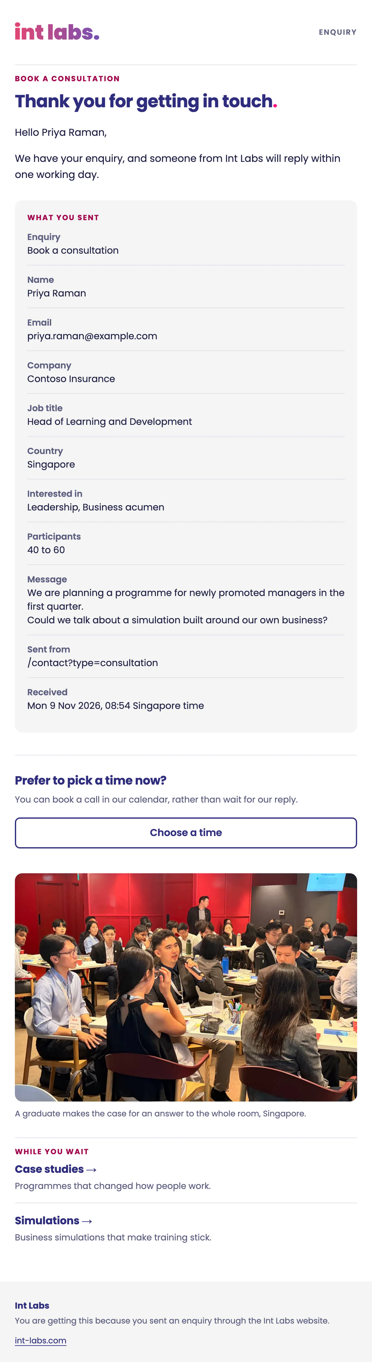
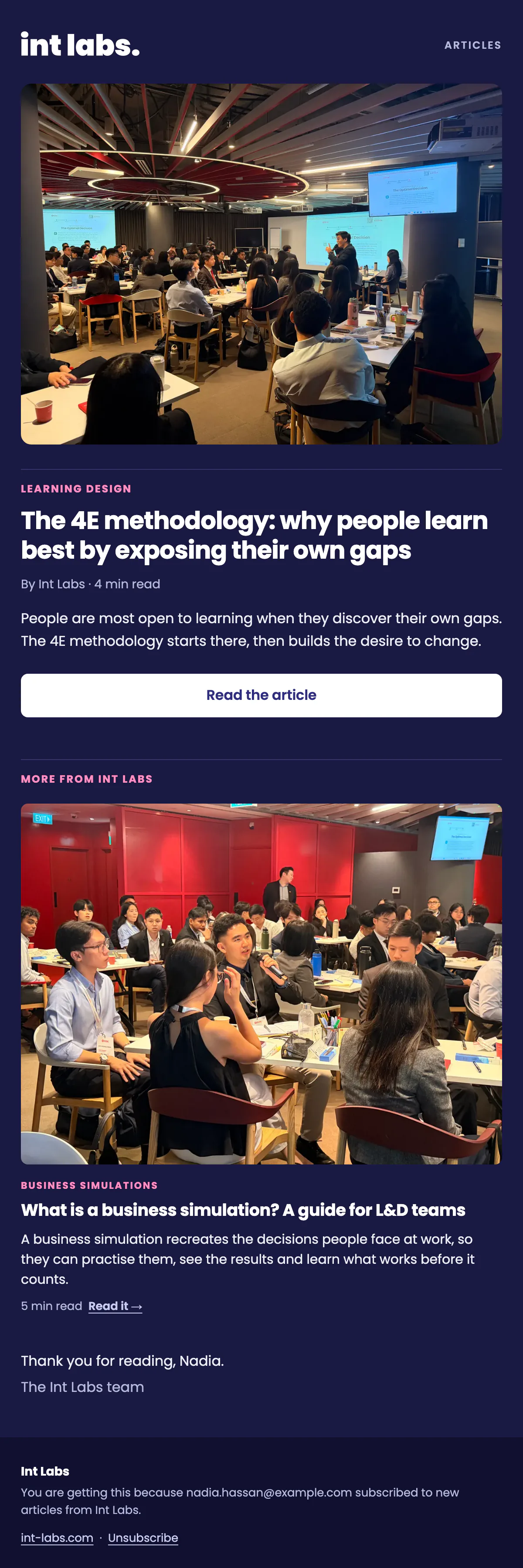
Ten emails, designed in the site's look: the gradient wordmark, navy titles with a pink full stop, a label on a hairline, the site's own photographs. Each is built from tables with inline styles at 600 px, with a plain-text twin, under Gmail's 102 kB clipping limit, and a dark version. Five are started by the database (a welcome to a new subscriber, the enquiry's thank-you, a review request to the editors, a writer's article published, a role changed); four by the function the admin calls (an invitation, a password link, access ended, an article to subscribers); one goes to the team for every enquiry. Password links are the site's own one-time tokens, spent only when the person presses Continue, so a mail scanner opening the link cannot use it up.

The Site Is Its First Consumer
The site is built on IntLabs' own design system, in the same repository: tokens, motion, icons, assets, 40 core components and 47 Branding patterns, each package depending in one direction only, held by a check. A colour, a space or a duration is a token: the stylesheet checks fail the build on a raw hex, a raw pixel or a typed duration. The admin uses the same core components, and found three bugs in them that core then fixed: a drawer that opened under a sticky bar, a select list painted transparent, and a button that dropped its disabled state for screen readers.

Designed With the Business, Built With AI
Every page started in Figma, designed by hand by the site's design engineer together with IntLabs' marketing team and CEO, and so did the material around it: the photographs, the films, the proposal and the assets. The structure came from inside the company too: a simulation-first sitemap drawn by a colleague in September, the founder's page-by-page copy in October, and a colleague's case study blueprint in November. Each review with the team became the next round.
- 17 August: the design system's first commit.
- 14 September: the website's first commit; foundations, checks, shell, home page and accessibility within two days.
- 16 October: version 1, a review draft of 57 pages, nothing sent from the site.
- 20 October: version 1.1 in one day: the database behind the admin, the forms and the analytics, the founder's copy page for page, the admin, ten emails, the move to IntLabs' own database project, and a calmer, more visual site. Version 1 stays at
/v1beside it, to compare. - 21 October: the owner's review, page by page: the opening, the type scale, the not-found board, the admin's logo; no email failing silently.
- 22 October: the physics of change drawn again, every menu section reachable on a phone, a Resources page; deployed.
- 2 November: the fifteen case studies in the blueprint's nine sections, anonymous, with the build holding the names.
Claude Code was the pair for the code: of 215 commits, 107 carry Claude Opus 5 as co-author, 40 Claude Opus 5.5 and 2 Claude Fable 5.1. The work ran as parallel sessions in their own worktrees (the design system, the website, the case studies, the events), each working to the design, the brief, its own rules file and two handoff files that record every review. Every check is a command that prints what it found, and a figure goes into a document only after the check has been run again.
A Database, Not a Content Service
Context: the team wanted to publish daily, keep every enquiry and see the site's own numbers, on a site with no server. Decision: one Postgres database with row level security on every table, reached by the pages with plain fetch and the publishable key, and by the admin with the client library. Every schema change is a migration in the repository. Cost: a schema, its policies and six functions to maintain, and a database a careless policy could open; hence a policy on every table and every visitor action behind a function.
Two Copies of an Article
Context: a writer must be able to change a live article without the change appearing until it is published. Decision: a working copy and a live copy, the live one written only by publish_article and its siblings. Cost: twenty database functions where an update would have done; in return a draft never leaks, a publish leaves a revision and an old address, and scheduling needs no job.
Scheduling With Nothing Running
Context: articles are scheduled for a day and time. Decision: a scheduled article is a live row with a future time, and the readers' policy shows only rows already due. Cost: search engines see it only after the next build, so Home says when the built site is behind the articles, and offers to update it.
Analytics Without a Cookie
Context: the team wanted the site's own numbers without a banner on every page. Decision: count visits with a daily salted hash and no stored address, and send nothing under Do Not Track, Global Privacy Control or automation. Cost: a visitor cannot be followed across days, so there is no retention curve.
Publishing Asks for Two Things
Context: a list of checks held Publish back until a summary, an author, a topic, 150 words and alt text were in. The owner: "too much validation ... if they don't want, just let them." Decision: a title and some words; an empty summary becomes the first 160 characters, an undescribed cover takes the title, and the SEO advice is ideas, never a gate. Cost: an article can go live thinner than the checks wanted; the advice stays one tab away.
No Sign-In by an Agent
Context: the admin had to be built and tested signed in, and the AI pair would otherwise type the owner's password into a hosted sign-in. Decision: the signed-in screens were built and tested against an in-page stand-in for the database; the real backend was checked signed out, and the whole article lifecycle run as the owner in a transaction that was rolled back. Cost: a person's own signed-in pass is still owed before launch. This case study is filmed the same way.
The Build Holds the Names
Context: no client is named without written sign-off, across fifteen cases, the photographs, the films and the alt text. Decision: checks in the build that fail on a name in a case's words, on any built page's words, alt text, head or structured data, and a media gate that only imports frames opened and cleared. Cost: every case had to be rewritten, and some of the strongest photographs are off the pages until a client signs.
Nothing Moves on Scroll
Context: version 1 moved a lot: an opening, page moves, reveals, scroll-linked pictures. The founder's review found it too much to scale across phones and screens. Decision: since v1.1 motion only answers an action: a hover, a press, a film, the opening once. Anything that moves on its own has a way to stop it. Cost: the page moves of version 1 went, and with them some of its character.
What Changed in Two Weeks
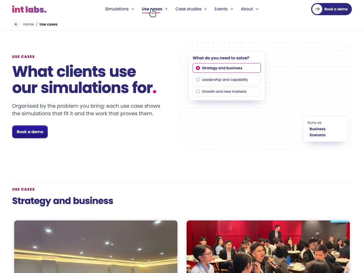
Version 1 was the review draft of 16 October: 57 pages, nothing sent from the site, no admin. It stays at /v1 beside version 1.1. What follows is how this page told it then: its film, how it worked, its architecture, its six decisions and the small things that carried the brand.
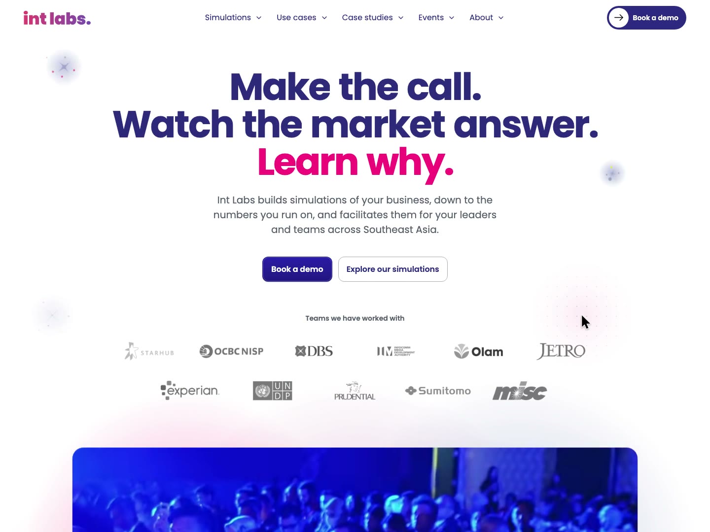
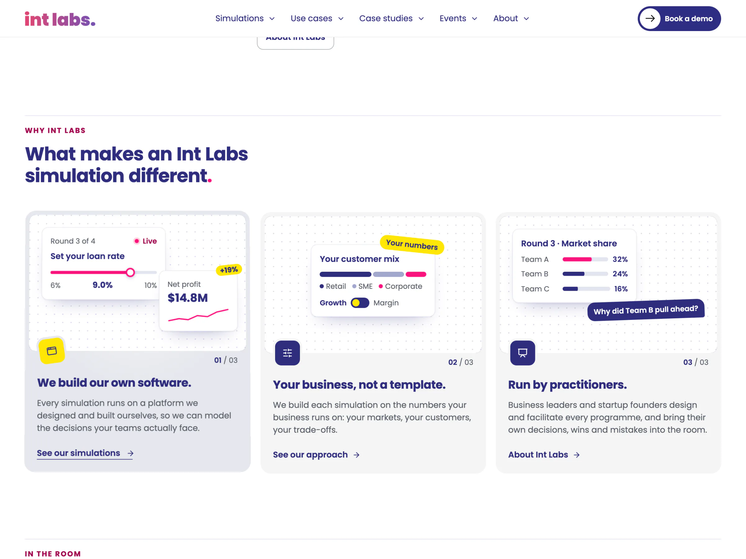
A Simulation Company That Behaves Like One
- The first visit opens with the brand. A navy squiggle carrying the wordmark thins and unwinds off the screen as the headline rises. It plays once per tab, never on a reload, and never for a reader who asked for less motion.
- Every move between pages keeps the thread. Each section has its own colour and turn of the same squiggle: pink and mirrored for Simulations, yellow and turned for Case studies, periwinkle for About.
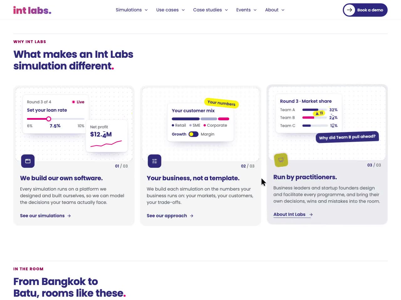
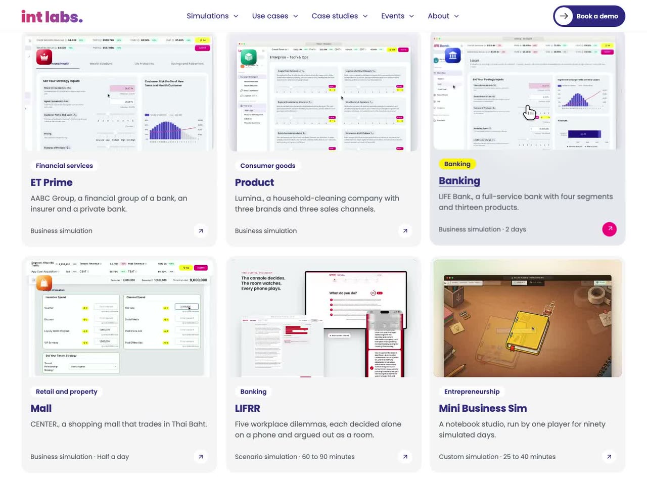
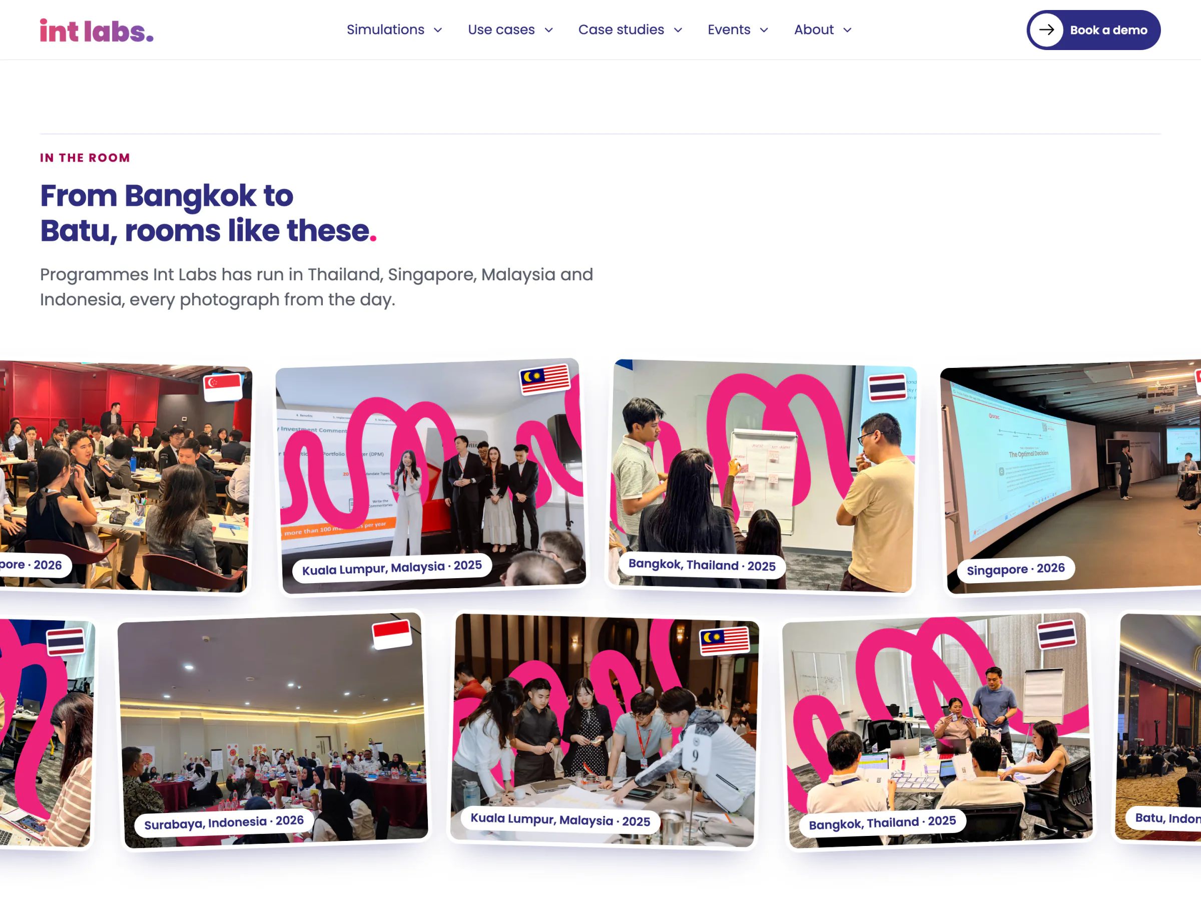
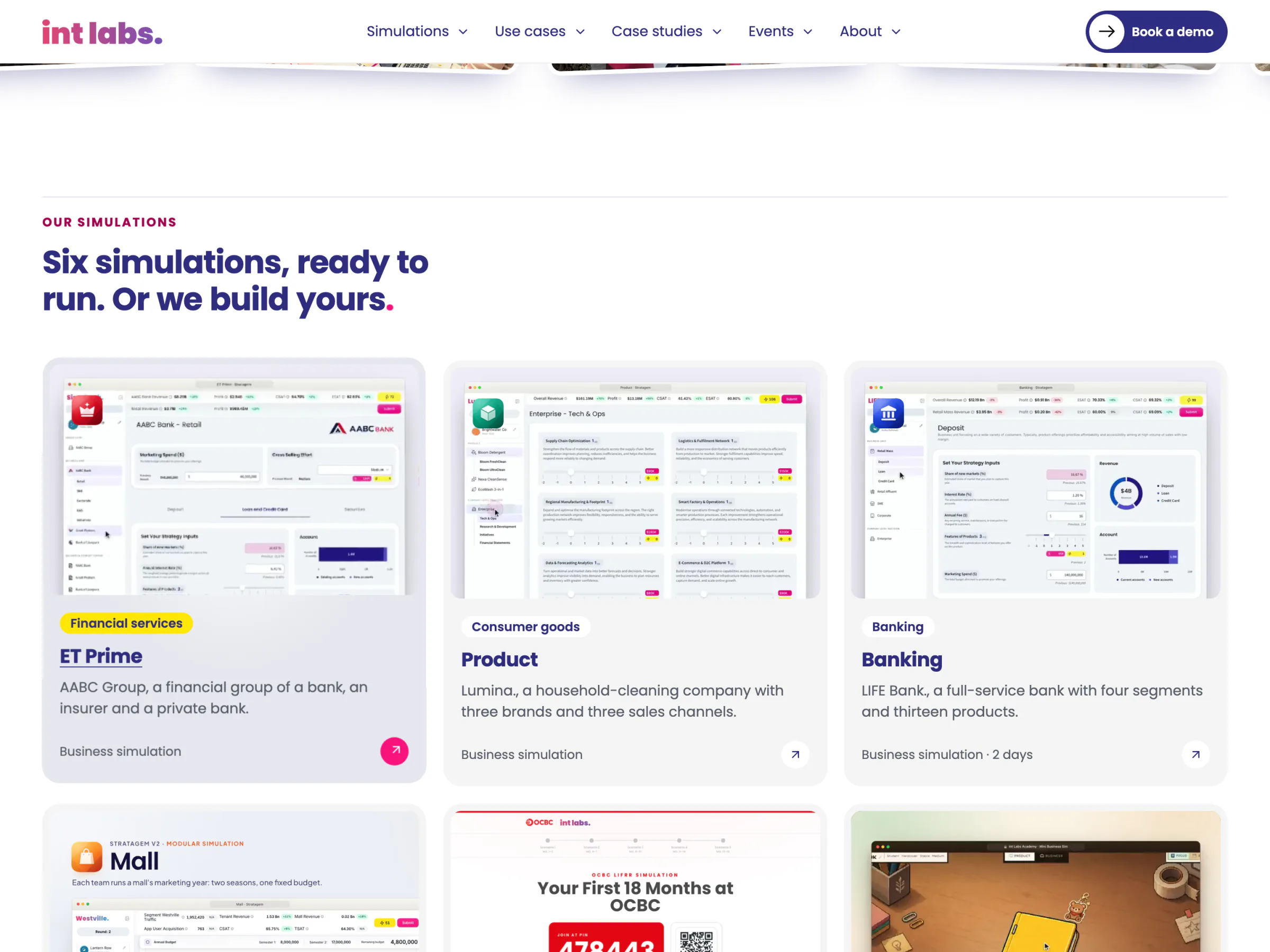
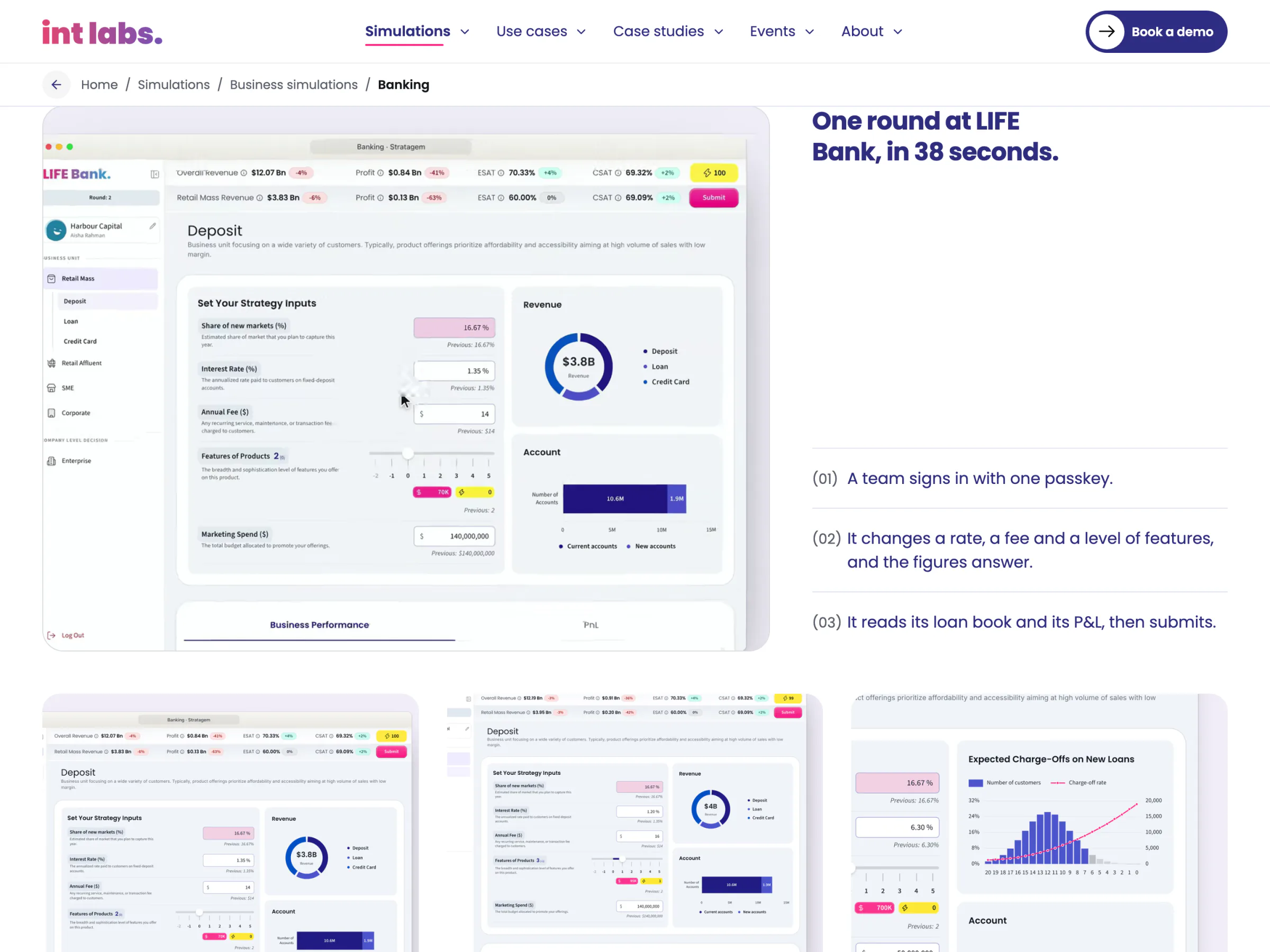
- The home page shows the room. Programme photographs from four countries pass each other in two rows; six simulation cards each play a film of their own product; four clips show a round from the inside.
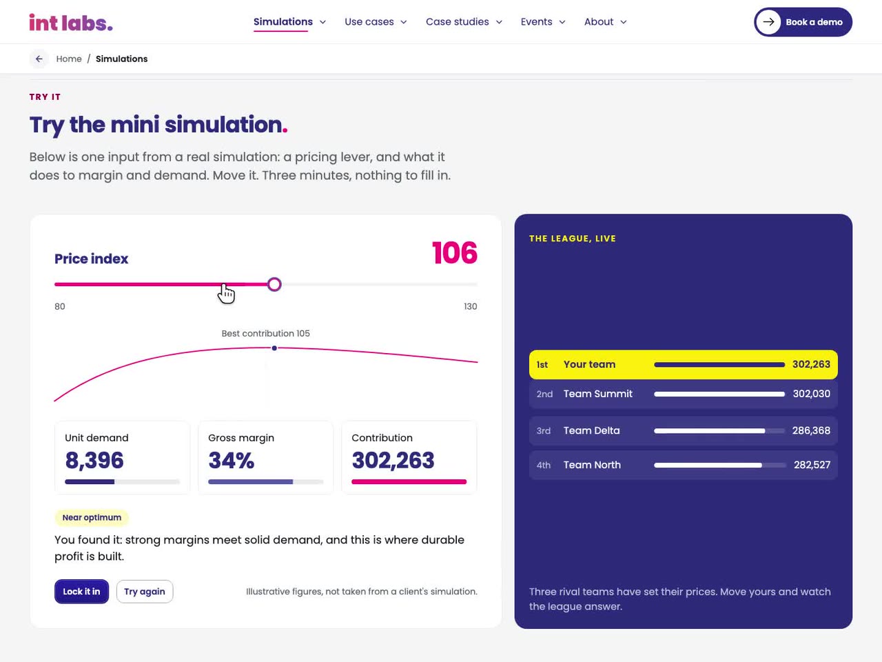
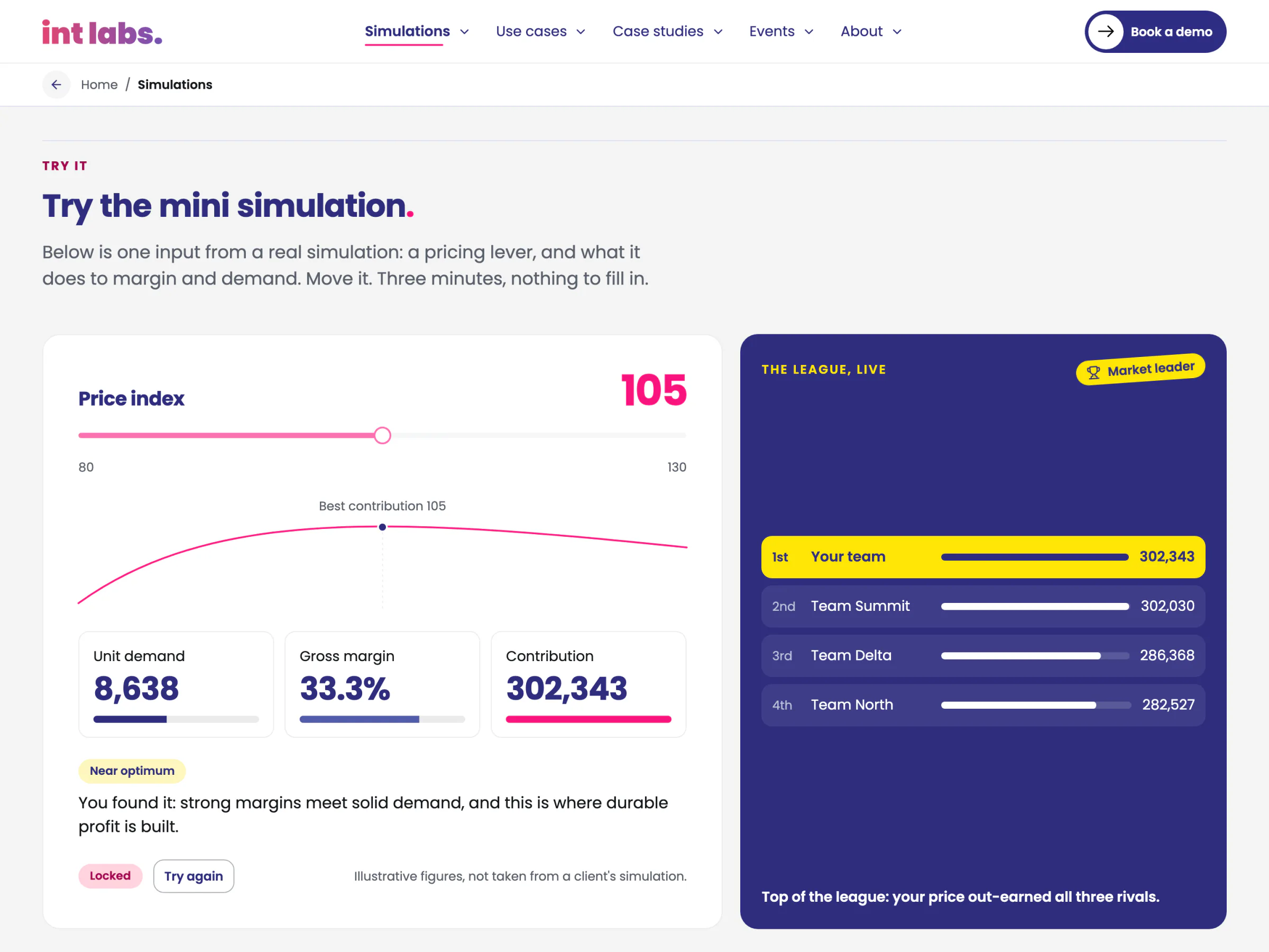
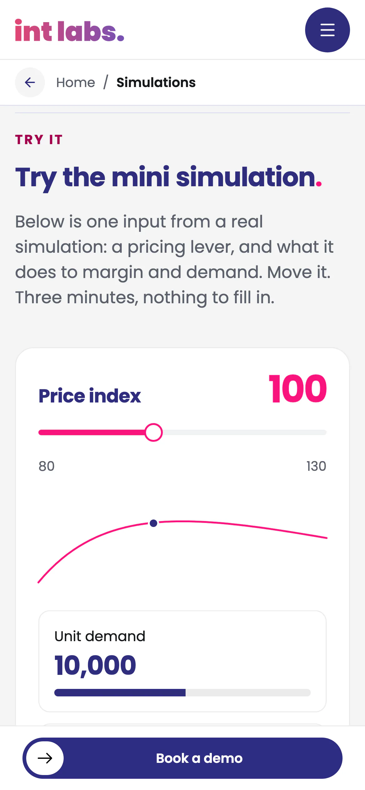
- The simulations hub lets a reader play. The mini simulation sets one price against three rival teams. Its figures change in the same frame as the lever, its rows slide into their new order, and locking in first earns the burst.
- Every call books a call. "Book a demo" opens IntLabs' calendar for a 15-minute call, and contact is an email. There is no form to fail.
Pre-Rendered, on the Company's Own Design System
The site is React Router 8 in framework mode with ssr: false and prerender: every route becomes its own static HTML file at build time, with no server behind it. Content lives in TypeScript and MDX files in the repository and is baked into each page, so a page reads whole before any script runs. The site is the first consumer of the Branding layer of IntLabs' own design system, in the same monorepo: tokens, motion, icons, core components, 47 brand patterns and the assets.

The life of one visit to the simulations hub:
- The host serves
/simulations/index.html, already complete. - A small script in the head runs before the first paint. It reads the session and the navigation type to decide whether the opening or the move plays.
- The fonts load before the scripts.
- The page hydrates. Reveals and the films in view start only if the reader allows motion.
- The mini simulation computes the league in the page from the content model: demand, elasticity, cost and the rivals' prices.
- "Book a demo" opens the calendar in a new tab. Nothing is sent from the site itself.
Two builds come from the one source. The preview build shows every draft, placeholder and stand-in photograph. The production build publishes only what the content gates allow: today, five pages and the not-found page, with eight items held back, each printed with what it waits on. No AI runs inside the product.
How Version 1 Was Built
Static pages with real links. Context: the old site's proof was invisible because nothing on it was a real link. Decision: every navigational control is an <a href>, every route has a unique title and a self-canonical, and sitemap.xml is generated from the content, each held by a check in the build. Cost: there is no server, so there are no forms. Calls go to an outside calendar, and every page move is a full document load, which the squiggle covers.
Two builds from one source. Context: most of the content describes client work still in draft, and the brief allows no invented facts. Decision: one codebase with two modes. The preview carries every draft for review; production publishes only cleared content. Cost: the public site stays small until each page clears, and reviewers see drafts with stand-ins they must not mistake for the real thing.
The company's own tokens over the brief's stack. Context: the brief named Next.js and Tailwind, while IntLabs already had a design system for its simulation products. Decision: React Router, pre-rendered, on the design system's own tokens and packages, because Tailwind would bypass the token pipeline; the brief's information architecture, content model, SEO rules and launch gate carried over unchanged. Cost: a stack the brief did not name, and a site whose look is only as finished as the packages it uses.
The brand guide over the old designs. Context: the live Figma designs and IntLabs' brand guide disagreed in places. Decision: wherever they disagree, the brand guide is the source of truth, down to the radii (20 px for cards, 999 for pills) and the one typeface, Poppins. Cost: parts of the live designs did not carry over.
Motion that steps aside. Context: the site moves a lot: an opening, page moves, comets in the hero, films, reveals and scroll-linked pictures. Decision: every effect tests the reader's motion setting. Under reduced motion the films wait on their stills behind a play button, the opening never plays, and the content is simply there. A build check presses every pause button with motion on. Cost: the opening plays once per tab and never on a reload, so every page after the first sees only the shorter move.
Stand-ins in preview only. Context: many picture slots waited on IntLabs' own photographs. Decision: licensed stand-ins fill them in the preview build only, and a production build carries none of their files. Cost: preview pages can show a stock picture where a real room belongs, so every film and still in this case study avoids those pages.
Small Things That Carried the Brand
A picture still on its way shows the brand's squiggle, rocking in the brand's colours three times before it rests. The bar's links open a preview of their section after a 90 ms rest. The wordmark's letters hop when the pointer finds them, and the closing words of every footer do the same.
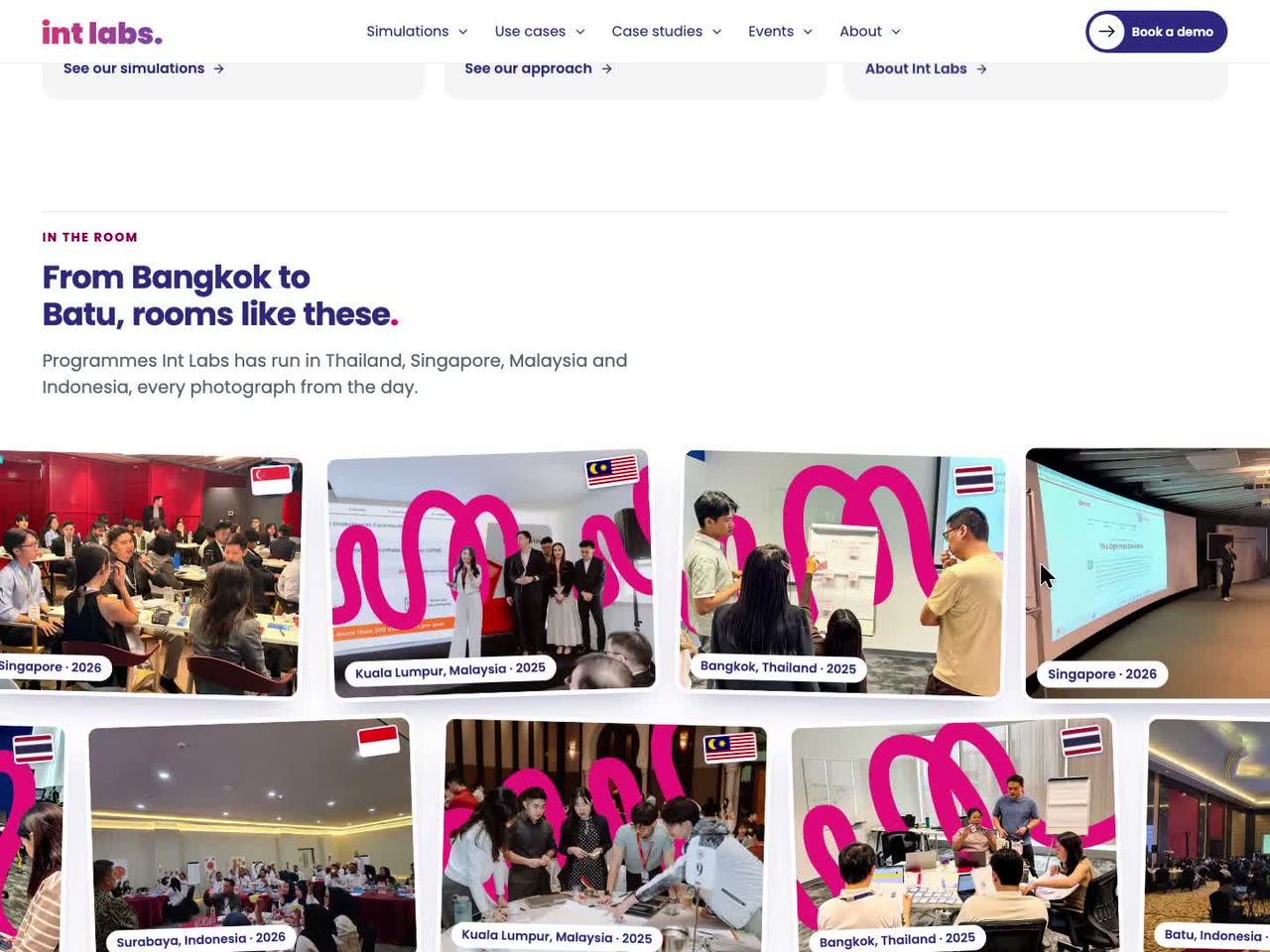
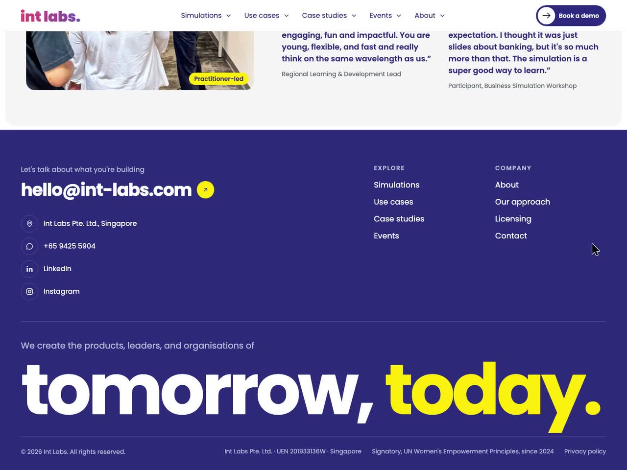
Every page was checked with axe-core at 1440 and 390 px, in both builds: 126 runs, no violations. On the production pages a keyboard walk finds the skip link first, a visible 2 px focus ring on every stop and nothing covering the focused control. Five widths were walked, from 1920 to 390 px, with no sideways scroll anywhere.
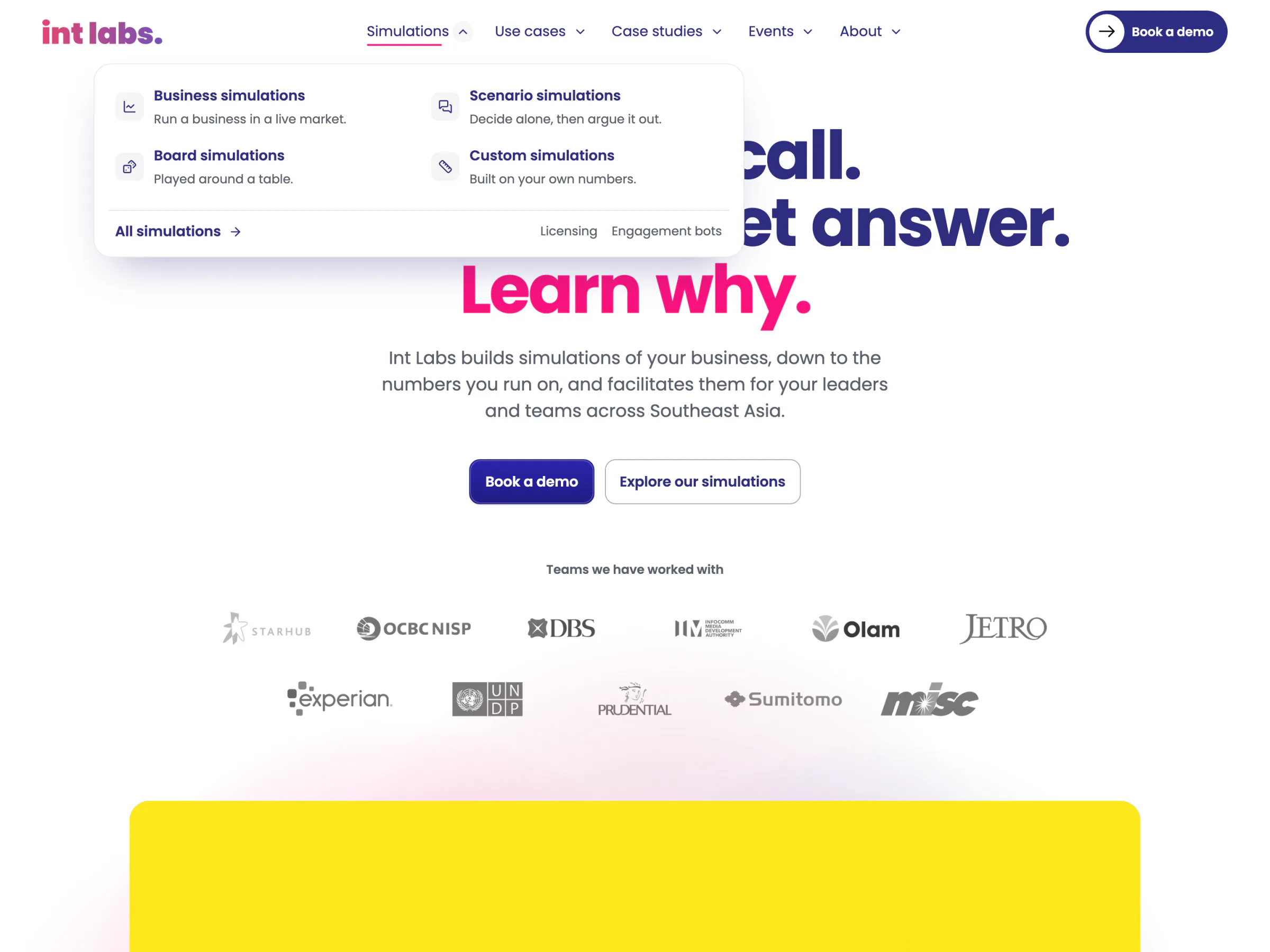
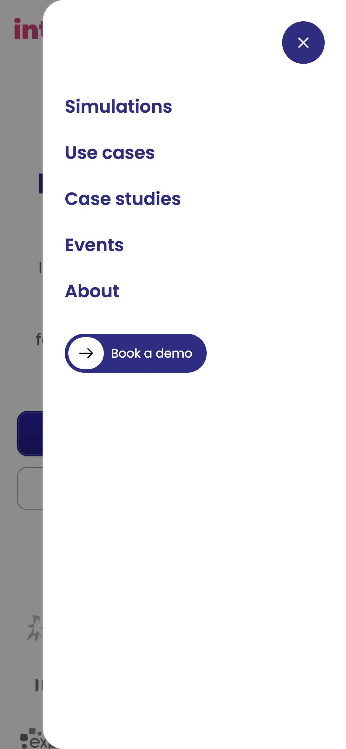
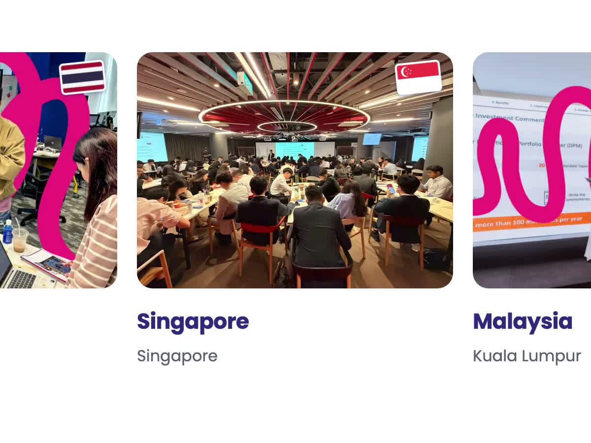
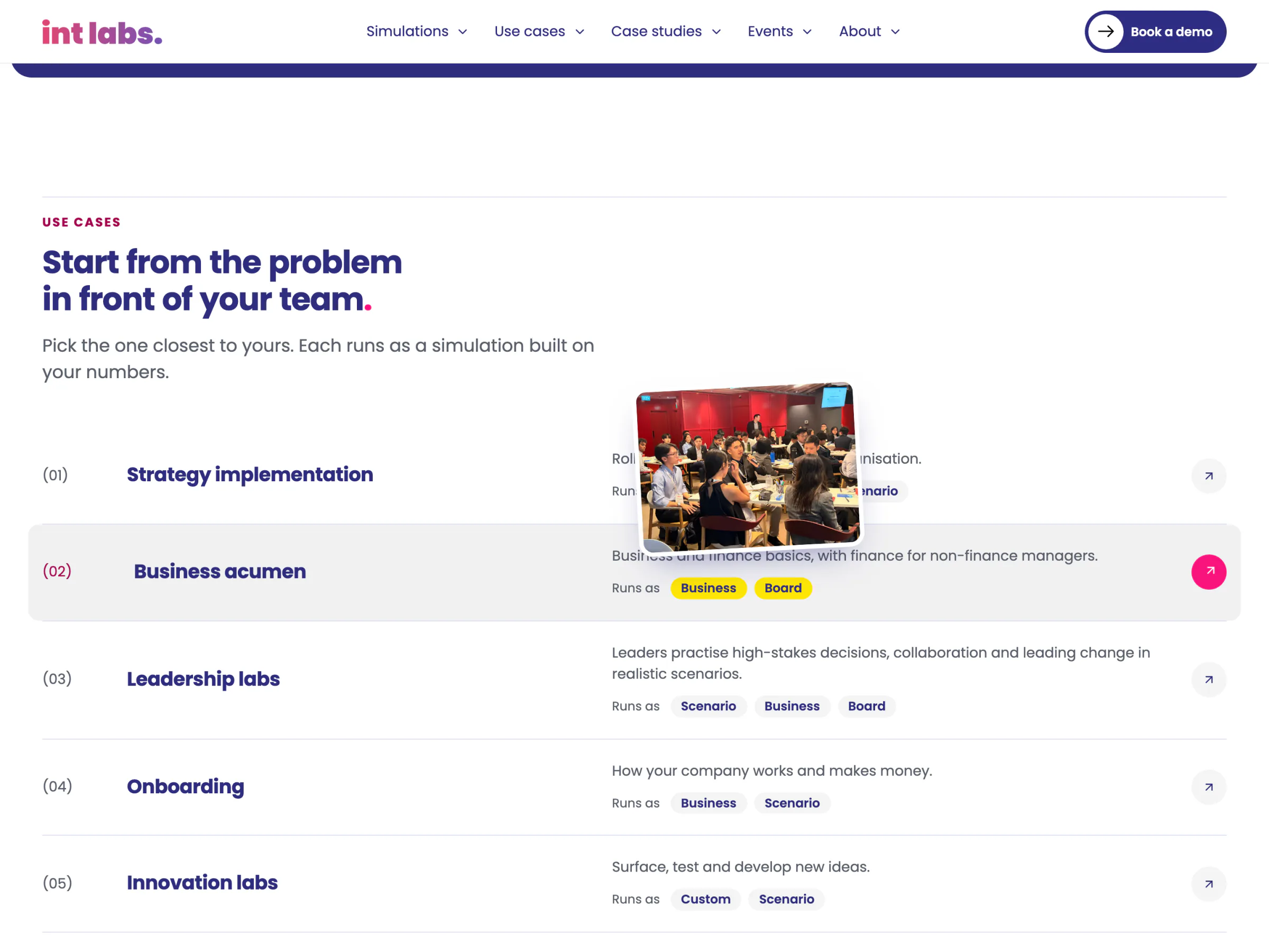
Each component answers a reader in one small, specific way. The pill in the bar turns yellow and says hello. A link in the bar previews its section. The wordmark's letters hop. A use-case row shades and points its arrow, a country tile lifts its photograph and its flag flutters, and a copied link turns to a check. Like every effect on the site, each one tests the reader's motion setting first.

Version 1, Page by Page
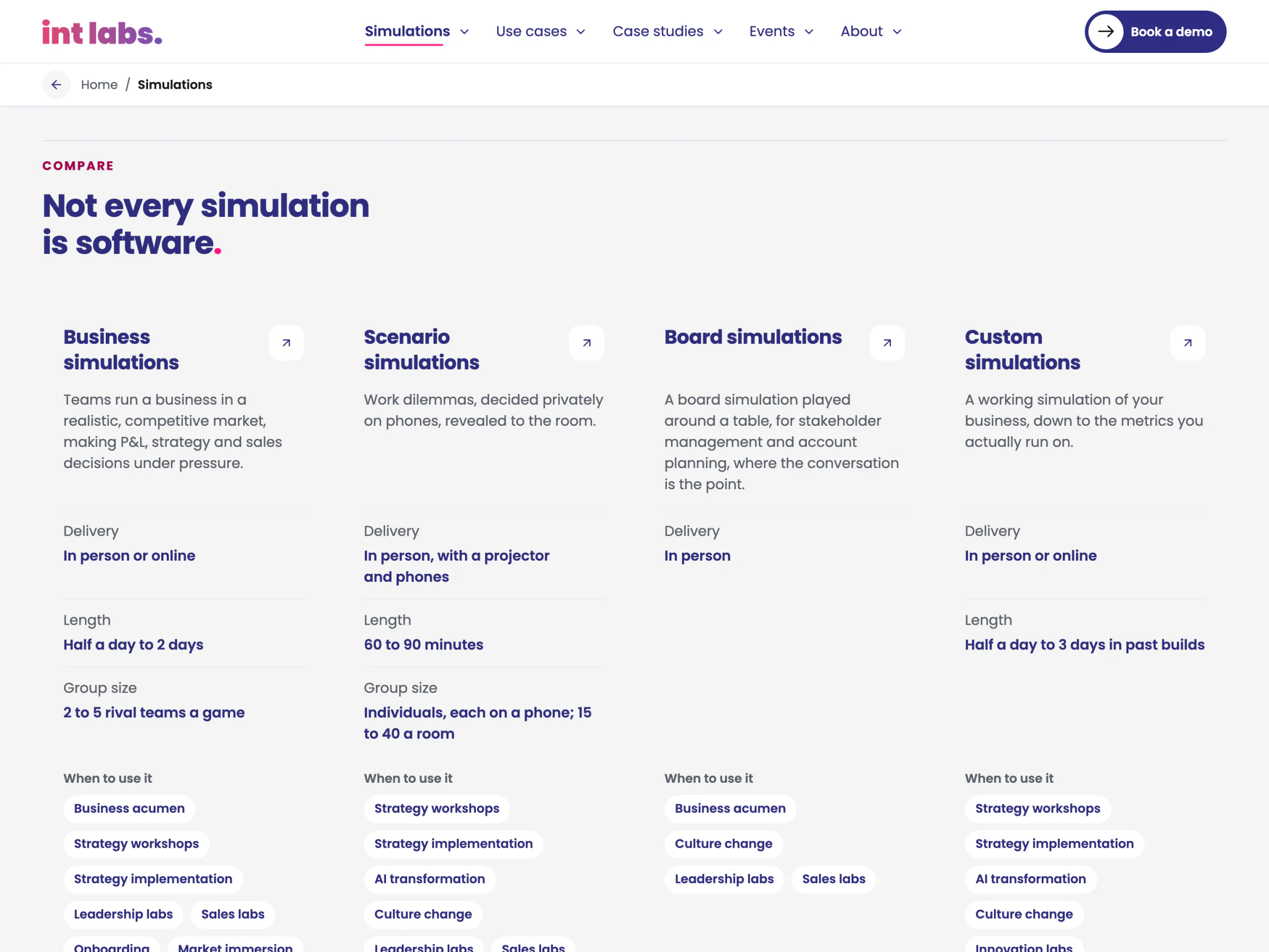
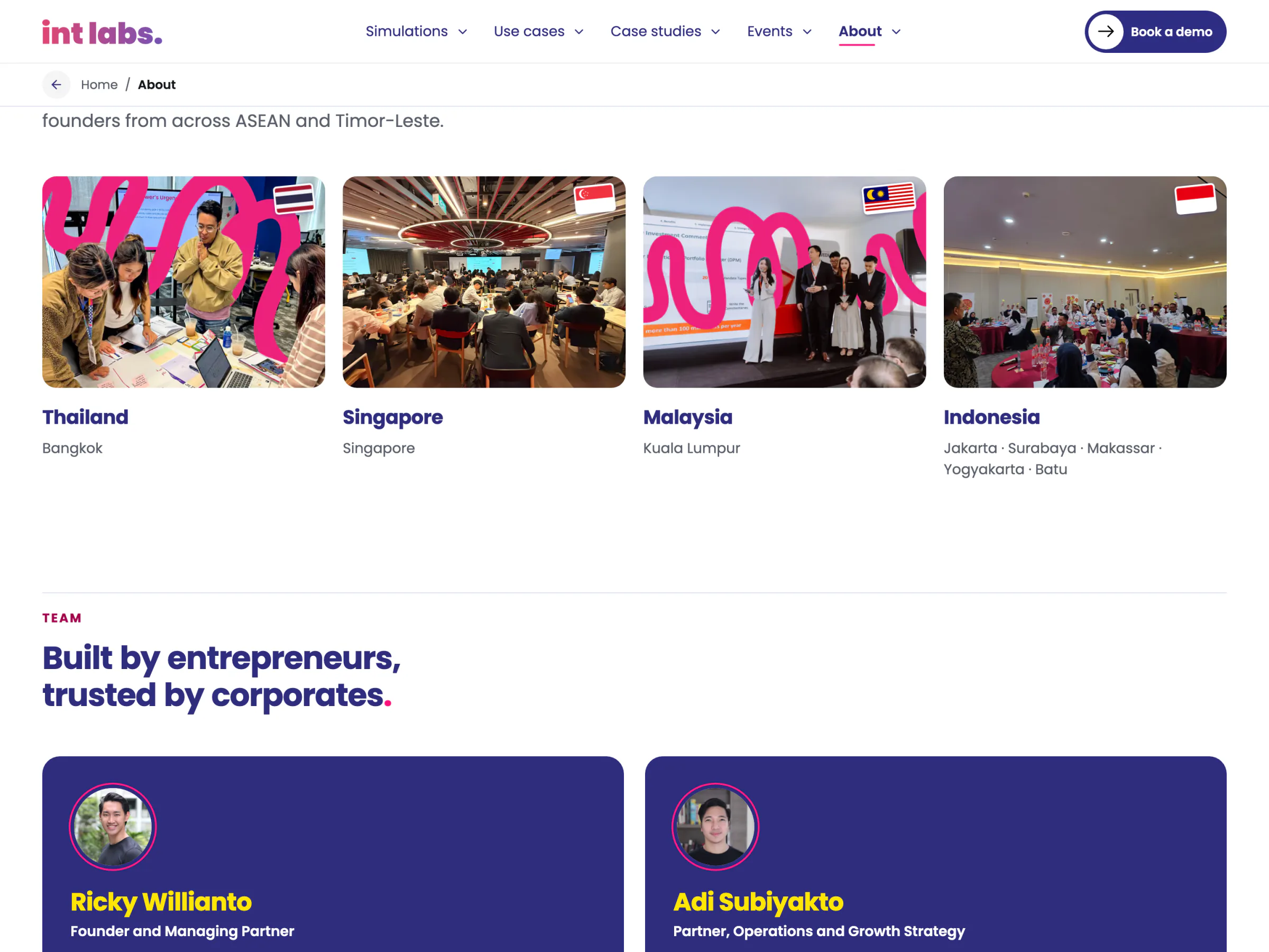
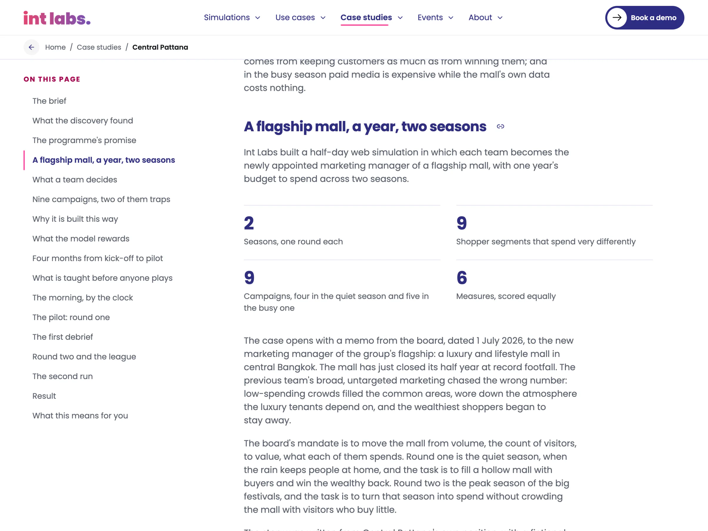
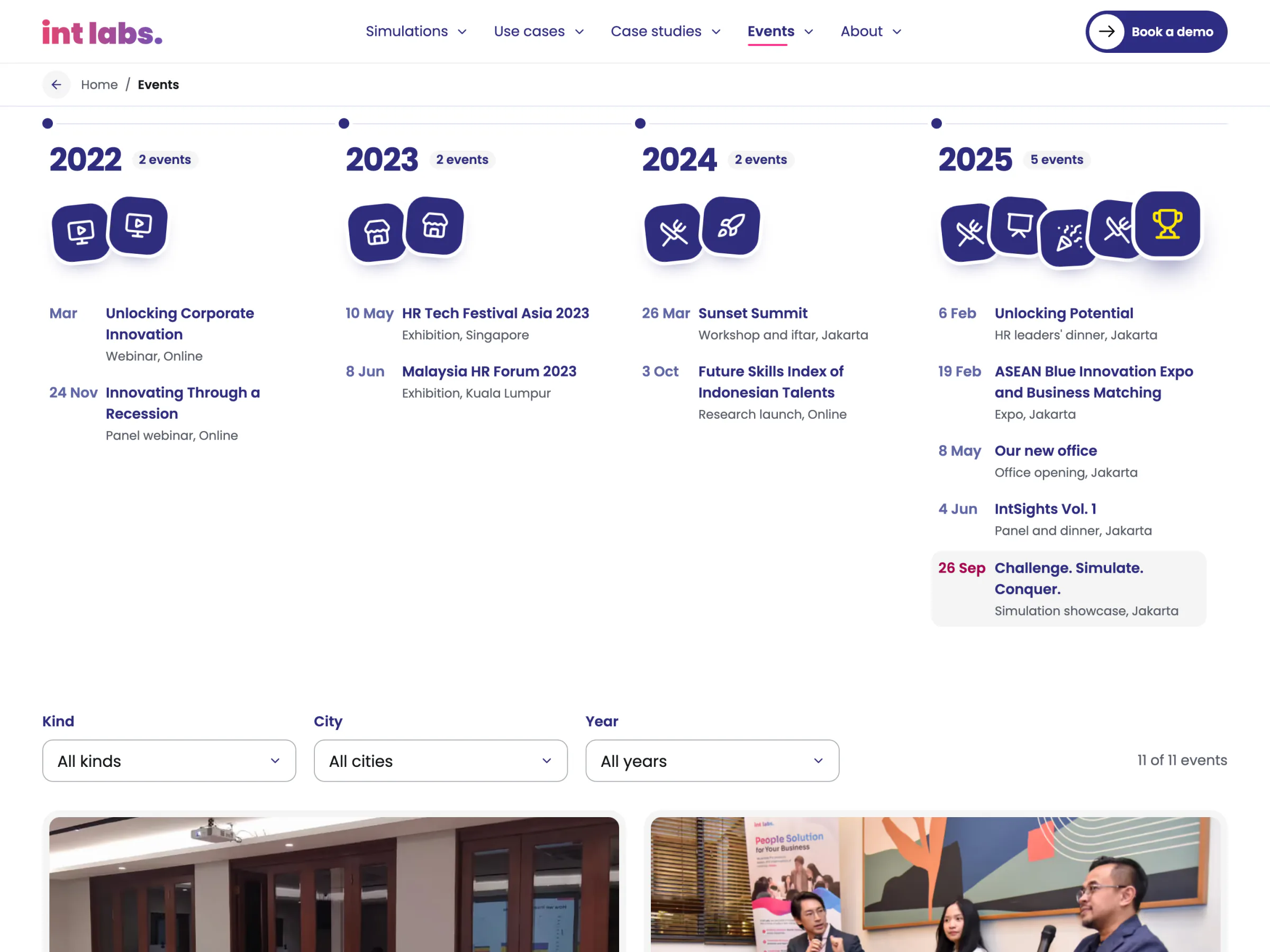

Small Things That Answer the Reader
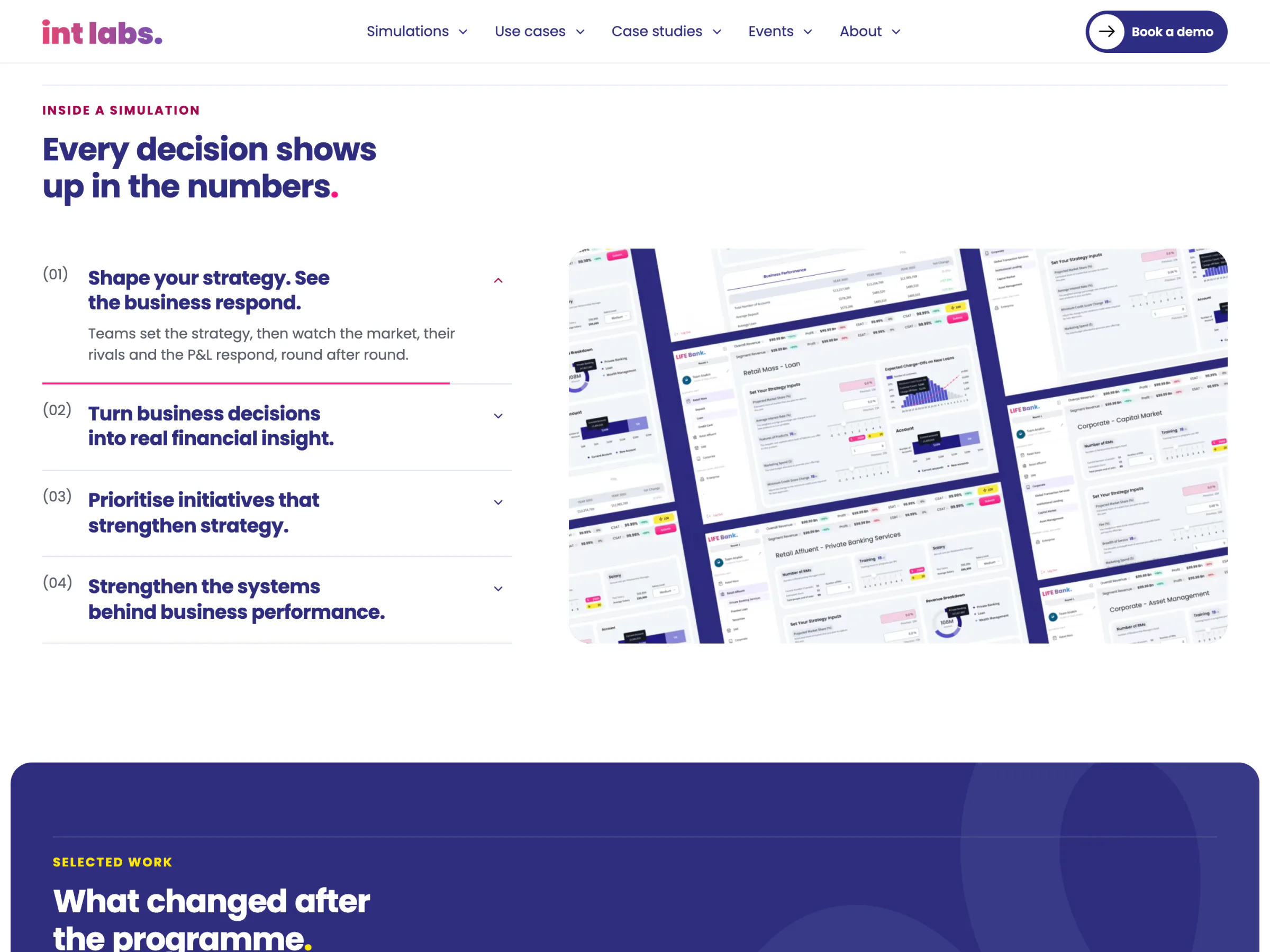
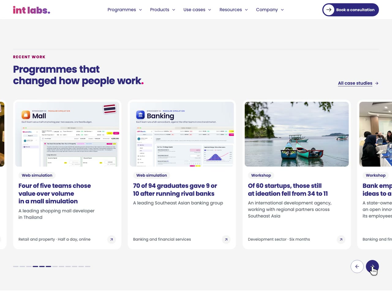
The recent work scrolls in one row that snaps to its cards, with buttons for a pointer and nothing moving on its own. Every card in a row stands as tall as the row, and every card has a picture: a case's cover, a simulation's screens, or a real room toned navy with "Coming soon". Under a pointer a card takes a navy hairline and a small rise, its photograph leans in and its arrow turns pink. Large numbers stand in the brand's deeper periwinkle, past the 3:1 large text needs; the 4E method's result sits on a yellow edge, never running text on yellow.
On the preview build of 2 November, axe-core found no serious or critical issue on any of the 78 pages at 390 and 1,440 px; a keyboard walk found a visible focus at all 6,729 stops, nothing covering the focused control; the brand's contrast pairs held; and both forced-colour modes passed. No page scrolls sideways at either width. Every effect that moves on its own was pressed with motion on to prove it can be stopped. The admin was walked the same way on 20 October: every screen at 390 and 1,440 px, light and dark, no serious finding, 320 keyboard stops all visible.
A Site the Team Runs, Waiting on Its Clients
The site is a review draft. It runs as a noindex preview for IntLabs, built by Vercel from the repository on every push, and int-labs.com still serves the old site. The admin runs on the draft at /admin, and since 22 October the emails go out from IntLabs' own sending domain to every address. Every case study, event, use case and simulation page is still a draft awaiting sign-off, so none of their results is claimed here.
What was learned: a site that sells a product should let the reader use a piece of it, and the physics of change says more than a paragraph could. A small database with its rules written as policies and functions gave a team without a developer a place to write, without a content service to pay for or a server to keep. And a rule that matters, like no client's name, belongs in the build, where it fails loudly, rather than in a document someone has to remember.
Known limits: the analytics count only what the site can see without a cookie; search engines see a scheduled or edited article only after the next build; the Bahasa versions were written with AI and await a native reader; and a person's own signed-in pass through the admin is still owed.
What is next: clearing the drafts case by case as clients sign, a deploy hook so publishing rebuilds the site by itself, and launching on the company's domain.
Gallery